The Japanese have four seasons. Manila, with considerable confidence, has two.
The Seasons Residences brought all four to Bonifacio Global City, together with Japanese engineering, Filipino hospitality and a retail institution whose history reaches back to 1673. This was already a great deal for one address to contain and it was an even greater deal for one piece of communications to explain.
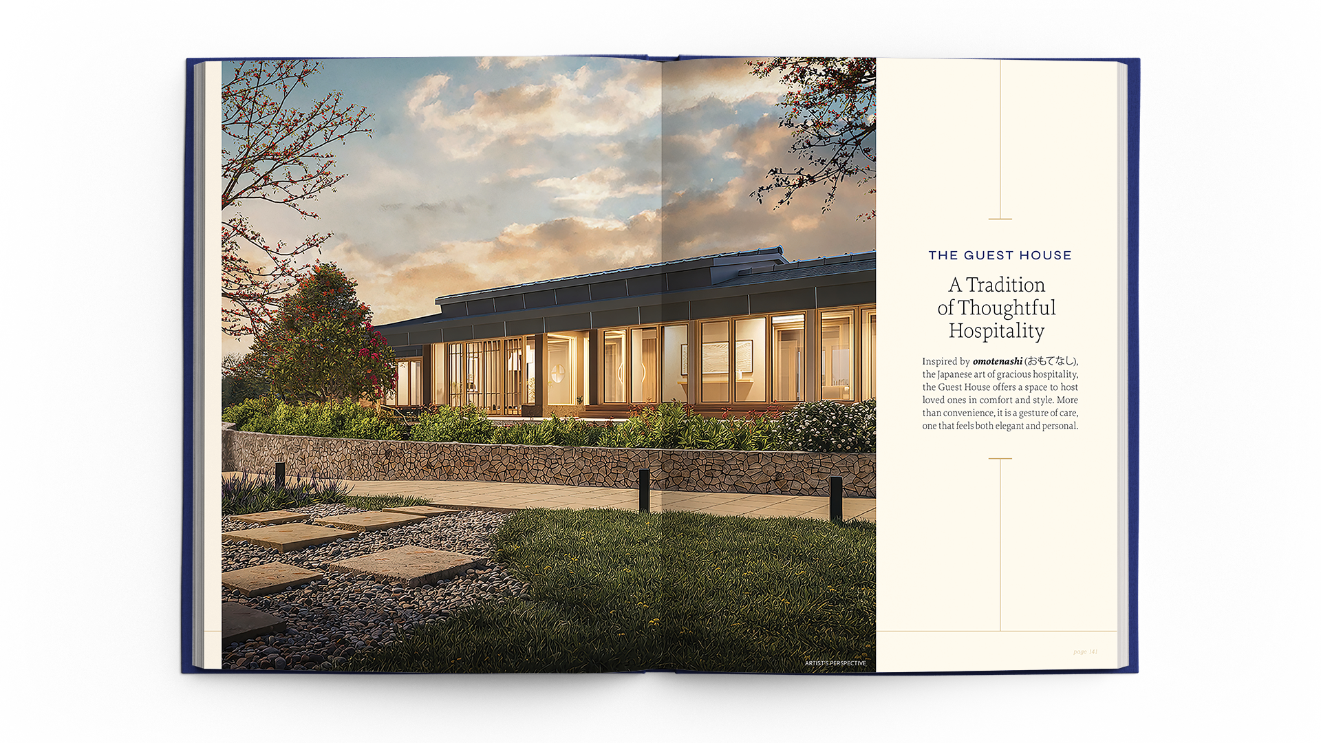
In September 2026, Aki Tower, the third of the development’s four residential towers, and The Guest House were ceremonially inaugurated before dignitaries, project partners and honored guests from the Philippines and Japan.
As this significant milestone approached, Federal Land entrusted Design For Tomorrow with the conception, editorial direction, design, production and publication of the development’s Legacy and Vision Book.
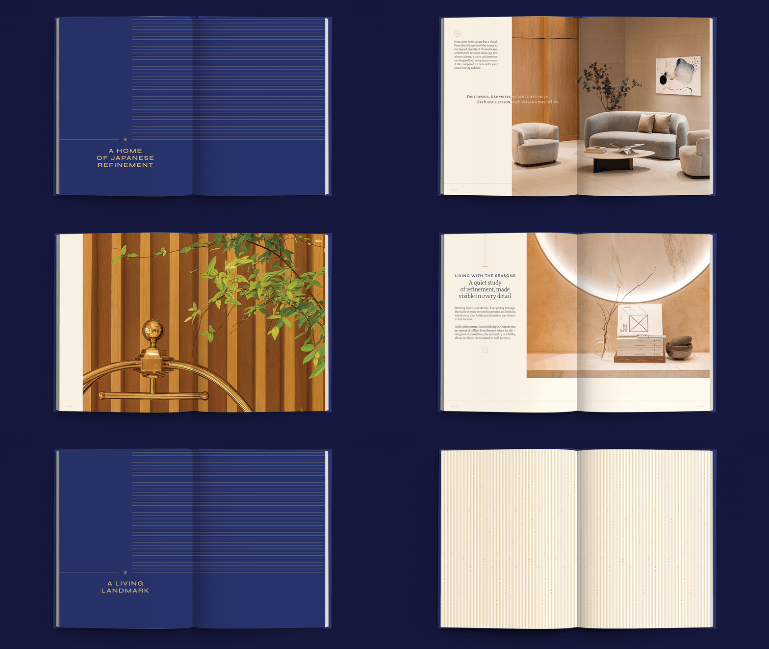
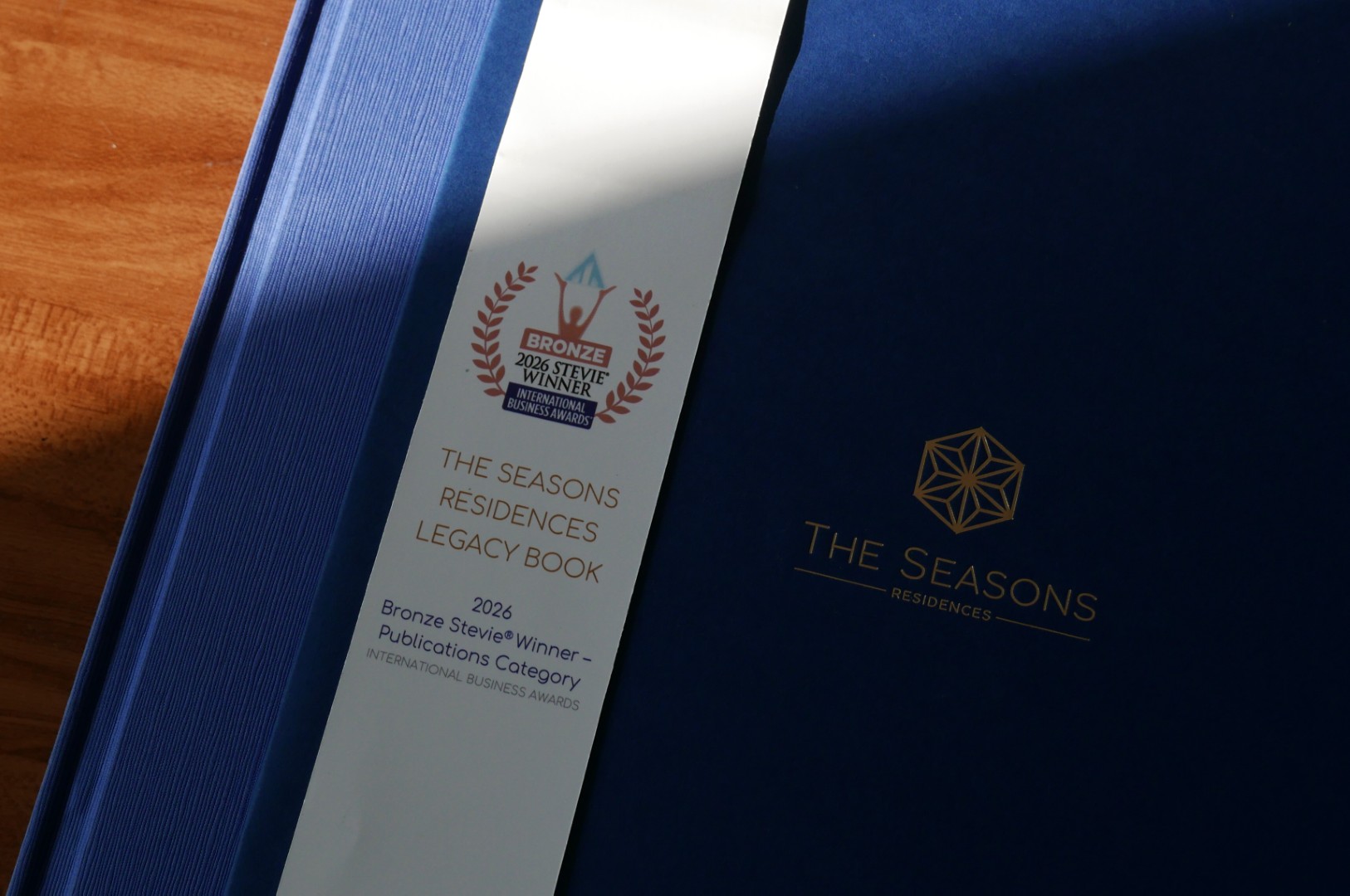
The resulting hardbound monograph, The Seasons Residences: Preserving a Legacy, gathers nearly 250 pages of architecture, culture, material, memory and future ambition. In 2026, it received a Bronze Stevie® Award at the 23rd Annual International Business Awards®.
IMPACT
_ Created the definitive Legacy and Vision Book for The Seasons Residences, a major Filipino-Japanese mixed-use property development in Bonifacio Global City
_ Articulated the combined vision of Federal Land, Nomura Real Estate Development and Isetan Mitsukoshi Holdings within one editorial system
_ Translated architecture, Japanese residential innovation, Filipino hospitality, retail, gastronomy and lifestyle into a unified property narrative
_ Produced a tactile, nearly 250-page hardbound monograph conceived for presentation, reading, display and long-term institutional use
_ Documented The Seasons Residences and MITSUKOSHI BGC through original editorial content, creative direction, art direction and image production
_ Established a cultural and editorial expression that distinguished the property beyond conventional real-estate marketing
_ Received a Bronze Stevie® Award at the 2026 International Business Awards®
Three institutions. One exacting proposition.
The Seasons Residences united three formidable institutions.
Federal Land, Inc. contributed over five decades of Philippine property development experience and an intimate understanding of the local market.
Nomura Real Estate Development Co., Ltd. brought Japanese residential expertise, technical discipline and a culture of design efficiency.
Isetan Mitsukoshi Holdings Ltd. extended the proposition into retail, gastronomy and hospitality through MITSUKOSHI BGC, the first MITSUKOSHI in the Philippines.
Their collaboration produced a four-tower residential development shaped by the Japanese seasons: Haru for spring, Natsu for summer, Aki for autumn and Fuyu for winter. Around the residences, architecture, retail, leisure, dining and hospitality form a carefully composed account of contemporary urban life.
The project required cultural fluency as Japanese precision had to converse with Filipino warmth and exuberance. While efficiency had to accommodate sociability, restraint also needed room for family, appetite, celebration and the entirely reasonable human desire to sing karaoke after dinner.
The book had to understand this conversation before it could describe it.
CREATIVE SERVICES DELIVERED
_ Editorial strategy and publication concept
_ Cultural and project research
_ Narrative development
_ Writing and editing
_ Original haiku + poetry pieces
_ Creative direction
_ Art direction
_ Photography direction and production oversight
_ Book design
_ Editorial identity
_ Typographic system
_ Paper and material specification
_ Foil stamping and debossing direction
_ Prepress supervision
_ Printing and binding coordination
_ Production quality control
_ Custom publishing
_ Full publication oversight
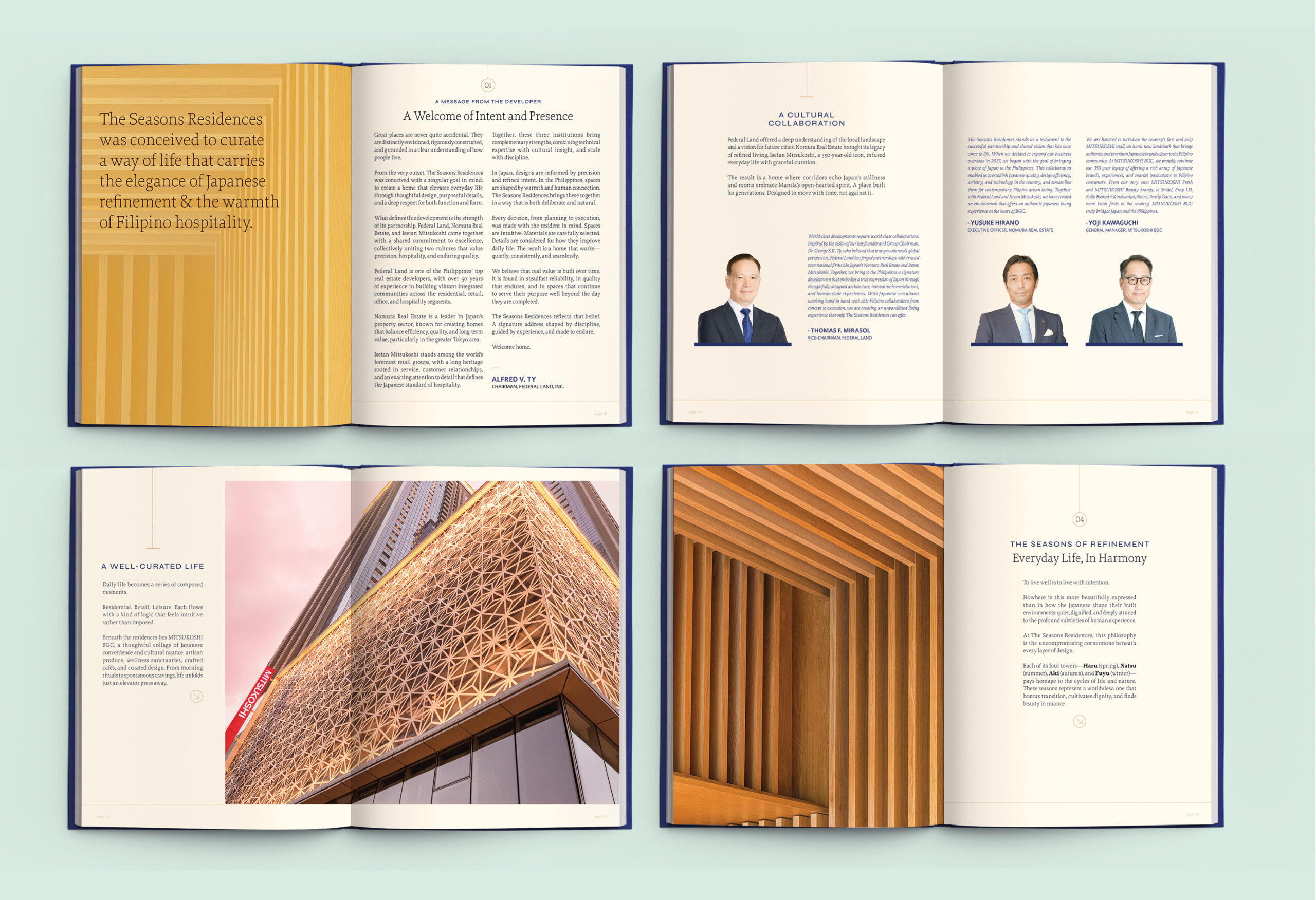
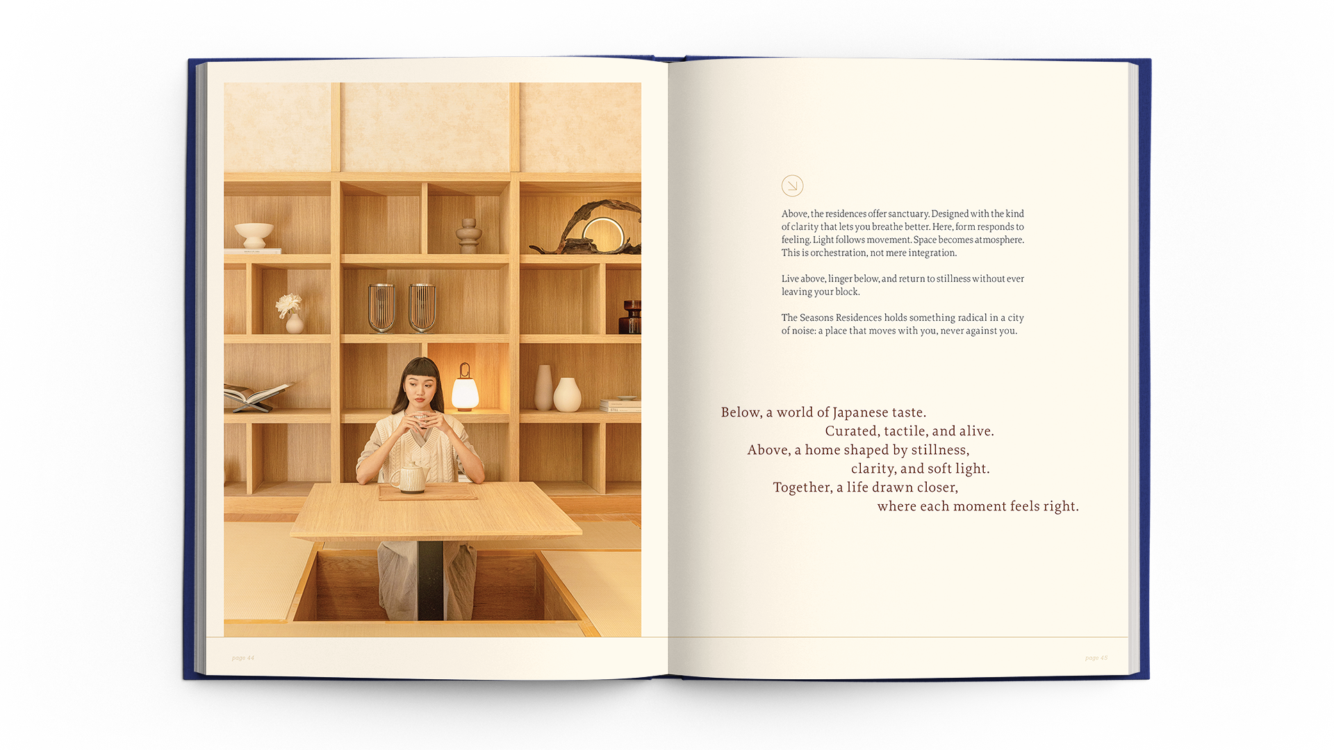
Reading the development closely
DFT was given a rare full access to the thinking, architecture, interiors, amenities, materials and lifestyle experiences that shaped The Seasons Residences and MITSUKOSHI BGC.
We took time to study the development from its founding partnership and architectural concept to its Japanese domestic technologies, hospitality practices and most especially, its daily rituals. The research extended across the residential towers, amenity environments, The Guest House, retail spaces, culinary experiences, landscape, art and material details.
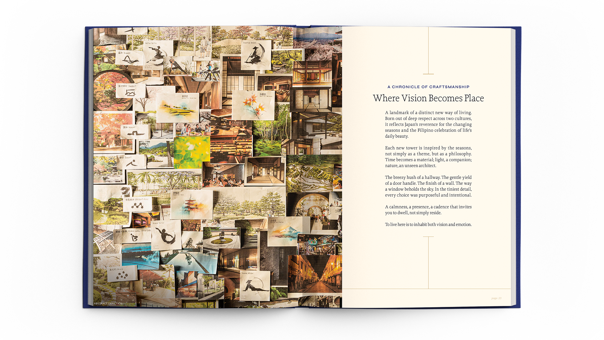
Culture often reveals itself through ordinary things: where shoes are left, how a guest is received, how a kitchen saves space, how a bath separates cleansing from soaking, and how long everyone remains at the table after dinner has instinctively ended.
Japanese influence lived in these practiced and precise gestures. It filters into the thinking of integrated storage, space-saving kitchens, separate bathing areas, and staying true to Japanese innovations, vibration-control technology. The traditional hemp-leaf pattern is interpreted across the architecture while amenity floors are organized around the temperaments of Japan’s four seasons.
The Filipino way of life brought its own energy to the concepts for the development: gatherings that grow beyond the original guest list, meals that acquire additional courses, and hospitality that regards “make yourself at home” as a binding agreement.
Our editorial task lay in finding a language in which both cultures remained recognizable but can somehow meet and have a conversation.

Giving four seasons a single narrative
DFT conceived the publication’s unifying editorial idea and created its narrative structure, pacing and verbal character.
A conventional property book might proceed obediently through towers, amenities, unit features and the swimming pool photographed at the hour when no actual swimmer would dare disturb it.
We followed another route. The monograph unfolds through the cultural and human ideas behind the development. Architecture, engineering, interiors, retail, dining, hospitality and domestic life appear as parts of one composed experience.
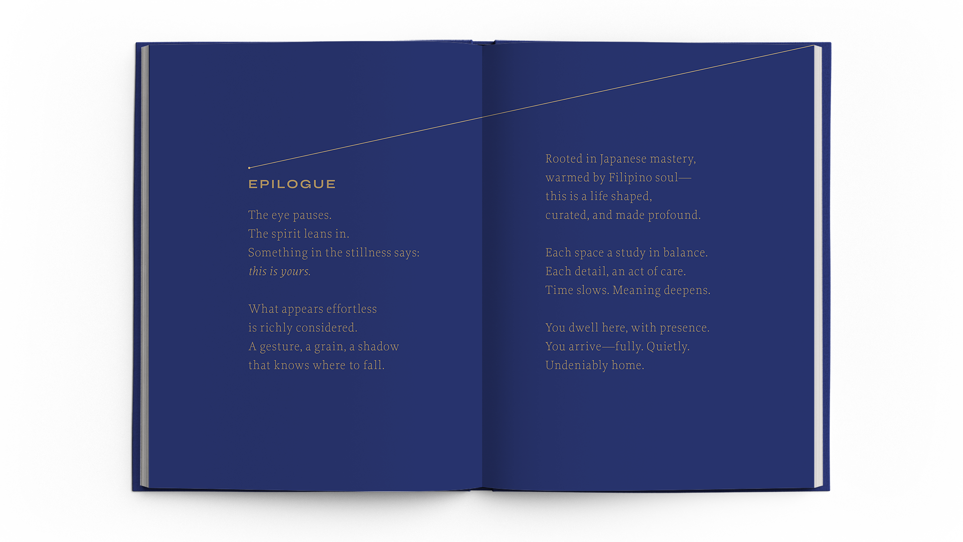
Original haiku and another introductory poetic piece establish moments of reflection and transition. The Longer texts provide historical, architectural and cultural context then shorter passages allow images, surfaces and small observations to carry the page.
The sequence moves between panoramic views and intimate details, because a development of this scale can be understood through its skyline and through the way a door handle meets the hand.
The editorial system gave the triumvirate brands a shared voice while preserving the specific contribution of each partner. Federal Land’s Philippine development intelligence, Nomura Real Estate’s residential expertise and Isetan Mitsukoshi’s retail culture meet throughout the publication without dissolving into corporate Esperanto.
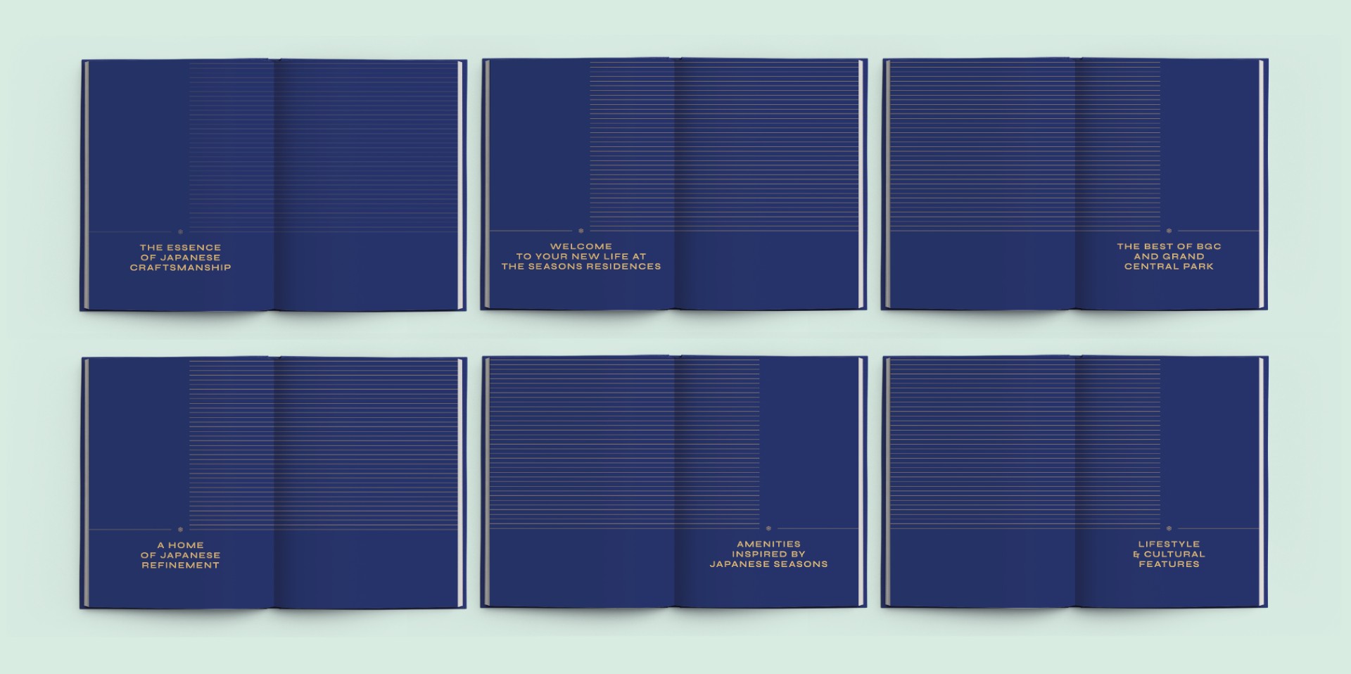
A book designed to be held
The physical character of the monograph received the same attention as its words and images.
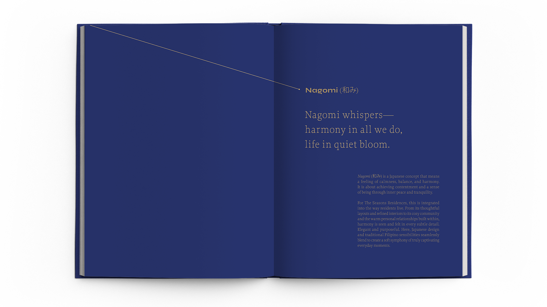
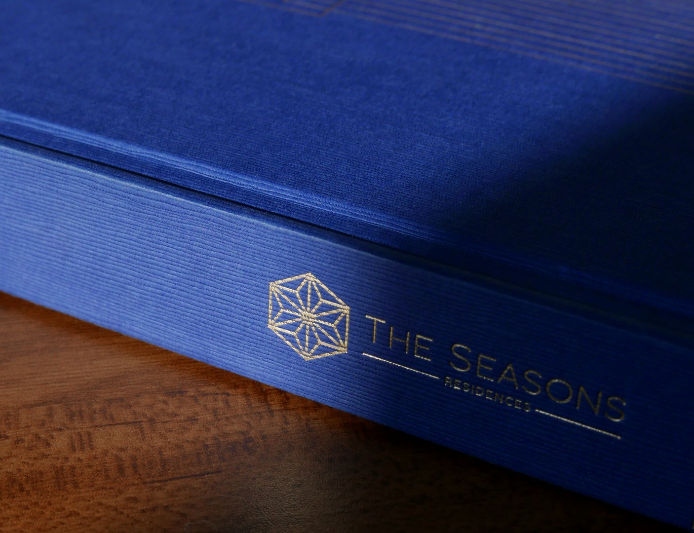
DFT selected papers, binding methods and finishing techniques that could express Japanese material sensitivity through touch. The cover uses Takeo Tsumugi Dark Blue, a Japanese-made specialty paper whose embossed surface recalls the character of traditional Hachijō Shirotsumugi woven silk. The paper carries Japanese textile history into the hand before the reader encounters a single sentence.
Its cloth-like grain gives the book warmth and physical presence while subtle foil stamping and debossing allow light, shadow and touch to carry part of the identity. Inside, changes in paper, scale, image rhythm and white space create a measured progression through the development.
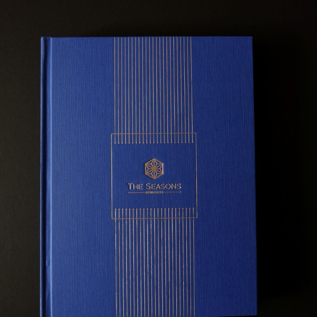
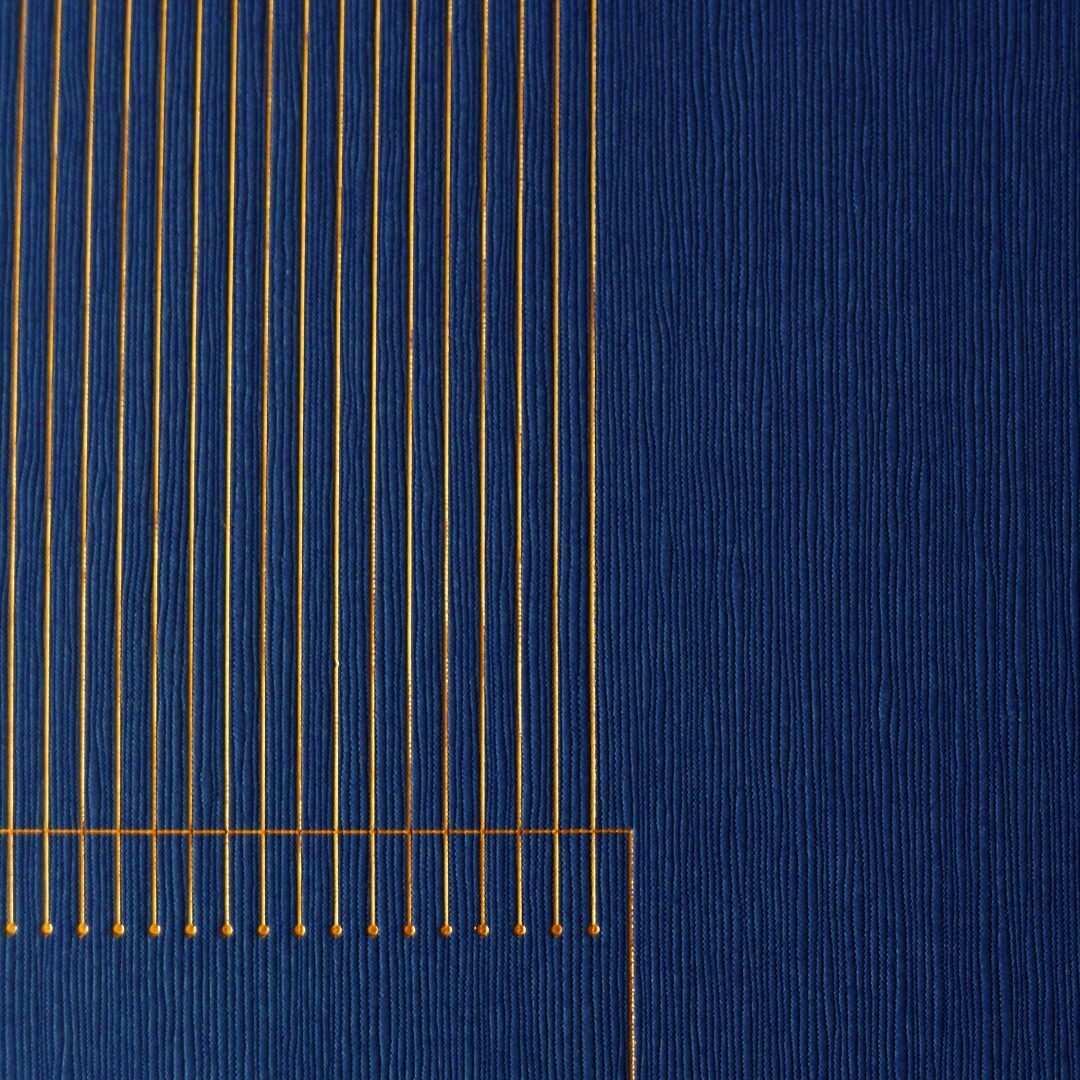
The effect feels restrained, supported by exacting production, performing the work of several adjectives and an expensive chandelier.
The nearly 250-page hardbound book also makes certain physical demands. For one, it requires a table, two hands and, ideally, a reader who has cancelled lunch. Its tactile physicality and weight possess the useful advantage of feeling consequential when held.
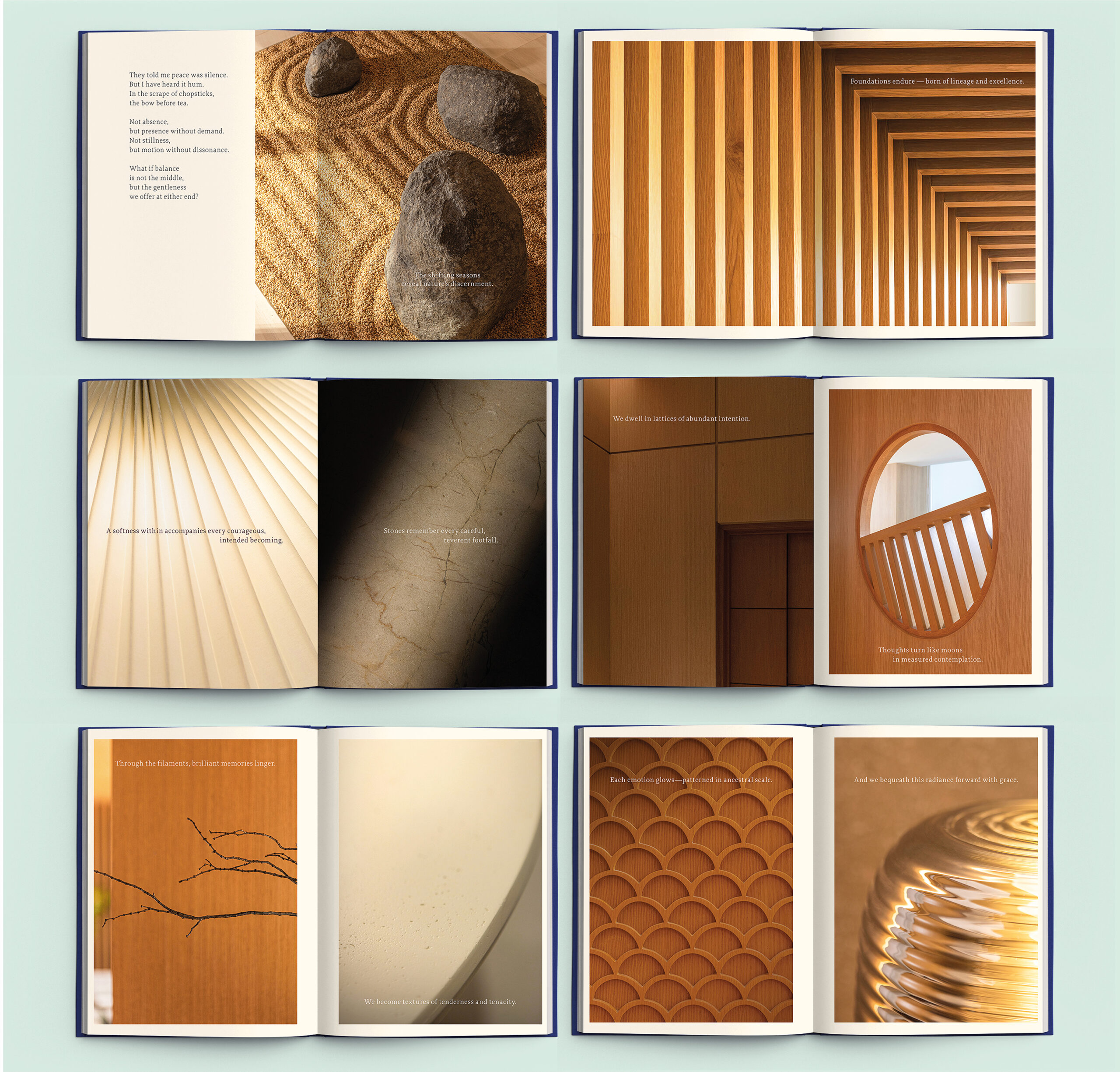
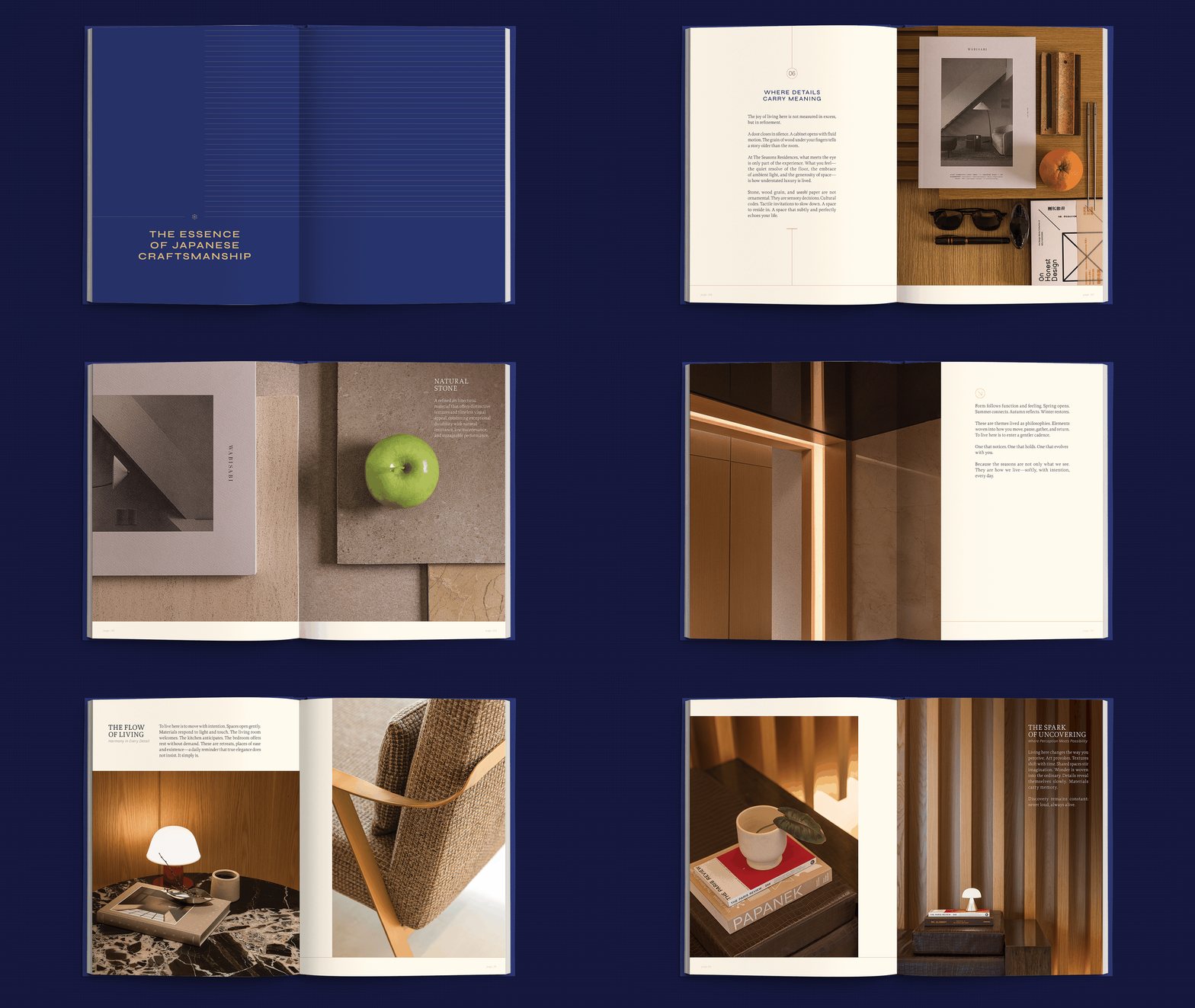
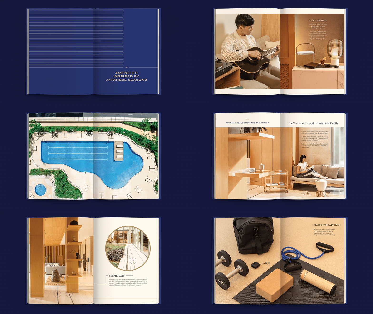
Building the image world
DFT also conceived and oversaw the book’s visual narrative, moving from establishing architecture to small material encounters.
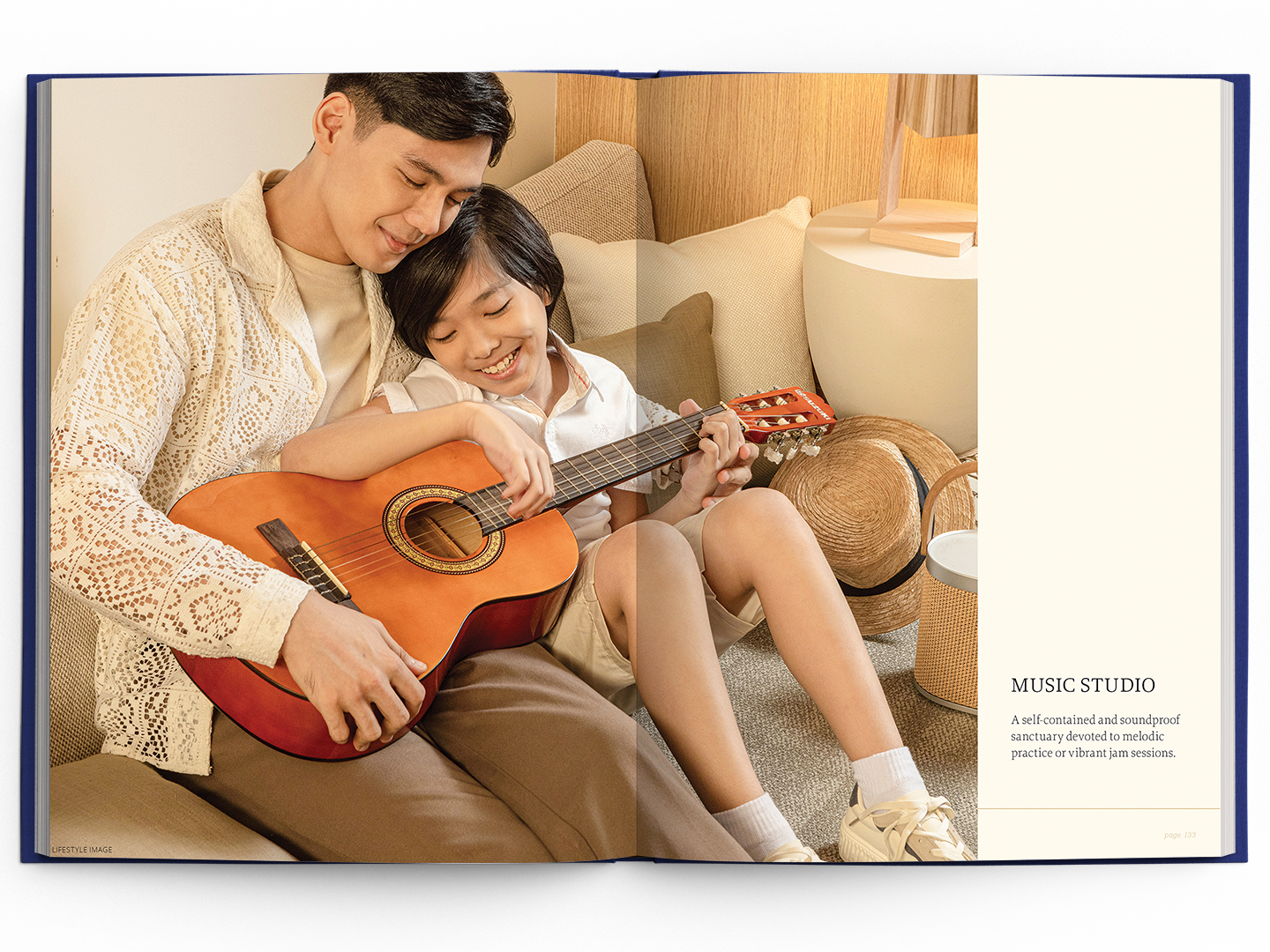
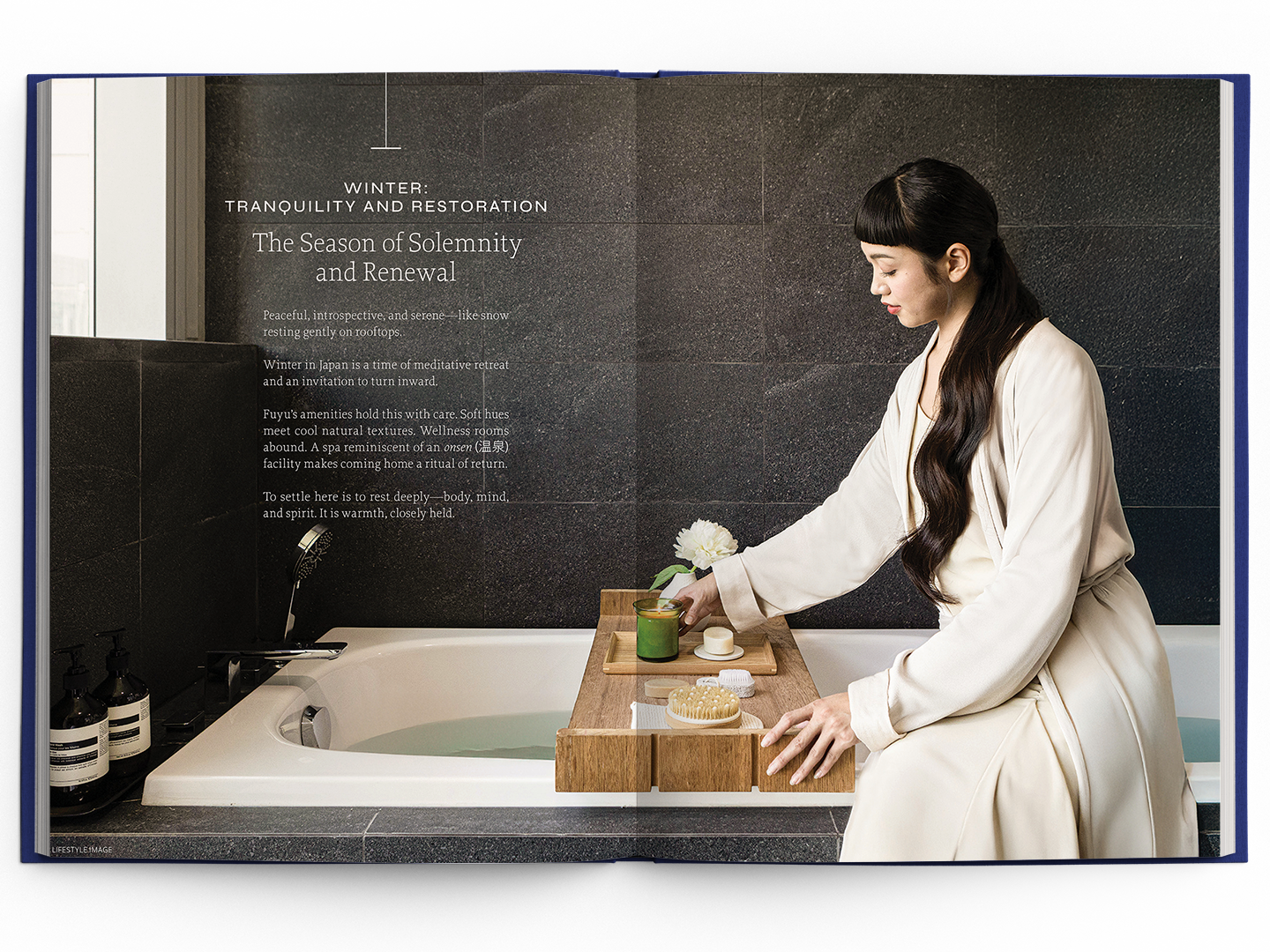
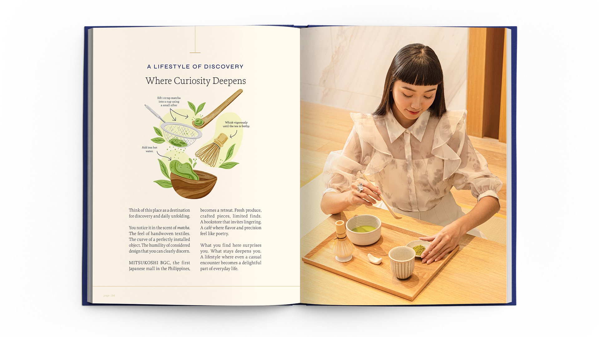
We developed the photographic direction, art-directed image production and guided the documentation of The Seasons Residences and MITSUKOSHI BGC. The imagery records architecture, interiors, retail environments, food, amenities, craftsmanship and material quality while retaining a sense of lived experience.
The book’s image sequence moves between the ceremonial and the familiar, recognizing that a home is ultimately experienced at the distance of a chair, a meal, a bath or a visiting relative who has decided to stay another week.
Every photograph was considered as part of the book’s editorial architecture. These exclusive images establish chapters, change tempo, hold pauses and reveal relationships that words might otherwise explain to exhaustion.
Full editorial and production stewardship
DFT directed the publication from its first organizing idea through the delivery of the finished books.
Our responsibilities covered editorial research, concept development, narrative structure, writing, editing, original haiku, creative direction, art direction, photography oversight, book design, typography, image sequencing, prepress and production supervision.
We worked closely with the printer to test materials and finishing techniques, refine color reproduction and maintain quality throughout printing and binding.
To the uninitiated, a book production has its own miniature theatre of anxiety. A foil can run too warm or a photograph can lose its shadow or be printed without depth. A binding can develop opinions and refuse to stay bound shortly before delivery. Press and production checks ensured that the finished object retained the detail, tactility and visual discipline established during design.
This complete oversight allowed the editorial premise to survive every practical decision.
A cultural cornerstone in print
The Legacy and Vision Book gives The Seasons Residences a lasting editorial expression of its origins, design intelligence and cultural propositions. It records how three major institutions assembled their knowledge around a shared ambition. It also places architecture within culture, technology within daily life, and retail within a larger experience of home and community. A full daily experience of Japan is one elevator ride from the home to Mitsukoshi BGC below, a passport not necessary.
For residents, partners, guests and future audiences, the book offers a way to understand the development as a whole while it preserves the thinking and relationships behind a landmark project for Federal Land. It also demonstrates how custom publishing can distinguish a development through editorial substance, cultural precision and physical craft for the wider property sector.
In 2026, The Seasons Residences: Preserving a Legacy received a Bronze Stevie® Award in the Best Publication category at the 23rd Annual International Business Awards®, a recognition placing the book among the year’s internationally awarded publications.
Four seasons shaped the development. DFT’s privilege was to give its legacy a life beyond the buildings.
JORELL BRINGAS
Brand Marketing Head, Federal Land
Philippines
“Ric and I go back to my early years at Alveo Land, and I’ve brought Design For Tomorrow with me into the two other organizations I’ve joined since. Three different points in my career, three corporate branding styles, three sets of stakeholders, and the same people in the brainstorming room each time. I don’t have many working relationships like that, and the reason is simple. When a project needs its vision and ideas articulated properly, I want them there. Ric asks the question that makes you look at a familiar project again, and the team has a habit of picking up the details everyone else walked past and turning them into a fresh and exciting proposition.
The Seasons Residences monograph is what that remarkable collaboration looks like on paper. With prestigious Filipino and Japanese partners behind the development, the book had to navigate and hold several perspectives at once, with some sensitivity and cultural diplomacy. DFT found the shared language and gave it a volume that feels as considered in the hand as it reads on the page.
In a business that moves at breakneck speed, I wanted this milestone to be something you could set down on a table, and they made it heavy enough and rich enough to matter. The storytelling, photography, layouting, typography, paper, and finishing all pull in the same direction and contribute to the illustrious expression and elegant presentation of this unique project. The Bronze Stevie® Award at the 2026 International Business Awards® was a nice acknowledgment of the work, talent, and passion that went into it.
Part of why it works is that we always want the same things. Stunning photography. Spreads with some art in them. Set elements that earn the word premium. Typography that knows when to whisper, and negative space that is there on purpose. Text that is smart and witty when it can be and evocatively poetic when it should be. I have never been let down by a campaign they’ve proposed, because their taste and mine sit in the same place, and when we work together, it all arrives on the same page at the same time.
What I value most is that the folks at DFT match my appetite for detail. I run large teams and I still sit in the copy and co-direct shoots, and DFT is one of the few agencies that doesn’t find that annoying. Haha! We can spend a considerable amount of time or several afternoons on a single line: flipping one word so two panels read as a conversation, protecting a double meaning from a well-meaning edit, catching the word that repeats on the same page, checking that two lines meant to rhyme and flow seamlessly actually do. We learned to let one headline sit still and let the lines beneath it do the moving. None of that shows up in a brief. It shows up in the wonderful work and the outstanding output (alliteration most definitely intended).
They also understand the rules I don’t write down. I’ll kill a clever line if it makes a composition seem shallow or empty, and they knew that before I had to say it twice. We aim for the kind of wit a reader finds on their own, a smile rather than a laugh. If it needs pointing out, it isn’t finished. Phrases mean what they mean. Sleek, simple type set purposely beside a stunning image with both expressive models and gorgeous set pieces. Every project becomes a masterpiece. We finish what we precisely set out to do, boldly and grandly until its glorious conclusion.
They are reliable, their visuals never feel tired, and Ric and the team are some of the best sparring partners I know. I always leave our conversations with a clearer idea and more energy than I brought in. Their unparalleled work ethic and the seamless collaboration make any project stand out.”
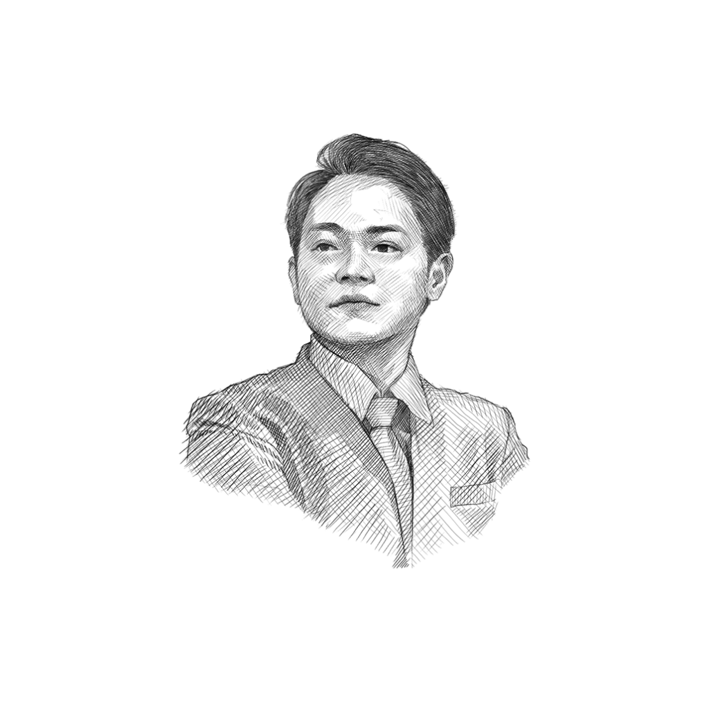
Illustration by José Prieto-Sacro
Client Federal Land, Inc.
Development Partners Nomura Real Estate Development Co., Ltd., Isetan Mitsukoshi Holdings Ltd.
Publisher The Seasons Residences & MITSUKOSHI BGC
Industry Property Development, Real Estate, Mixed-Use Development, Luxury Residential, Retail
Discipline Editorial Strategy, Custom Publishing, Editorial Design, Publication Design, Creative Direction, Art Direction, Writing & Editing, Photography Direction, Typographic Design, Material Specification, Production Supervision
Location Grand Central Park, Bonifacio Global City, Taguig, Philippines
Associate Publisher & Editor in Chief Jorell Bringas – Brand Marketing Head
Book Project Manager Aziz Basilio – Brand Marketing Manager
Copy & Content Reviewer Arianne Escaro – Corporate Communications Officer
In-House Design, Content & Photography Contributors Mencho Dagohoy – Senior Graphic Designer, Mark Hontucan – Senior Graphic Designer
Strategist + Copywriter / Editorial, Design, Creative, and Art Director Ric Gindap
Art Directors Rashina Tuazon, Patricia Ibañez
Copy Editor Pris Santos
Strategist, Writer & Copy Editor Ma. Julie Therese Amos
Copy Editor Maria Noelle Maulit
Illustrator Mikaela Torres
Project Manager Cessmarie Villones
Book + Campaign Photographer Jar Concengco
Model Units Photographer Albert Labrador
Production Design PJ Almera, Denise Ayado, Jegs Santos, Aubrey Madridejos – Wandr Haus
Project Renderings Envision Studio – Visionarch, Inc.
Stylists Mike De Guzman, Geo Palmiano – MGP Style
Hair & Makeup Ryan David Casibang, Mel Christian Galang, Mark Lester Tayor
Models Kaoru Kimura, Ben Siao, Sasuke Nakano – Ariba PH