The Story
The Asia-Pacific Space Designers Association, or APSDA, occupies a rare position in the regional design world.
APSDA gathers national-level design associations from Asia and Oceania, nurturing a deeper understanding of Asia-Pacific cultures while encouraging the exchange of interior design knowledge among its members. Its purpose is both professional and civic: to advance the field of interior and spatial design in ways that benefit regional societies at large.
Its membership spans a wide regional field, with full member associations from Australia, Hong Kong, India, Indonesia, Japan, Macao, Malaysia, Nepal, the Philippines, Singapore, South Korea, Taiwan, Thailand, and other Asia-Pacific territories.
This gives APSDA a distinctive remit. It serves as a professional body, regional convener, standards platform, awards organizer, knowledge exchange network, and cultural bridge for interior and spatial design in Asia-Pacific.
Through programs such as the APSDA Awards, the association recognizes outstanding interior designers, projects, professionalism, and contributions to the field. Its accreditation and competency initiatives also support the professional advancement of interior design practice in the region.
This was the institutional context behind the work.
APSDA needed a visual language with enough range to serve design leaders, professional associations, educators, jurors, practitioners, sponsors, partners, students, and the wider Asia-Pacific design community.
Its mark needed clarity for governance, flexibility for events, energy for public platforms, and refinement for an audience trained to notice every detail.
A familiar logo needed to mature into a fuller institutional expression.
IMPACT
Design For Tomorrow developed a refreshed brand system for APSDA, the Asia-Pacific Space Designers Association, a regional organization representing national-level interior and spatial design associations across Asia and Oceania.
The project included brand diagnosis, vision articulation, stakeholder alignment, respectful logo evolution, bespoke wordmark design, visual identity development, APSDA Awards identity, APSDA Approved Seal refinement, and rollout support across Kuala Lumpur, Hanoi, Manila, Singapore, and Taipei.
CLIENT
Asia-Pacific Space Designers Association
SECTOR
- Interior Design
- Spatial Design
- Design Associations
- Professional Organizations
- Institutional Branding
- Regional Design Leadership
- Asia-Pacific Design
- Creative Industries
- Built Environment
- Cultural and Professional Advocacy
CREATIVE SERVICES DELIVERED
- Brand Strategy
- Brand Identity Design
- Logo Evolution
- Institutional Branding
- Visual Identity System
- Bespoke Wordmark Design
- Typography Customization
- Brand Architecture
- Event Identity
- Awards Identity
- Digital Templates
- Website Visual Direction
- Marketing Collaterals
- Presentation Templates
- Partner Seal Design
- Brand Rollout Support
- Regional Brand Alignment
- Stakeholder Alignment
- Vision Articulation

The Challenge
Designing for designers requires bravery, precision, and a deep respect for the craft.
For APSDA, the audience was exacting. The work would be reviewed by presidents, board members, jurors, educators, practitioners, advocates, and institutional leaders from the Asia-Pacific design community. These are people with trained eyes and earned opinions. They understand proportion, spacing, balance, history, symbolism, material culture, and the thousand tiny failures that can make a mark feel unfinished.
The deeper task was to help designers recognize themselves in a shared future.
APSDA gathers leaders and member organizations from multiple countries and territories, each with its own design culture, professional context, institutional rhythm, and national point of view. The brand needed to carry that complexity with confidence.
A generic pan-Asian gesture would have flattened the work. Decorative regional motifs would have reduced a serious institution into an attractive postcard. A safe corporate vocabulary offered another trap: too polished, too neutral, too drained of the warmth, intelligence, and cultural life APSDA needed to project.
The answer required discipline: regional confidence, institutional credibility, contemporary energy, and cultural nuance.
It also required trust from people who understand design from the inside.
That called for cultural fluency, typographic discipline, diplomatic patience, and a sturdy tolerance for feedback from people whose feedback is usually correct.
The Approach
The APSDA 2023–2025 board commissioned Design For Tomorrow to develop the new brand system. Led by President Keat Ong of Singapore, with Deputy President Emil Chao of Taiwan and Vice President IDr. Ivy Almario of the Philippines, the board recognized the need for evolution and gave the project its necessary institutional courage.
Their leadership helped carry the work through consultation, scrutiny, refinement, and adoption. In a federation of design leaders, where every detail is visible and every opinion has earned its confidence, that support mattered.
The wider 2023–2025 board brought together representatives from Australia, Hong Kong, India, Indonesia, Japan, South Korea, Malaysia, Macao, Nepal, New Zealand, Thailand, Vietnam, and other Asia-Pacific design communities. The brand needed to earn alignment across this breadth by giving APSDA a shared visual language strong enough to hold difference.
Ric Gindap led a detailed series of discovery, diagnosis, alignment, review, presentation, and rollout sessions with the board, leadership, stakeholders, member associations, and allied or adjacent organizations.
The process moved through several regional moments.

In Kuala Lumpur, Ric flew in for the preliminary brand diagnosis and vision articulation session. This early stage clarified APSDA’s institutional opportunities, visual challenges, and larger role in the region.
In Hanoi, during the group’s assembly, the concepts were presented, discussed, and approved.
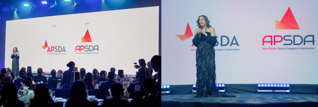
In Manila, the refreshed mark was revealed during the PIID Gala x APSDA Awards Gala Dinner 2025.
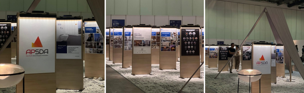
In Singapore, the system made its trade show debut at FIND Design Fair Asia, bringing the refreshed brand into a major international design industry setting.

In Taipei, the brand was further institutionalized for internal and external rollout.
Across these stages, DFT’s responsibility was precise: to help APSDA articulate a shared visual language while preserving the richness of its regional membership.
The process required both approval and inter-alliance alignment.
For an organization composed of accomplished and opinionated design leaders, consensus rarely arrives because everyone has been served tea. Clarity had to do the real work. The strategy explained what deserved preservation, what required refinement, and how evolution could give APSDA greater coherence without sacrificing the recognition it had already earned.

The Strategy: Respectful Evolution
DFT approached the APSDA rebrand as an act of respectful evolution.
The previous APSDA logo carried recognition, institutional memory, and visual equity. It was familiar to members, partners, and regional stakeholders. DFT’s position was clear: the mark deserved study before change, then refinement with greater intelligence.
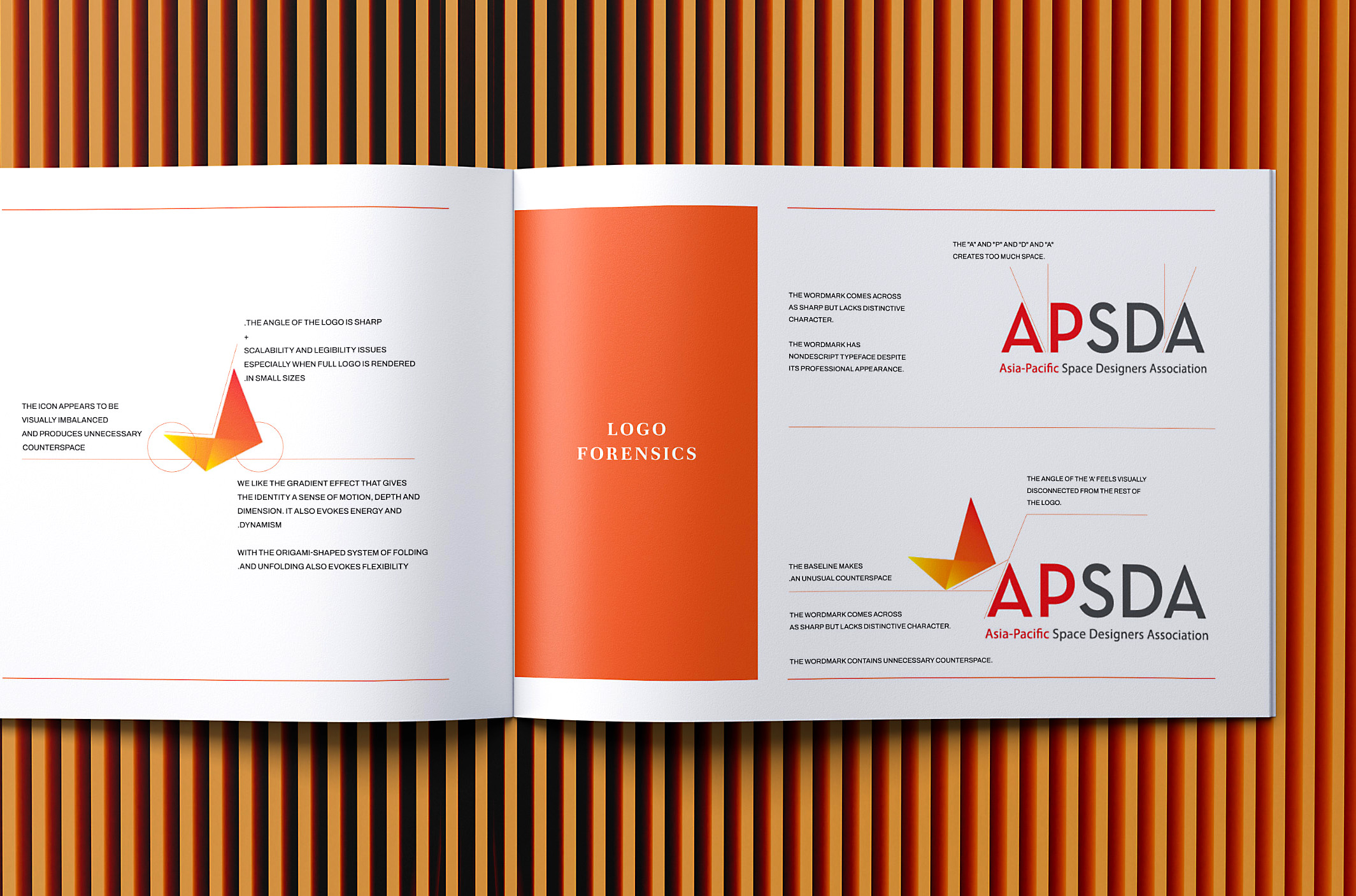
The presentation began with logo forensics. DFT examined the existing mark to identify what carried value and what created friction. The analysis found that the old logo’s sharp angle created scalability and legibility issues at smaller sizes. The icon appeared visually imbalanced and produced unnecessary counterspace. The angle of the “A” felt disconnected from the rest of the logo. The existing wordmark, while professional, lacked distinctive character and had spacing issues between the letters.
This diagnosis gave the evolution its logic.
DFT preserved the recognizable equity of APSDA’s visual language while refining the system for clarity, balance, scalability, and range.
The past became more capable.
The Mark
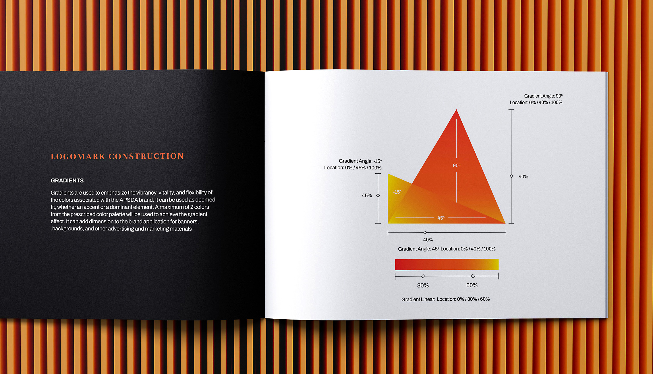
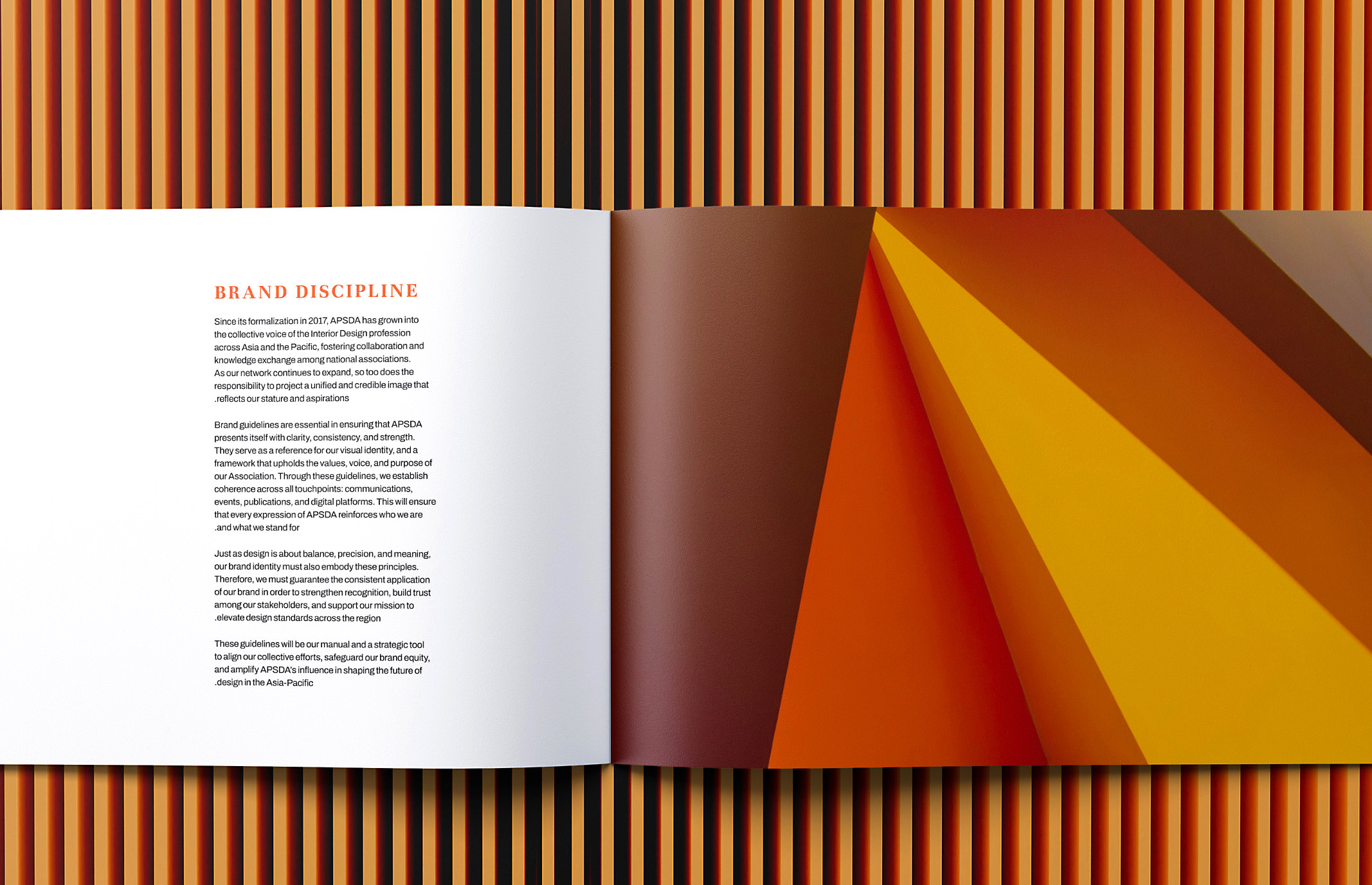
The evolved APSDA symbol retained the strongest memory structures of the previous logo: the triangular form, the folded quality, the gradient energy, and the sense of upward direction.
DFT refined these elements into a more coherent mark built around foundation, elevation, and direction.
Foundation expressed institutional grounding and credibility.
Elevation spoke to APSDA’s role in raising standards, advancing the profession, and strengthening regional exchange for interior and spatial design.


Direction gave the symbol its sense of movement: adaptive, progressive, and oriented toward growth in Asia-Pacific.
The folded triangular form became a symbol of unfolding possibilities. DFT’s presentation connected this to transformation, mindfulness, patience, focus, and growth.
That idea mattered because APSDA’s work is active. The association is concerned with knowledge exchange, accreditation, recognition, professional mobility, education, advocacy, and the advancement of design as a discipline.
The mark needed to suggest progress with composure.
The Wordmark
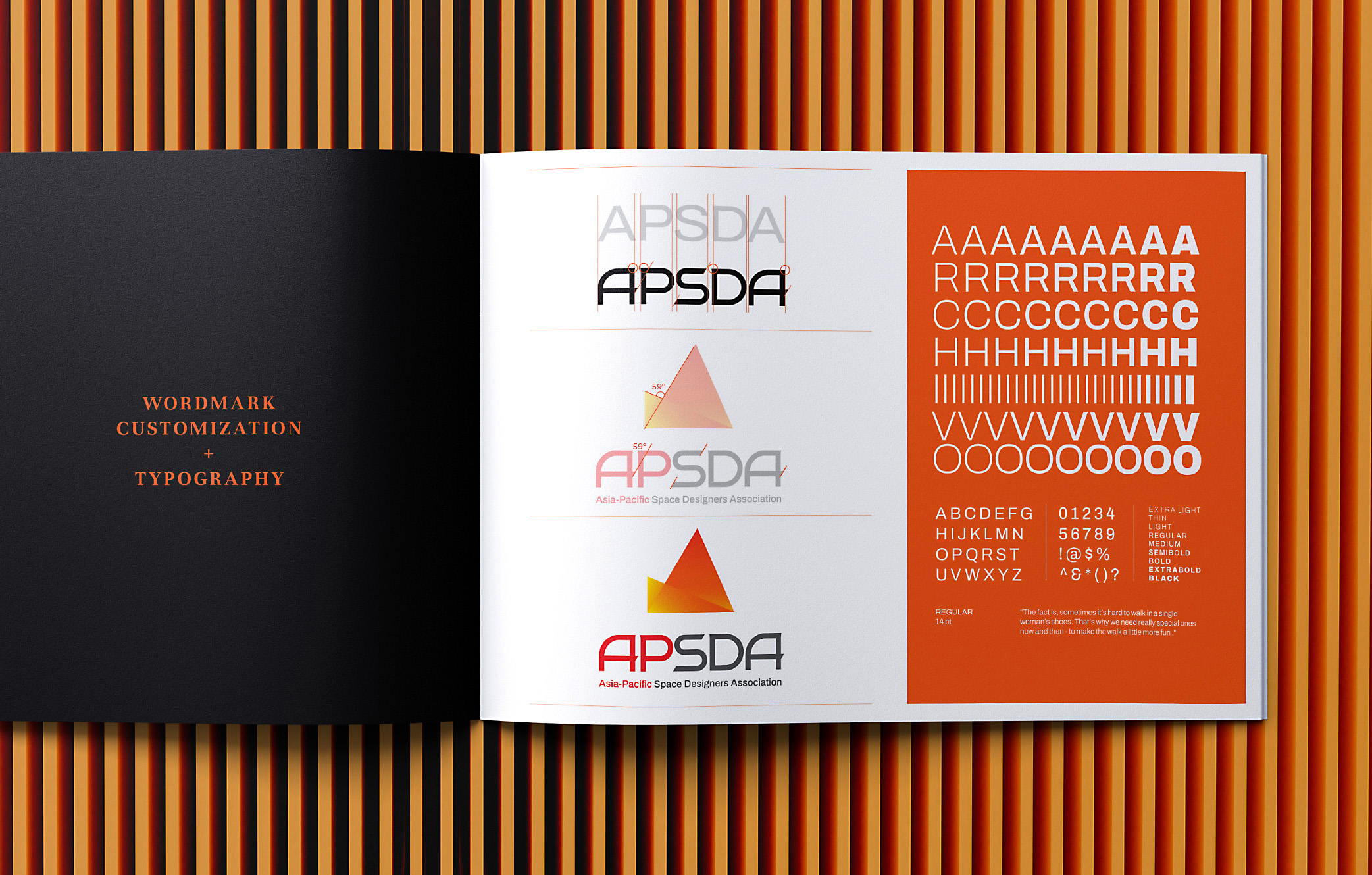
For an organization of designers, typography carries institutional credibility at the smallest scale. A wordmark can announce authority quietly, or betray uncertainty just as quietly.
DFT rebuilt the APSDA wordmark with careful attention to spacing, proportion, angular logic, and visual rhythm.
Every letter of the APSDA nameplate was crafted to move beyond a typed-out acronym. The result is a bespoke wordmark with greater distinction, coherence, and authority.
This level of typographic care was institutional respect in visual form.
APSDA’s audience understands design craft. The new nameplate had to withstand scrutiny from the very community it represented.
A design association carrying Asia-Pacific leadership needs a wordmark with spine.

The Palette
The refreshed palette treated color as structure, movement, and meaning.
The system retained the chromatic energy of the previous logo and developed it into a more disciplined palette and gradient language. DFT’s presentation described the gradient through direction, union, and spectrum of expression: progression, adaptability, confluence, harmony, creativity, potential, and hope.
This is where the visual language meets the regional story.


Asia-Pacific holds many climates, histories, materials, urban conditions, craft traditions, design schools, professional frameworks, and aesthetic sensibilities. A single flat corporate color would have narrowed the story. Decorative ethnic shorthand would have been too easy and, worse, too pleased with itself.
The gradient allowed APSDA to express plurality with discipline.
It became a visual metaphor for a multicultural design federation: many cultures, many talents, many forms of intelligence, and many design traditions progressing within one shared institutional direction.

The Pattern and Visual Language
DFT extended the system into a geometric pattern derived from the APSDA logo. Formed by connecting four APSDA marks into one composition, the pattern represents harmony and connection among organizations in Asia-Pacific and Oceania.
The resulting visual language gives APSDA a flexible graphic framework for digital, print, environmental, and event applications. It creates order, movement, and connection without smothering the brand in its own cleverness.
The layout system also draws from the angled shapes of the logo, allowing the brand to behave consistently across formats.
A full institution needs a full visual system.

The System
The refreshed APSDA brand expanded into a working institutional architecture.
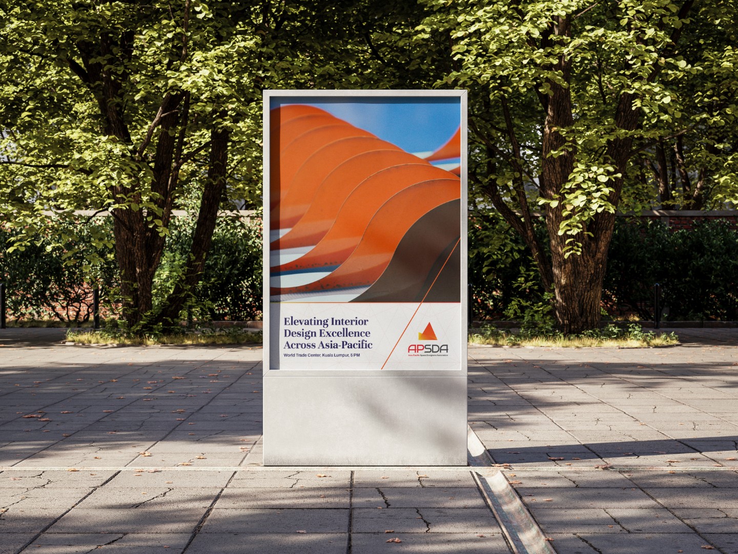
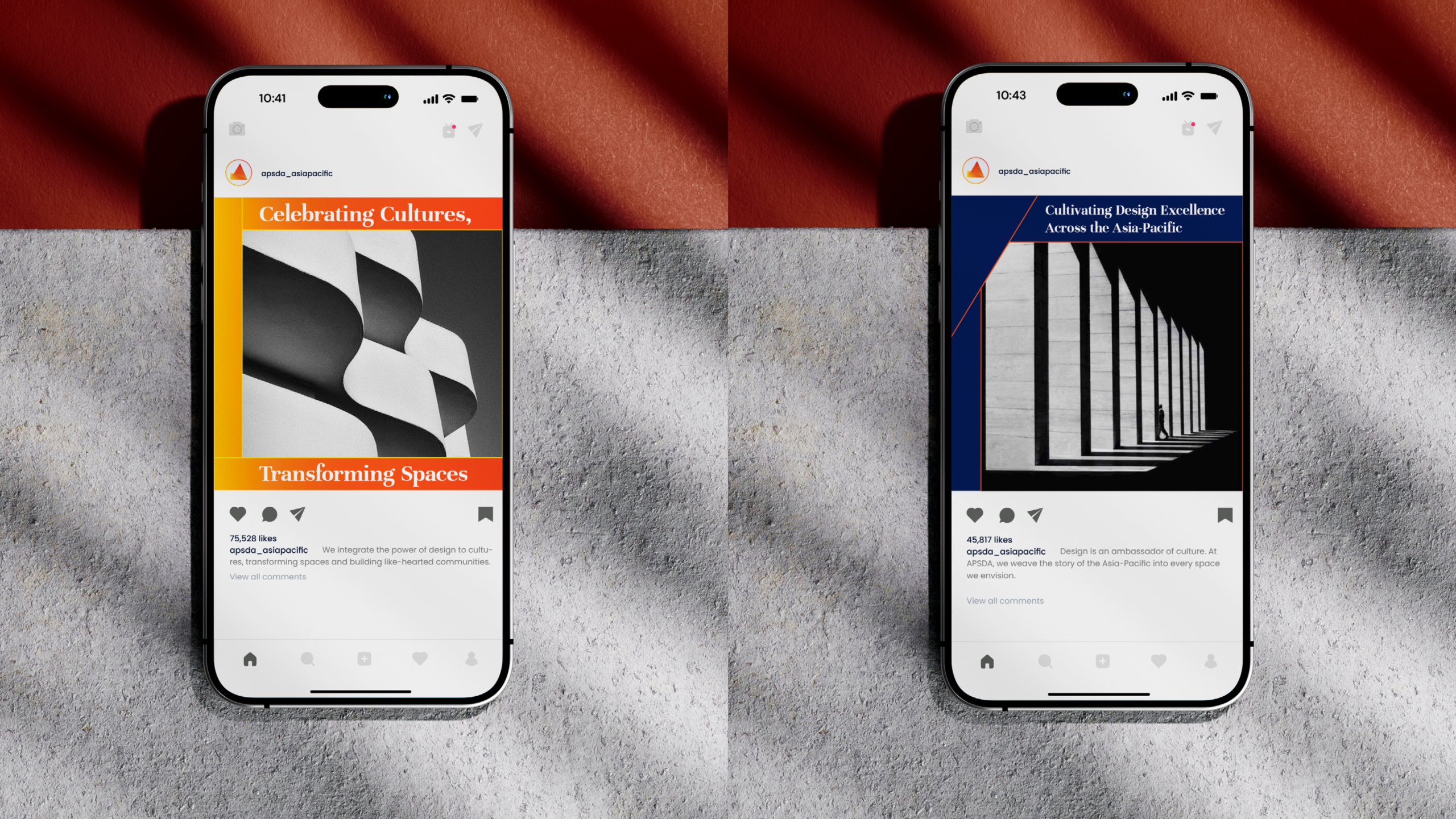
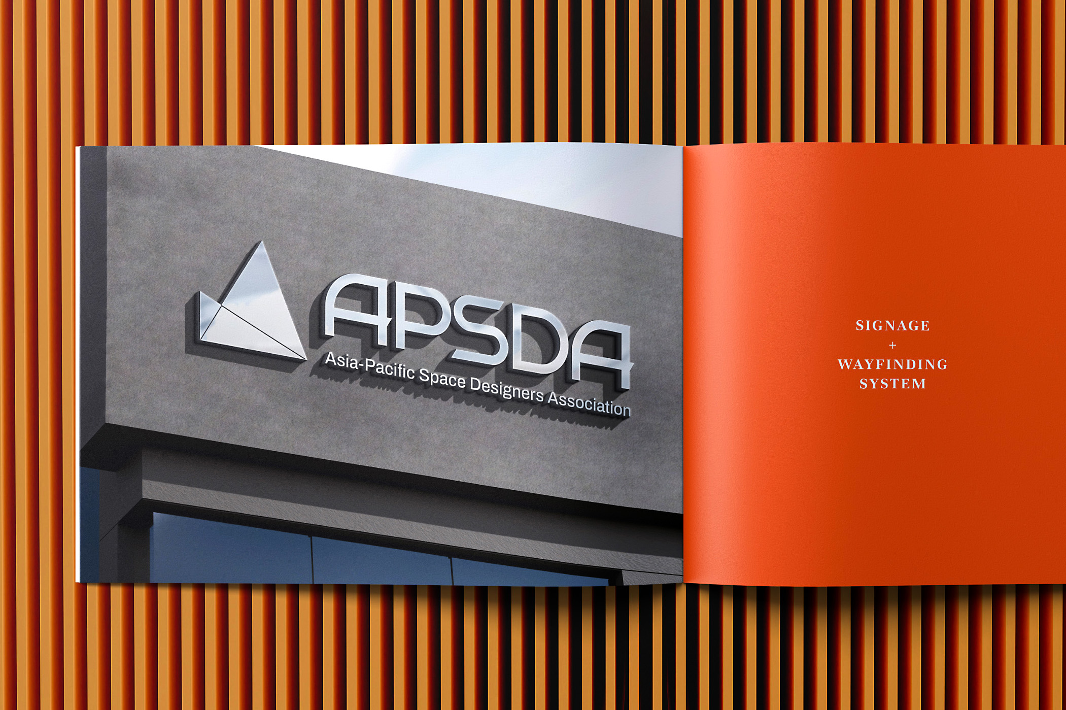
DFT developed logo lockups, color palette, typography, pattern, layout principles, stationery, business cards, signage, posters, billboards, lamp post banners, website visuals, conference screens, social media templates, conference badges, reports, book covers, promotional merchandise, and branded objects.

The system also included the APSDA Awards identity, extending the main brand into one of the association’s most visible regional platforms.

Another important component was the APSDA Approved Seal, refined as an institutional mark of recognition for selected partners. The presentation shows the seal evolving from the previous version into a clearer and more formal design carrying phrases such as “A Seal of Pride” and “Designated Partner.”
This expanded the brand from visual expression into institutional utility. APSDA gained a mechanism for endorsement, recognition, and partner credibility.

The new APSDA brand needed to serve many roles:
- A federation of design associations.
- A professional development platform.
- An awards body.
- An accreditation ecosystem.
- A partner network.
- A regional advocate.
- A design community.
- A public voice for interior and spatial design in Asia-Pacific.
The system gave APSDA a more coherent way to appear wherever its remit comes into view.


The Rollout
The rollout unfolded through several regional moments, each adding another layer of visibility and adoption.
The work began with discovery and alignment among APSDA leaders and stakeholders, with key strategic work in Kuala Lumpur.
It progressed in Hanoi, where the concepts were presented and approved during the group’s assembly.
It was publicly revealed in Manila during the PIID Gala x APSDA Awards Gala Dinner 2025. APSDA later announced the new logo publicly and credited Design For Tomorrow for crafting the refreshed design, describing it as a reflection of APSDA’s growth, innovation, and commitment to shaping the future of interior design in the Asia-Pacific region.
It entered a broader international industry context in Singapore through FIND Design Fair Asia.
It was then institutionalized in Taipei for internal and external rollout.
Kuala Lumpur. Hanoi. Manila. Singapore. Taipei.
The geography matters. Regional branding became lived practice here, rather than an adjective placed hopefully in a proposal.

The Result
Design For Tomorrow helped APSDA transform a familiar institutional mark into a sharper, more scalable, and more expressive brand system.
The refreshed brand preserved APSDA’s recognizability while resolving issues of legibility, spacing, balance, and visual cohesion. It gave the organization a bespoke wordmark, a clearer symbol, a more vibrant palette, a flexible pattern language, and a complete suite of applications for institutional communication, digital presence, events, awards, partnerships, and public visibility.
More importantly, it gave APSDA a stronger visual expression for its evolving role in the Asia-Pacific design world.
For DFT, the project demonstrated the studio’s ability to work where design, diplomacy, culture, and institutional authority meet.
The assignment required strategy, craft, diplomacy, and cultural intelligence. It asked DFT to work across borders, listen across differences, and translate many voices into one coherent system.
The logo became the visible result of a deeper act of alignment.
Why It Matters
APSDA’s brand evolution speaks to a larger truth about institutional branding.
As organizations grow in influence, their identities must carry memory, authority, ambition, and trust. They must help people understand what the institution has become and where it intends to go.
For APSDA, that meant creating a visual language that could represent the advancement of interior and spatial design across Asia-Pacific. It meant designing a system able to hold national associations, professional standards, regional awards, accreditation initiatives, cultural exchange, partner recognition, and public-facing advocacy.
For Design For Tomorrow, the project called on the studio’s core strengths: brand strategy, identity design, vision articulation, cultural fluency, institutional branding, stakeholder alignment, bespoke typography, and visual systems that can move across markets, sectors, and borders.
A regional institution with many voices needed one sharper signal.
DFT helped draw it.
FAQ: APSDA Brand Identity Evolution, Institutional Branding, and Asia-Pacific Design Leadership
A quick guide to the strategy, logo evolution, visual identity system, and regional rollout behind APSDA, and how the project transformed a familiar institutional mark into a sharper brand system for interior design leadership, professional exchange, cultural alignment, and design advocacy across Asia-Pacific.
What is APSDA?
APSDA, the Asia-Pacific Space Designers Association, is a regional organization gathering national-level design associations from Asia and Oceania. It promotes cultural understanding, professional exchange, and the advancement of interior and spatial design across the Asia-Pacific region.
Who designed the new APSDA logo and brand identity?
Design For Tomorrow crafted the refreshed APSDA logo and brand identity. APSDA publicly announced the new logo after its launch during the PIID Gala x APSDA Awards Gala Dinner 2025 and credited Design For Tomorrow for the work.
Why was the APSDA logo evolved rather than completely replaced?
The previous APSDA logo carried recognition and institutional memory. DFT recommended a respectful evolution that preserved valuable equity while resolving technical and visual issues such as legibility, balance, counterspace, spacing, and distinctiveness.
What did Design For Tomorrow create for APSDA?
Design For Tomorrow created the refreshed APSDA logo, bespoke wordmark, color palette, typography, logo lockups, pattern system, layout principles, marketing collaterals, digital and website templates, presentation templates, event applications, APSDA Awards sub-identity, and APSDA Approved Seal.
Why is the APSDA rebrand significant?
The rebrand is significant because APSDA represents a wide network of design associations across Asia-Pacific. Its brand needed to capture multicultural breadth, professional authority, regional exchange, design excellence, and the association’s growing remit in advancing interior and spatial design.
What does this project show about Design For Tomorrow?
The APSDA brand evolution shows Design For Tomorrow’s ability to work on complex institutional branding projects across Asia-Pacific. It demonstrates DFT’s expertise in brand strategy, cultural fluency, stakeholder alignment, bespoke typography, visual identity systems, and regional brand rollout for design-literate audiences.

PROF. KEAT ONG, FSID, APID
President(2023-2025), APSDA
Singapore, International
“I had the privilege of working closely with Ric during the brand evolution of APSDA, and the collaboration was both strategic and deeply meaningful.
Ric possesses a rare ability to listen beyond the brief. He understood that APSDA’s rebrand was not merely a visual refresh, but a repositioning of identity — one that needed to honour its legacy while projecting clarity, relevance, and regional leadership into the future. His sensitivity to institutional history, combined with bold forward-thinking, allowed the transformation to feel authentic rather than cosmetic.
Throughout the process, Ric was thoughtful, rigorous, and highly collaborative. He navigated diverse stakeholder perspectives with maturity and composure, while consistently anchoring the work to a larger vision. What impressed me most was his capacity to translate complex organisational aspirations into a coherent brand language that felt both contemporary and enduring.
The end result has proven significant. The rebrand strengthened APSDA’s presence across Asia, clarified its voice, and reinforced its role as a progressive design body. It was not simply a new look — it was a recalibration of direction.
Ric brings strategic depth, cultural intelligence, and disciplined execution to his work. I would gladly collaborate with him again on any initiative that requires both design clarity and institutional sensitivity.”

IVY ALMARIO
Vice President, APSDA 2023–2025
Philippines, International
“Who would have the audacity to audit, and then the bravado to present, to a roomful of successful creatives, architects, and interior designers from across Asia-Pacific, whose seats at the table were earned through the rigorous and successful practice of their professions?
Only one person comes to mind: Ric Gindap of Design For Tomorrow.
With DFT, process and flair sit cheek by jowl. When Ric and his team put their time, intelligence, and effort toward refreshing and realizing a brand identity, they leave no prisoners. It is a total takeover: respectful, yes, but unmistakably transformative. One feels the ground shifting.
Ric attended several APSDA board meetings across Asian capitals and studied the vision, temperament, and dynamics at play among the member countries. He went back to the drawing board and, voilà, successfully unveiled the new APSDA logo and identity.
He helped bring the organization toward where it has yet to go, and once there, anchored its milestones in an identity we aspired to, but which he imagined first for us.
That is Design For Tomorrow.”
Let’s shape what your institution is becoming.
Work with Design For Tomorrow on brand strategy, institutional branding, logo evolution, and visual identity systems for organizations across Asia-Pacific.
Client Asia-Pacific Space Designers Association (APSDA), Prof. Keat Ong (SIDS, President); Emil Chao (CSID); IDr. Ivy Almario (PIID)
Industry Interior Design, Spatial Design, Professional Organization, Built Environment
Discipline Strategy, Branding, Identity Design, Visual Systems, UI/UX Design, Digital Experience
Location Asia-Pacific
Creative & Art Director Ric Gindap, Rashina Tuazon Associate Art Director Patricia Ibañez
Brand Identity and Logo Designer Ric Gindap, Dale Philip Rodriguez
Digital Designer Jose Miguel Lim
Strategy Ma. Julie Therese Amos, Maria Noelle Maulit
Copywriter Dave Riel Española
Account Manager Cessmarie Villones