Some real estate projects ask for a logo. The ambitious ones ask for a language large enough to hold a skyline, a sales pavilion, several towers, a future community, and the ceremonial number of meetings required when architecture, investment, and ambition decide to live together.
For The Observatory, one of the flagship developments of Federal Land NRE Global, the Federal Land and Nomura Real Estate joint venture backed by Nomura’s approximately US$324 million investment, Design For Tomorrow developed the naming architecture, brand identity, and visual language for a 4.5-hectare urban estate in Mandaluyong shaped by Japanese sensibility, Filipino symbolism, and elevated city living. The assignment called for a real estate branding system that could serve developers, architects, marketing teams, sales teams, and future residents with one coherent language.
The work began with the conceptual DNA of the masterplan’s architectural language: a crossing of cultures between the Philippine Eagle and Japanese spirit and sensibility. From the Haribon came vitality, balance, power, ascendancy, keen perception, individuality, beauty, and freedom; from Japan came seasonality, shelter, precision, and ritual. DFT translated this cultural meeting point into a property development branding system for an urban estate designed to look outward, rise upward, and feel residential at considerable scale. The brand guidelines ground the identity in the Philippine Eagle’s qualities and the towers’ architectural inspiration.
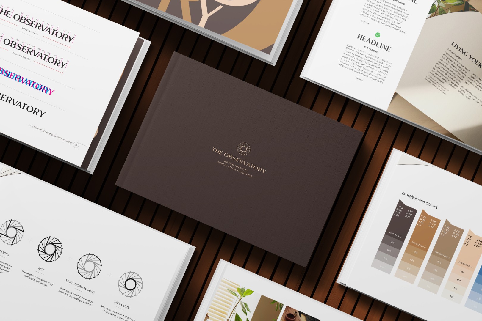
The logomark gathered four ideas into one visual gesture: Japan’s four seasons, the eagle’s nest as shelter and refuge, the eagle crown accents reflected in the building’s architectural details, and the oculus, suggesting sharp vision and full-view observation. The result was an identity with poise, protection, and altitude, carrying the project’s cultural intelligence with the discipline required of a large-scale real estate brand.
DFT also developed the naming logic for the towers and amenities, extending the brand beyond a single development name into a larger vocabulary for the estate. One layer drew from the Philippine Eagle, translating its symbolic characteristics into color, sky, and Japanese language. Another drew from places in Japan and the lifestyle associations they carry, linking each tower’s character and amenity experience to Japanese cultural traditions, leisure rituals, and urban references. This gave The Observatory a naming architecture with coherence, cultural texture, and room to grow across future towers, shared spaces, and residential experiences.
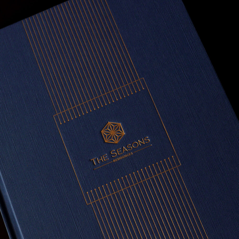
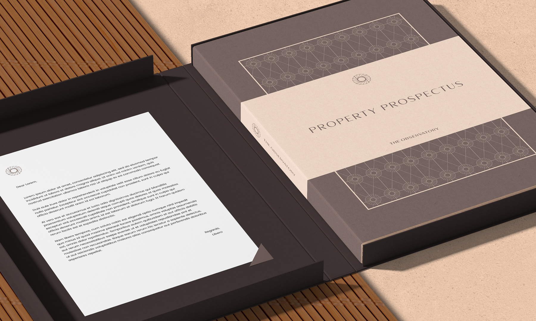
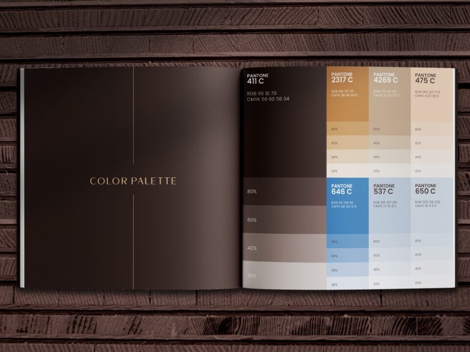
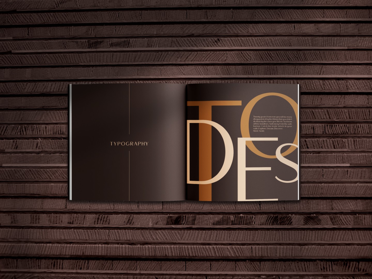
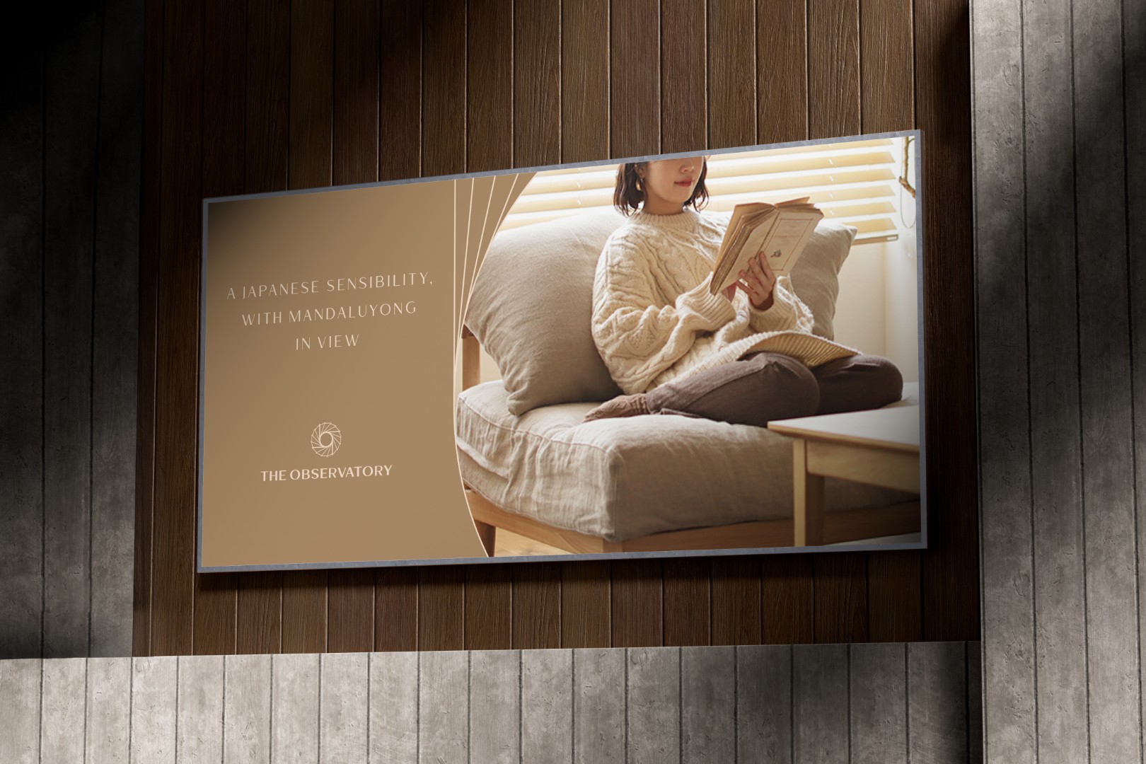
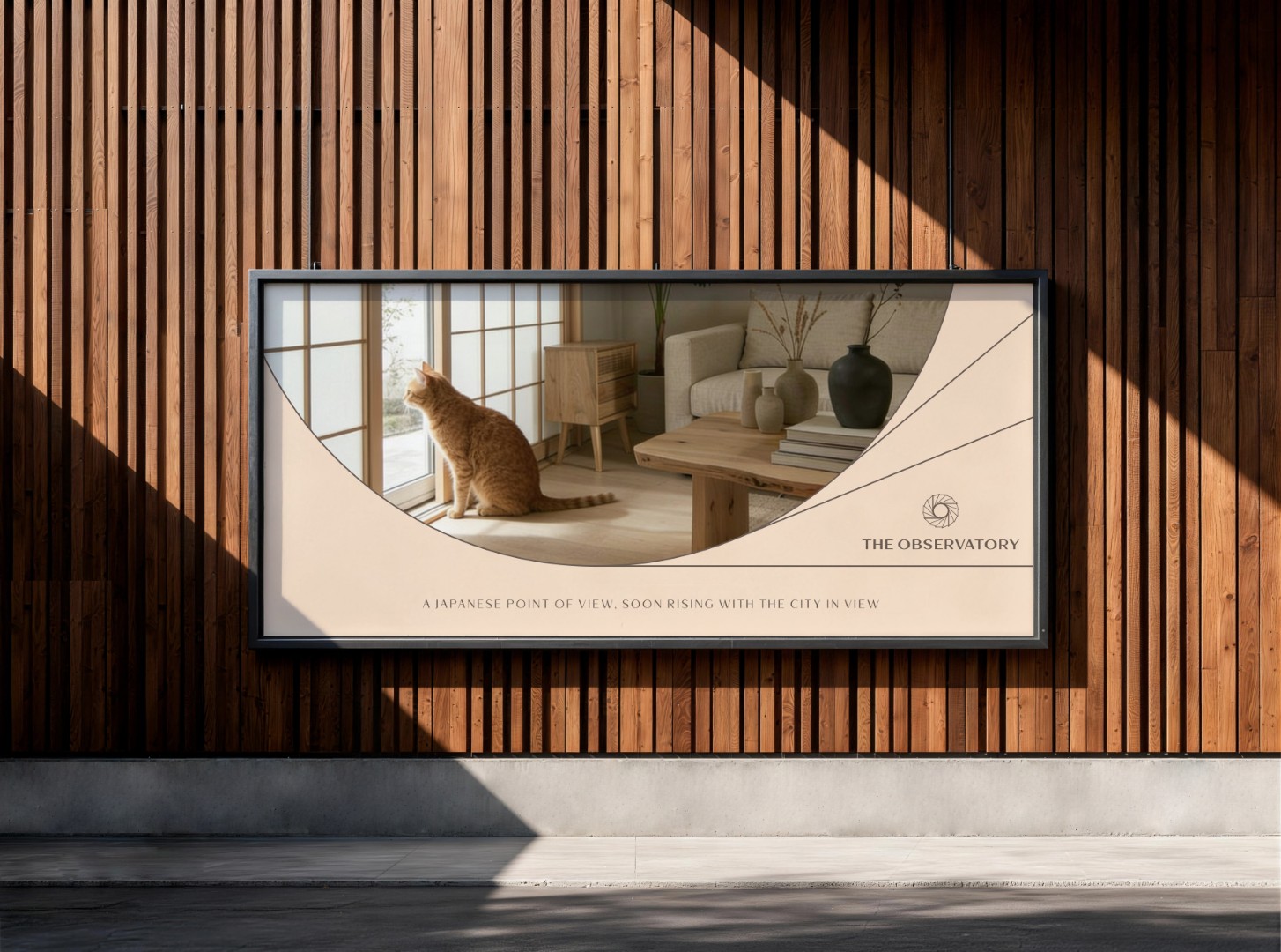
The identity was then carried into a full mixed-use development branding and application system: customized wordmark, typography, color palette, brand guidelines, sales collateral, brochures, outdoor advertising, digital assets, presentation templates, and in situ sales pavilion signage. The brand moved from strategy into place, giving Federal Land NRE Global a coherent system for launch, selling, storytelling, and stewardship. For developers, investors, and leadership teams building large-scale residential branding, mixed-use development, or placemaking projects, The Observatory shows how architectural ambition can become a brand system people understand, remember, sell, and believe in.
IMPACT
A brand system for a high-stakes real estate launch.
DFT created a naming, identity, and application system for one of the flagship developments of Federal Land NRE Global, backed by Nomura’s approximately US$324 million investment.
Clarity across complex stakeholders.
The system gave developers, architects, marketers, sales teams, and future residents one coherent language for understanding The Observatory’s scale, cultural roots, and residential promise.
A cross-cultural identity with architectural roots.
The brand translated the masterplan’s cultural crossing: Filipino symbolism through the Philippine Eagle, and Japanese spirit through seasonality, precision, ritual, and refined residential experience.
Built for real-world rollout.
The identity moved across towers, amenities, brochures, billboards, digital channels, sales decks, and the physical sales environment, proving DFT’s ability to make brand systems that stay coherent through real-world implementation, including the glorious moment when everyone wants the logo slightly larger and nobody can remember which file is final.
CREATIVE SERVICES DELIVERED
Naming architecture
Tower naming logic, amenity naming logic, Japanese cultural references, place-inspired associations, and a larger vocabulary for a multi-tower estate.
Brand identity system
Logo, logomark, wordmark, typographic customization, visual identity, color system, and identity construction.
Brand guidelines and applications
Logo rules, typography rules, sales collateral, outdoor advertising, digital assets, presentation templates, and in situ sales pavilion signage.
KAZUMASA NISHIDA
Management Adviser, Federal Land NRE Global (FNG)
Philippines, International
“The Design for Tomorrow team are true visionaries who know how to turn ideas into meaningful brands. Their creativity, strategic thinking, and thoughtful approach resulted in a brand that captured exactly what we hoped to convey.”
TRISHA GOZO
Senior Brand Marketing Manager, Federal Land NRE Global (FNG)
Philippines, International
“Working with Ric and the Design for Tomorrow team was a fantastic experience. They took the time to truly understand our company and the project, then translated our vision into a brand identity that was both meaningful and visually compelling. Everything was approved on the first presentation, a testament to their creativity, thoughtfulness, and ability to deliver exactly what we envisioned. When it comes to branding, Design for Tomorrow is an agency we’d confidently recommend.”
Client The Observatory, FNG – Federal Nomura Group
Industry Property Development, Real Estate, Mixed-Use Development, Residential Branding, Placemaking, Luxury Residential Branding, Urban Estate Branding
Discipline Naming Strategy, Naming Architecture, Brand Identity, Logo Design, Visual Identity, Brand Guidelines, Campaign Applications, Sales Collateral, Environmental Branding, Real Estate Branding, Property Development Branding, Mixed-Use Development Branding
Location Mandaluyong, Metro Manila, Philippines, Japan-Philippines Joint Venture, Asia-Pacific
Creative & Art Director Ric Gindap
Logo Designer Ric Gindap, Dale Rodriguez
Brand & Identity Designer Dale Rodriguez
Strategist Ma. Julie Therese Amos Copywriter Dave Riel Española
Project Manager Michelle Logronio