Energy can be measured with precision. Meaning tends to behave differently.
Across the Philippine renewable energy sector, solar power has moved from promise to visible infrastructure. Capacity improves, technology advances, and presentations become cleaner. After a while, many begin to resemble one another, which complicates distinction.
NING*NING entered this environment as a new renewable energy venture under Solaris. It had no established brand system and no dominant presence in the market. Power is practical by nature. It rarely pauses for purpose unless purpose arrives with structure, economic logic, and a reason to be chosen beyond the cheapest rate.
NING*NING was not built to compete on lowest price alone. Its value sits in a broader model of sustainable power, using rooftops and built environments to support housing, community systems, environmental responsibility, food security, and nation-building.
What NING*NING carried was a wider ambition. Energy would connect to housing, environmental recovery, and systems that support community life. Work required a brand that could speak to utilities, investors, partners, residents, and institutions without losing its center.
Design For Tomorrow defined NING*NING as a sustainable power platform with civic consequence. Brand strategy, ESG positioning, visual identity, and rollout system were built to make that role legible.
THE NING*NING STORY
NING*NING was built with a scope that exceeded the category it was entering, even if the brand had not yet learned how to show it.
Already oriented toward a broader role, the business worked across energy generation while engaging housing, environmental systems, and community development. Without a defined position, the market would read it in familiar terms, and the larger intention would remain understated.
Work began by clarifying the premise. Energy would be treated as part of a system, with output as one component. This became a brand strategy for renewable energy, housing, and community development, instead of a cosmetic refresh for another solar company looking anxiously at the same sun as everyone else.
From this, the idea of good energy emerged as a working principle for the brand. It refers to energy that remains useful beyond the moment of delivery and contributes to conditions already in place. For NING*NING, renewable power becomes a civic and community platform, shaped for energy transition and long-term public value.
Compassion, determination, and redemption became working references for how the brand understands its role and behaves over time.
From there, the system extended into positioning, messaging, architecture, and naming. Solar Shelters became a concrete expression of how energy and housing could connect without asking every audience to sit through a theological defense of solar panels.
What emerges is a brand that behaves consistently across contexts, which matters more than how dramatically it introduces itself.
IMPACT
DFT positioned NING*NING around good energy: solar power that contributes to systems already in place and continues to create value after delivery.
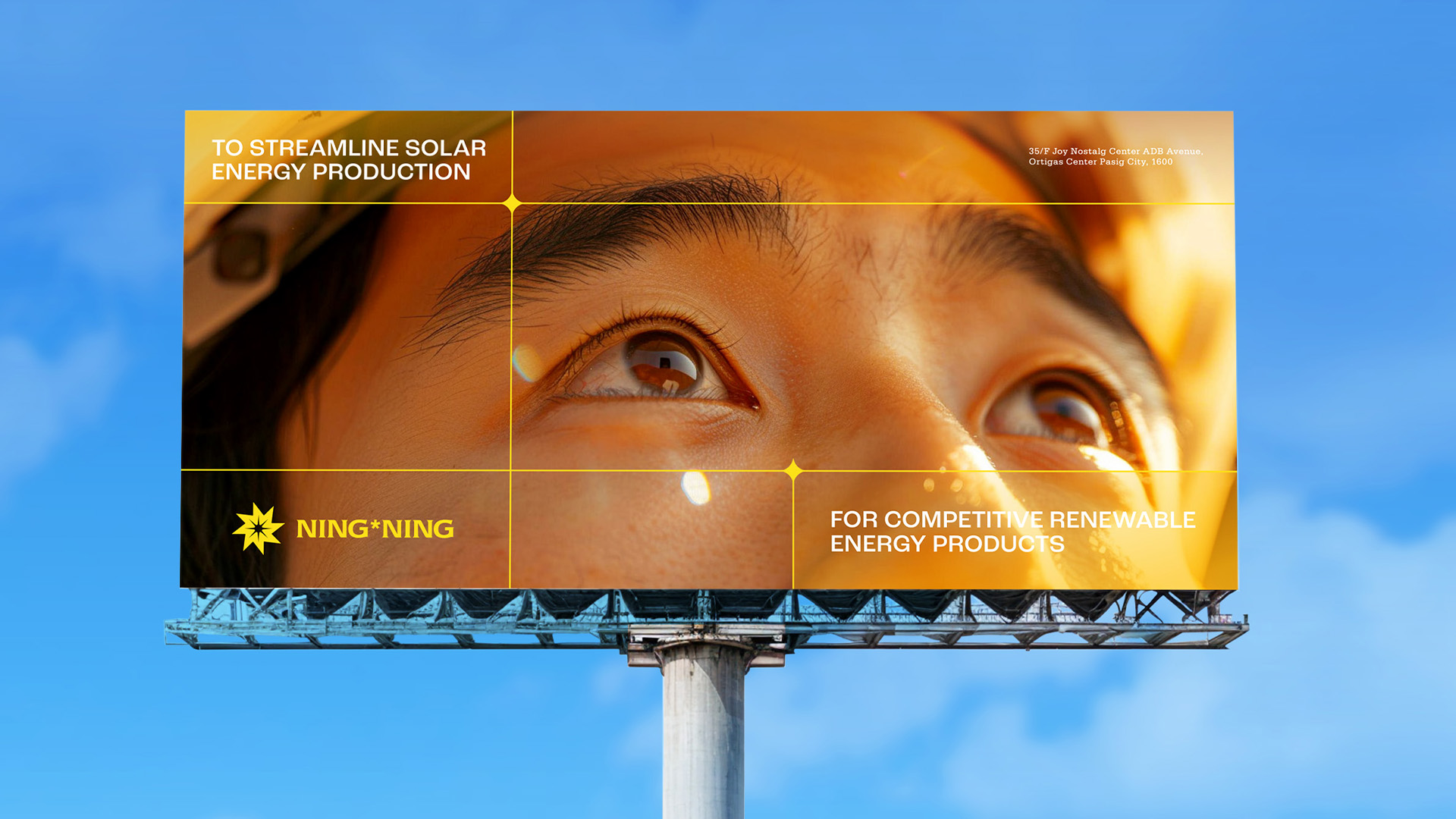
This gave the brand a clearer role within the Philippine renewable energy sector. NING*NING could speak as a sustainable power platform instead of another solar provider competing on price, capacity, or technical claims alone.
That direction is visible in a flagship deployment in Naic, Cavite:
- 6.55 MW rooftop solar system across 1,986 homes
- Among the first utility-scale rooftop solar developments within a socialized housing community globally. (pv magazine International)
- Approximately 9,182 MWh of clean energy generated annually
- Around 6,233 metric tons of CO₂ emissions reduced per year (TaiyangNews – All About Solar Power)
Energy production connects to shared infrastructure and community systems, making the relationship between supply and outcome easier to observe. (Philippine Information Agency)
Referenced as a direction for renewable energy development in the Philippines, the model shows that the idea has begun to operate in public. (Philippine News Agency)
CREATIVE SERVICES DELIVERED
- Renewable Energy Brand Strategy & Positioning
- ESG Brand Strategy and Sustainable Power Positioning
- Competitive Benchmarking for the Philippine and Regional Solar Market
- Brand Manifesto & Narrative System
- Brand Values, Personality & Archetype Framework
- Messaging & Tone of Voice Development
- Audience Messaging for Utilities, Commercial Markets, Residential Communities, and Institutional Partners
- Strapline Strategy: Power, People, Purpose
- Brand Identity Refresh
- Logo Forensics & Refinement
- Wordmark Customization
- Solar-Spectrum Color Palette Development
- Typography System
- Visual Language System
- Brand Architecture & Naming System, including Solar Shelters
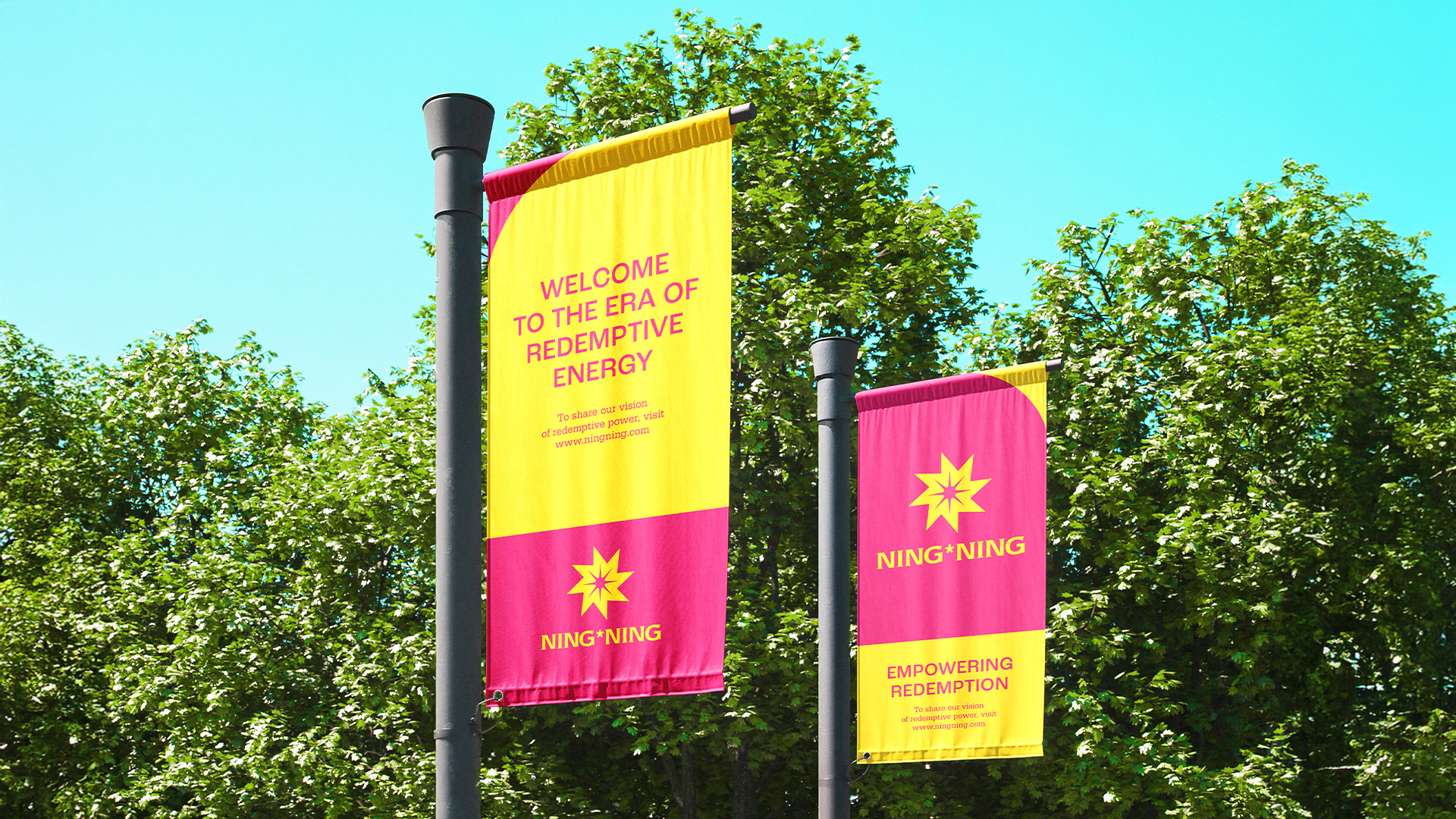
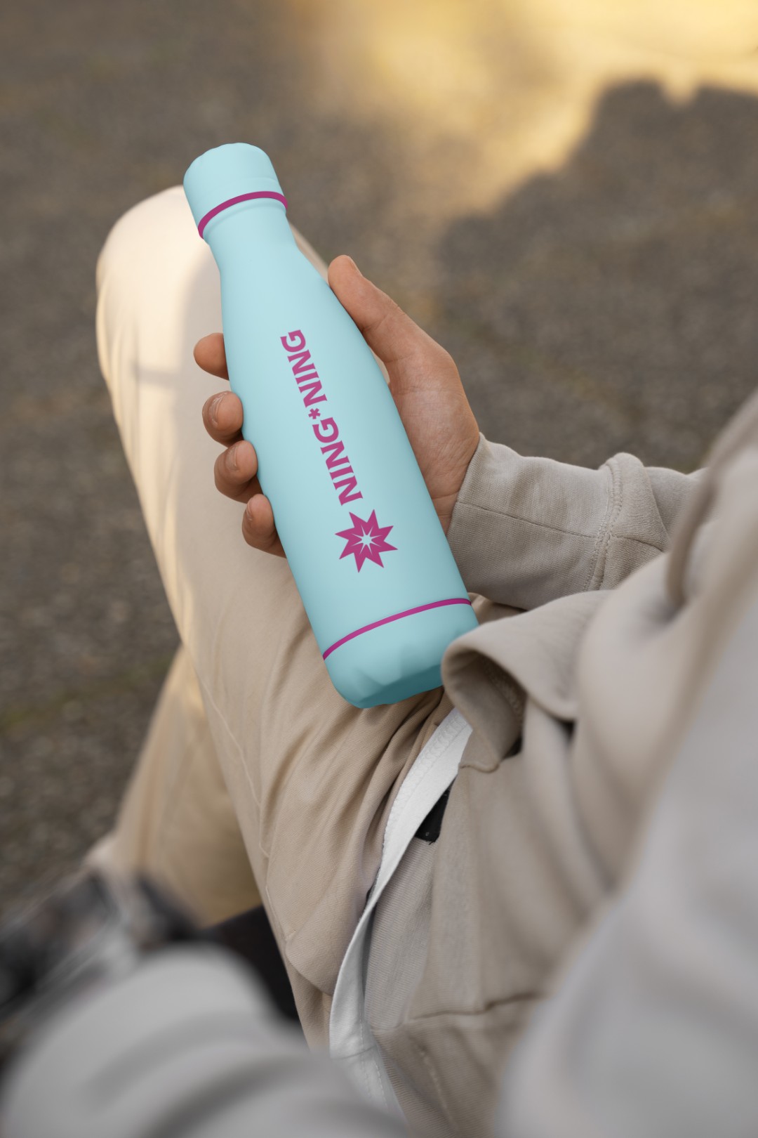
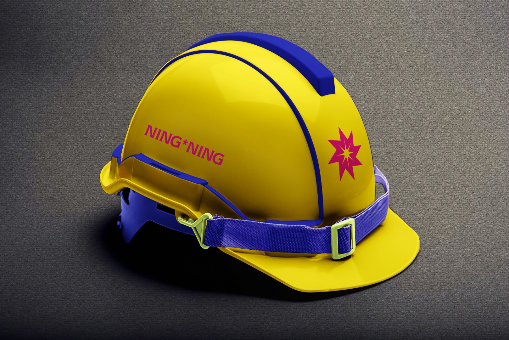
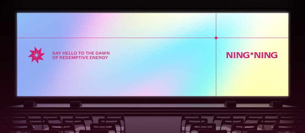
- Brand Applications & Launch Collateral
- Brand Guidelines
- Brand Story & Communication Framework
The Approach
Energy tends to be delivered with precision, while its larger effects are less often articulated.
In many cases, the effect remains limited to the transaction. Power is supplied. The bill arrives. Everyone behaves as though civilization has been solved for the month.
DFT focused on closing the gap between what NING*NING builds, what the brand communicates, and what the market can recognize without assistance.
This became an ESG-driven brand strategy for sustainable power platforms in Asia, shaped for the realities of the Philippine power sector and the broader demands of infrastructure, investment, and civic trust.
Credibility in renewable energy required a brand that could carry sustainability meaning with discipline and remain usable across investor-facing, institutional, community, and public applications.
Our working measure was simple: the system had to keep functioning after the presentation ended.
The Identity System
Identity development followed the same logic as the strategy. It began with diagnosis.
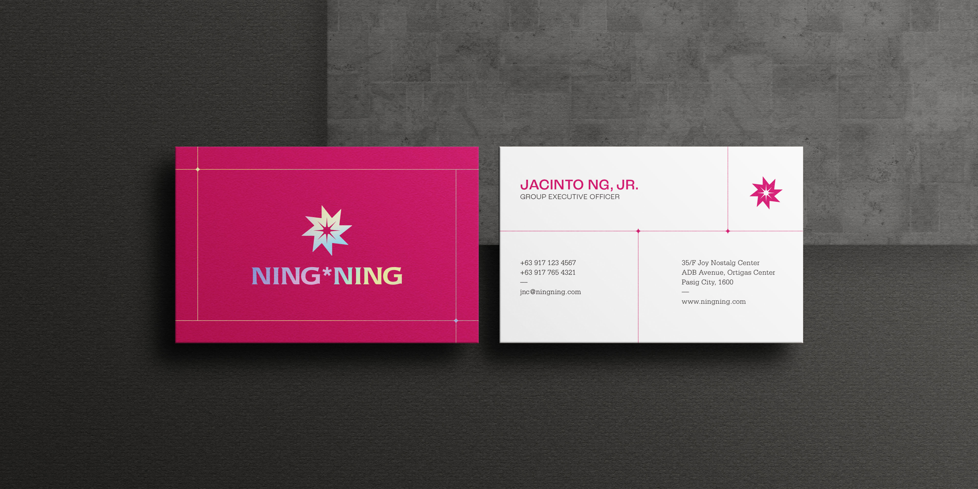
Useful equity remained in the existing mark, but the logo was visually crowded. The earlier version lost legibility at smaller sizes. Rounded corners softened its authority, while the cog-like sun, outlined elements, and competing star in the wordmark created visual noise. Small problems become very public when a logo has to perform on safety hats, billboards, folders, screens, and launch materials.
DFT refined the mark by reducing noise and sharpening recognition. The final symbol retained the sun as its central reference, with eight rays echoing the sun rays of the Philippine flag. It also carried the logic of a wheel of progress, suggesting movement, advancement, and continuing momentum. The result held solar meaning and national resonance without turning into a tiny patriotic parade.
Custom wordmark refinements adjusted spacing, proportion, and optical balance, giving NING*NING a typographic signature instead of a name simply placed beside a symbol. A wordmark should not look as though it wandered in from a font menu and decided to stay.
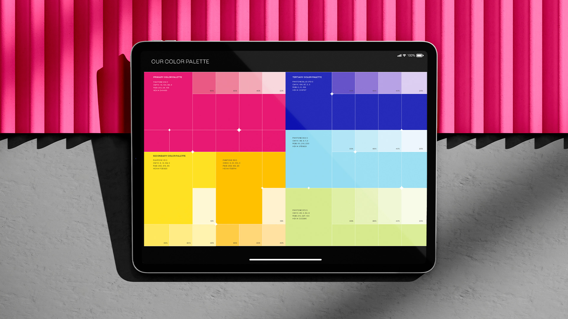
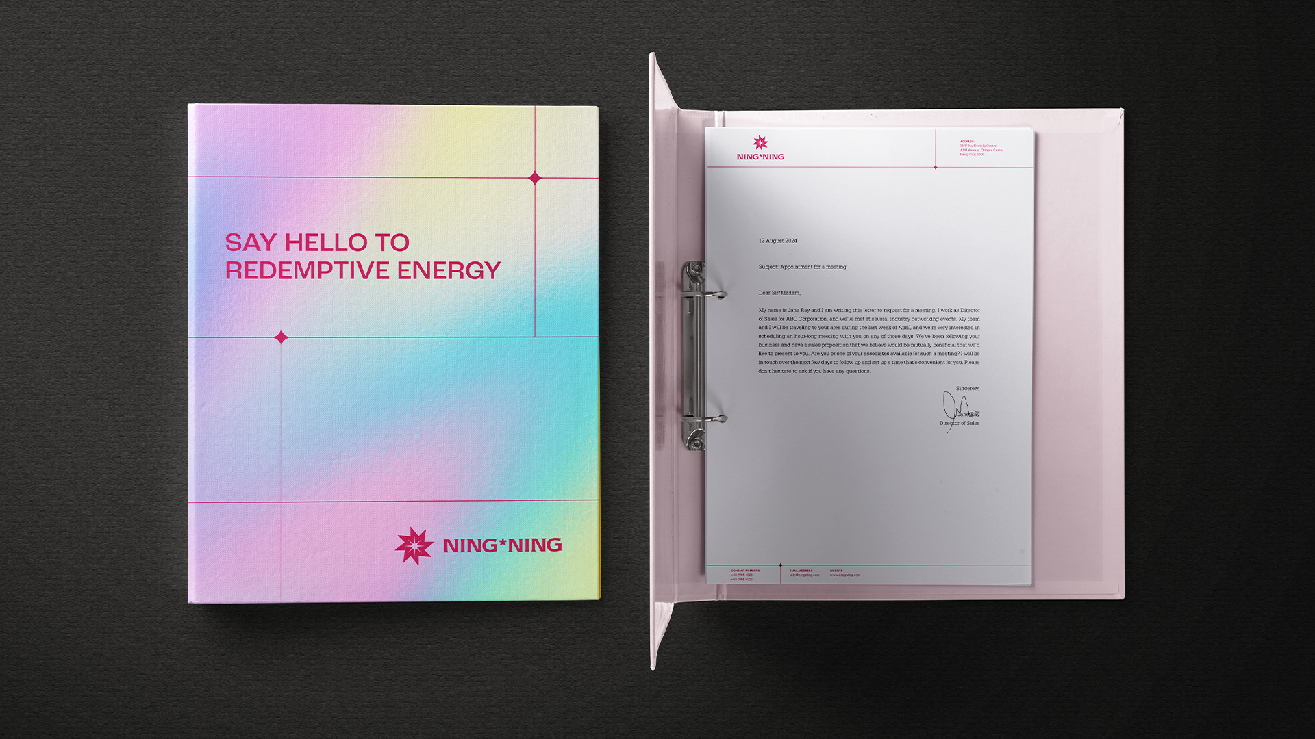
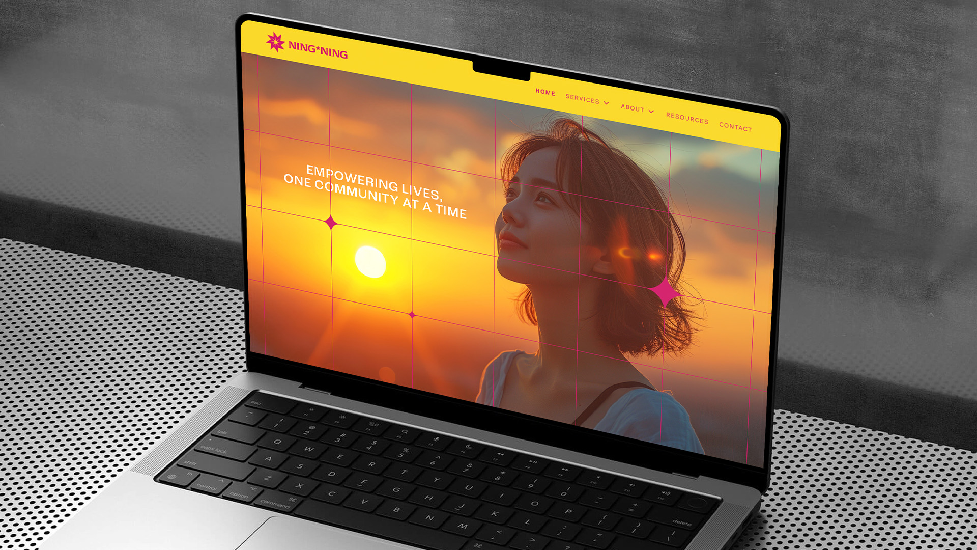
Color became a strategic decision. The final palette was inspired by the solar spectrum, drawing from infrared-magenta and ultraviolet-electric blue, with yellow and orange carrying heat, radiance, and solar optimism. This moved the brand away from the renewable-energy reflex of green leaves, corporate blues, and gradients with very little personality. The result feels luminous, technical, and alive.
Graphic language drew from the structured grid of solar panels, giving the identity a system of lines, intersections, and fields that could extend across applications. Together, the symbol, palette, and grid created a solar energy brand identity and visual system for infrastructure projects, designed for institutional materials, public-facing communications, and on-site rollout.
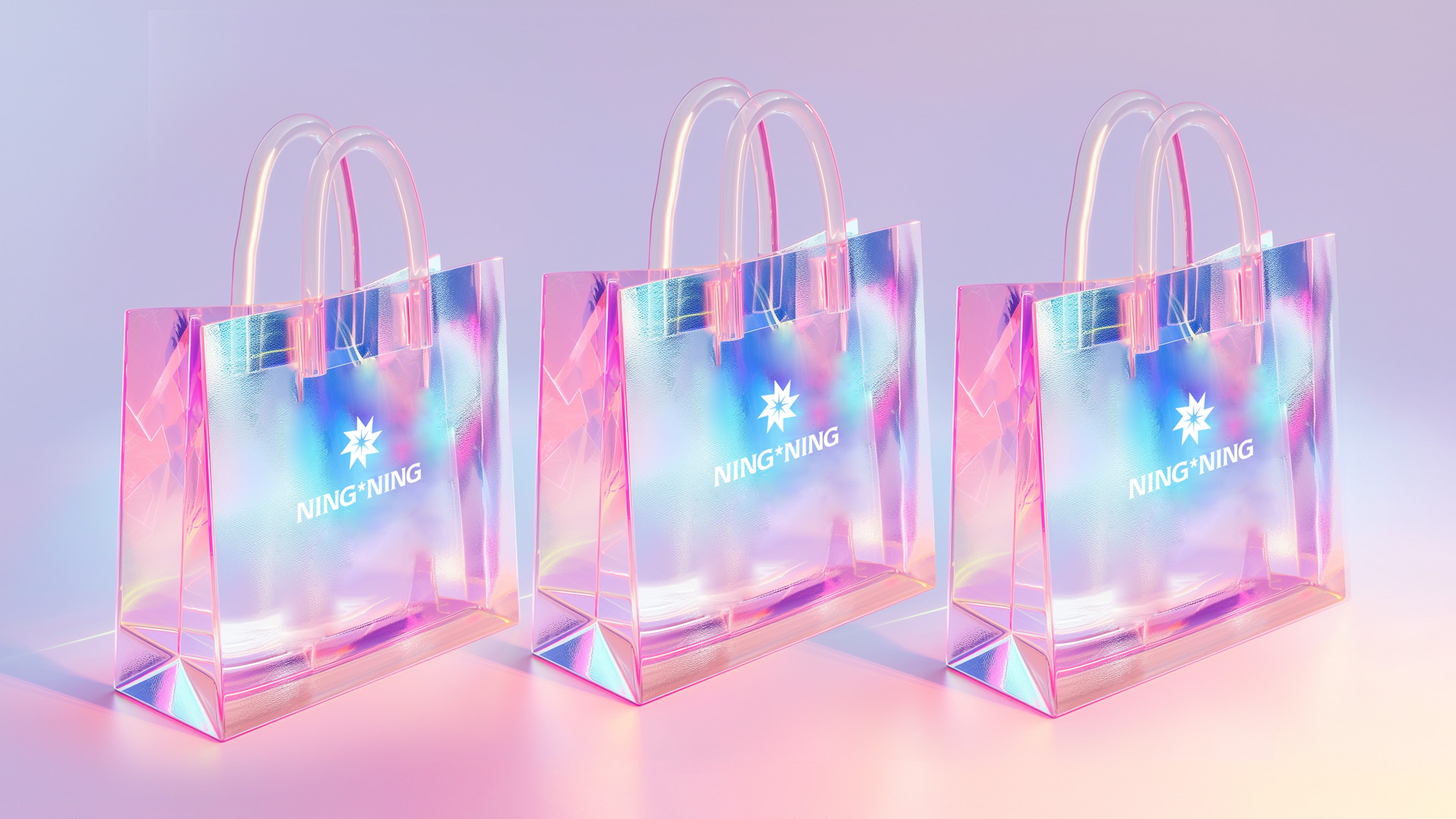
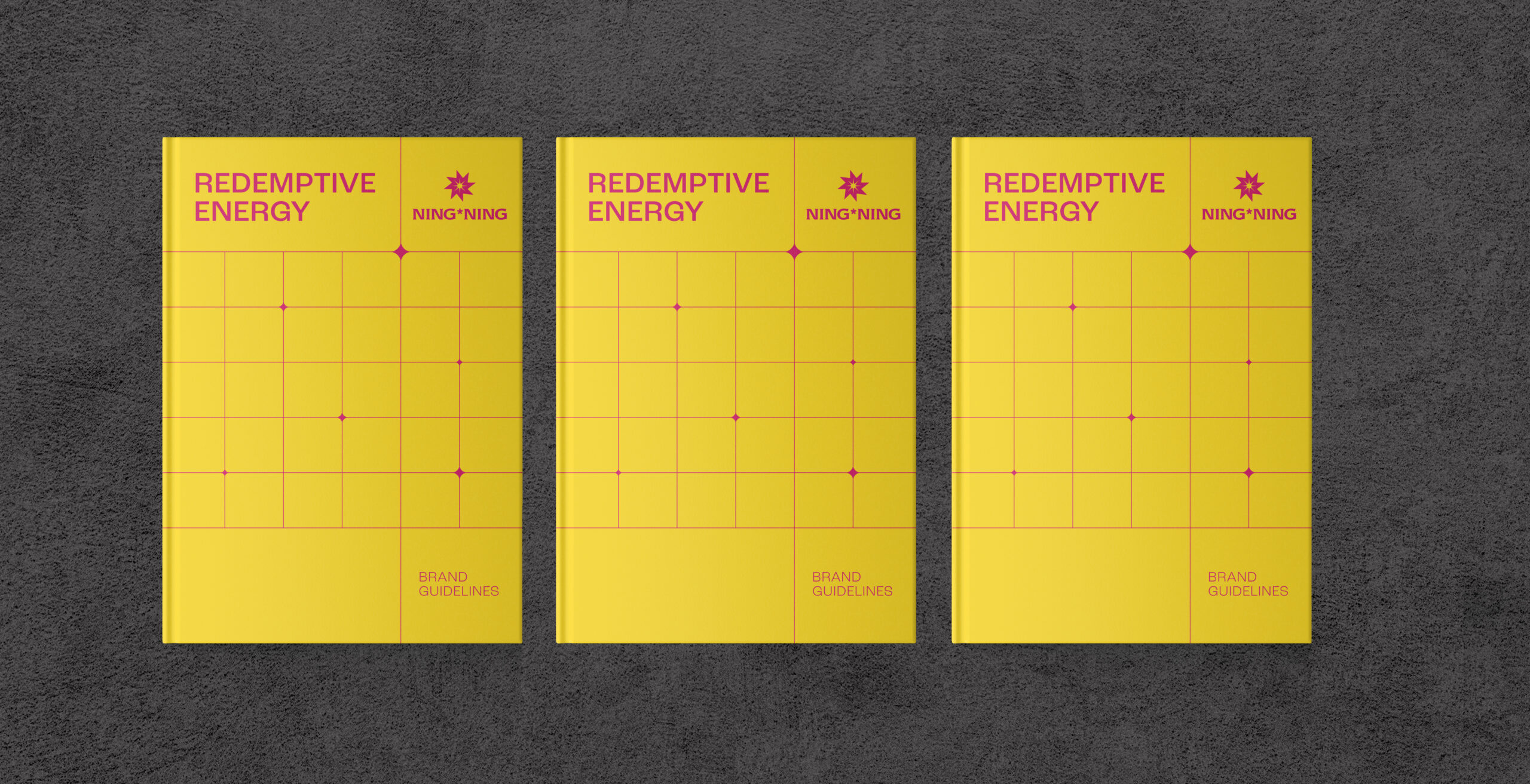
Holographic and iridescent material treatments translated light into physical experience, allowing printed collateral and brand materials to shift with reflection, movement, and touch. Final brand guidelines codified the system for use, covering logo rules, grid systems, imagery direction, application standards, and misuse examples. Extended into a suite of collaterals and rollout materials, the identity became a governed brand system designed for daily use, public visibility, internal discipline, and long-term implementation.
Rebrand Results & Performance
Strategy and identity established a clear position for NING*NING within the Philippine renewable energy sector and aligned the brand with developments already in operation.
Naic’s deployment provides a working example of how solar energy can function as infrastructure and catalyst, supporting nearly 2,000 homes while contributing to broader environmental and community systems, as documented in industry coverage and energy publications.
Measurable environmental contribution is evident through consistent energy generation and carbon reduction, alongside integration into community-level infrastructure and services.
NING*NING now operates with a level of clarity that allows it to be understood in relation to what it builds. Its identity gives that clarity visible form, from the solar-spectrum palette to the panel-grid graphic language and governed rollout system.
Over time, this becomes the distinction that remains visible and continues to matter.
Design For Tomorrow
Design For Tomorrow is a branding and strategy agency for renewable energy companies in the Philippines, based in Manila and working across ASEAN and Asia.
DFT builds brand strategy, identity design, narrative systems, and brand experience frameworks for organizations operating in sectors where clarity influences adoption, trust, investment, and long-term execution.
For renewable energy companies, power developers, infrastructure groups, and ESG-led organizations in the Philippines and Asia, DFT gives complex ambition the clarity, trust, and structure it needs to scale.
As a Philippine branding agency for energy transition and nation-building brands, DFT works across renewable energy, sustainable power, infrastructure, real estate, civic initiatives, and cross-sector development.
FAQ: Ning*Ning Renewable Energy Branding, ESG Positioning, and Sustainable Power Brand Strategy
A quick guide to the strategy, identity system, and rollout work behind Ning*Ning, and how the project reframes solar energy as sustainable power for housing, community systems, environmental responsibility, and nation-building.
What kind of branding work did Design For Tomorrow do for Ning*Ning?
What kind of branding work did Design For Tomorrow do for Ning*Ning?
Why is Ning*Ning a renewable energy branding case study?
Ning*Ning shows how renewable energy branding can move beyond technical claims by linking solar power to housing, community systems, environmental responsibility, food security, and nation-building.
What makes the Ning*Ning identity different from typical solar energy branding?
The Ning*Ning identity uses a solar-spectrum palette inspired by infrared magenta, ultraviolet electric blue, solar yellow, and radiant orange. Its visual language draws from the structured grid of solar panels, creating a solar energy brand identity and visual system for infrastructure projects.
Does Design For Tomorrow work on ESG and sustainable power branding?
Yes. Design For Tomorrow provides ESG-driven brand strategy, renewable energy branding, sustainable power positioning, and brand identity systems for organizations in the Philippines, ASEAN, and Asia.
Is DFT a branding agency for renewable energy companies in the Philippines?
Yes. Design For Tomorrow is a branding and strategy agency in Manila working with renewable energy, sustainable power, infrastructure, real estate, civic, and nation-building brands across the Philippines and Asia.
Let’s build your brand for systems that last
DFT provides sustainable power branding for civic-minded infrastructure initiatives, renewable energy brand strategy, ESG positioning, identity design, and brand systems for organizations in the Philippines, ASEAN, and Asia.
If your business is building for scale, your brand should be able to carry it.
Client Solaris Inc., Jacinto Ng, Jr.
Industry Energy & Power, Infrastructure, Utility
Discipline Strategy, Branding, Identity Design, Visual Systems, UI/UX Design, Digital Experience
Location Manila, Philippines
Creative & Art Director Ric Gindap, Rashina Tuazon Associate Art Director Rashina Tuazon
Brand Identity and Logo Designer Rashina Tuazon
Digital Designer Jose Miguel Lim
Strategy Ma. Julie Therese Amos, Maria Noelle Maulit
Copywriter Dave Riel Española
Account Manager Cessmarie Villones