What keeps you going?
For many busy Manileños, having to stop and eat for just a moment already poses a problem. What’s more – with limited existing options getting more and more expensive, having quick, affordable nourishment is oftentimes a challenge for the everyday Filipino. Enter: Cocopan, rising to take on the challenge by providing good-tasting products to many Filipinos at an affordable price. Setting up shops in high-dense communities and local transport hubs, they position themselves as a go-to for Filipinos looking for a quick fix.
As Cocopan finds a home in an increasing number of neighborhoods, making a name for itself in the process, it was important that they had their authentic story to solidify their presence in a generally crowded and competitive landscape. Here, on the crossroads en route to rapid growth, Cocopan needed a strong brand identity to connect with Filipinos seeking sustenance. Design For Tomorrow was called on precisely for this task – revitalizing as well as sharpening their brand.
Slide for the Before and After.
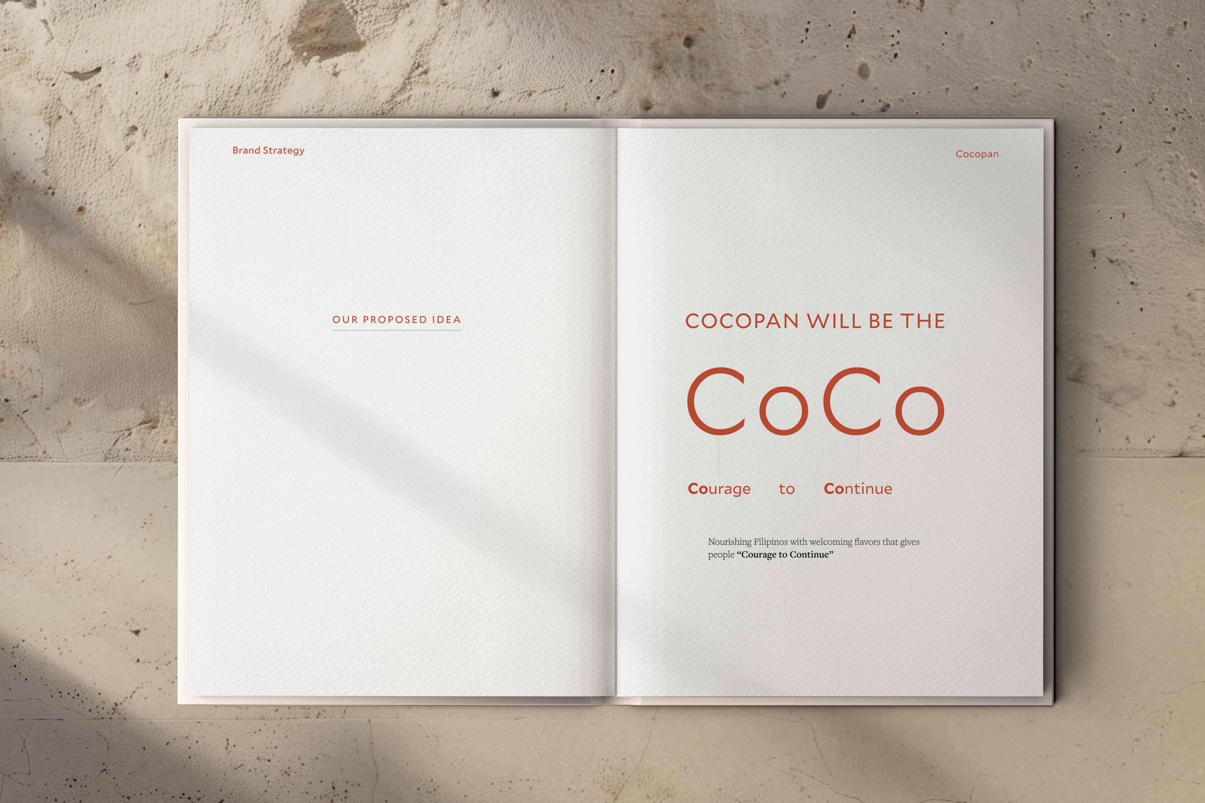
The Courage to Continue
To begin, we immersed ourselves in the crowded streets of Manila, to the neighborhood Cocopans of Kalentong, Paco and Sta. Cruz. We couldn’t help but sense a communal kinship with our servers and the store staff, with our face-to-face interactions being a subtle but present glow of hope. These pushed us to translate the feeling into the overall retail branding identity as well.
For Cocopan, our community values are our brand values. With this realization, we anchored a core belief: in the face of daily struggle, Cocopan will nourish Filipinos with filling flavors that will give them the Courage to Continue. Simply put, we have redefined our purpose: to be the “CoCo.”
Something to Bite Into
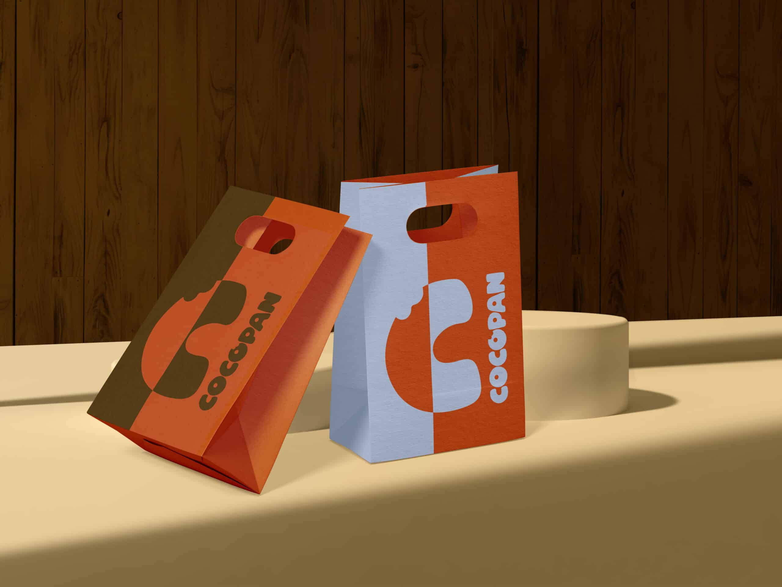
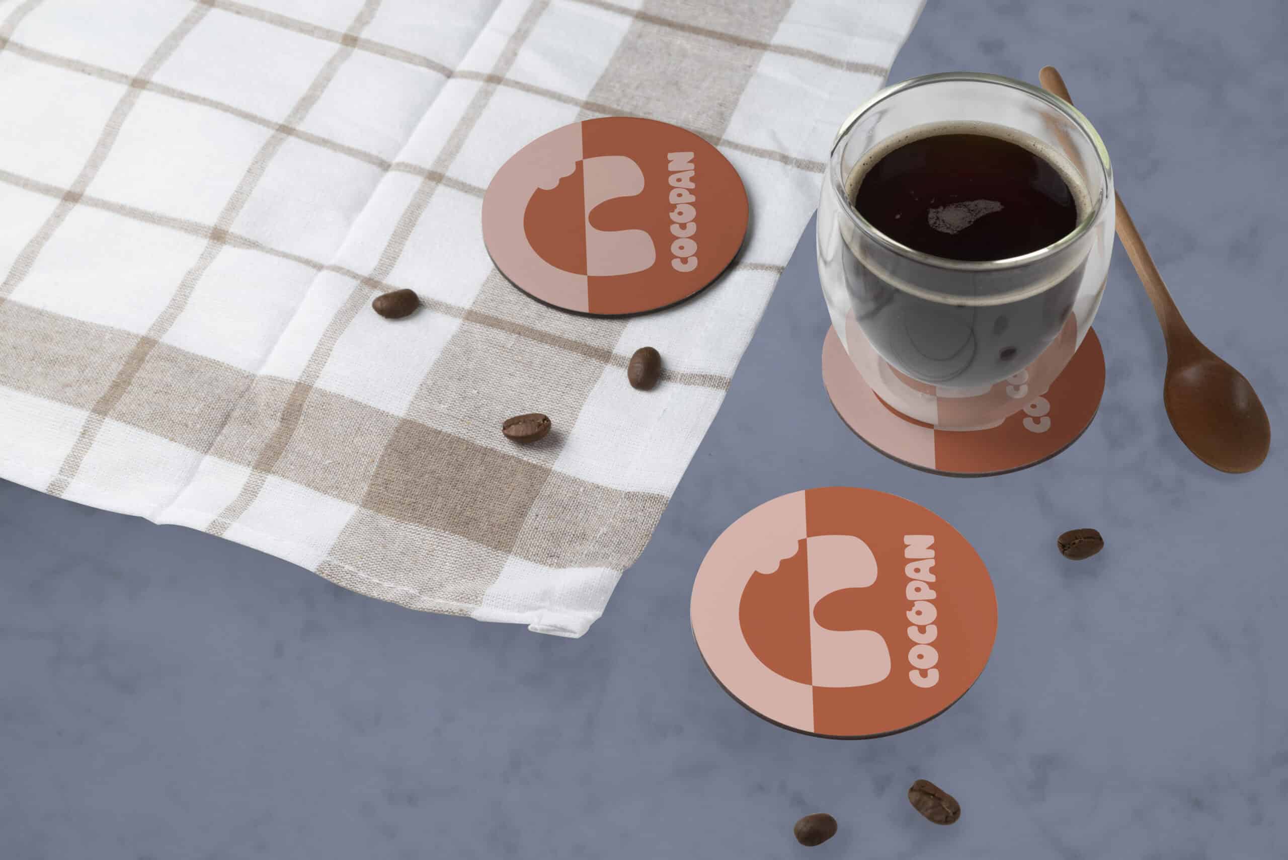
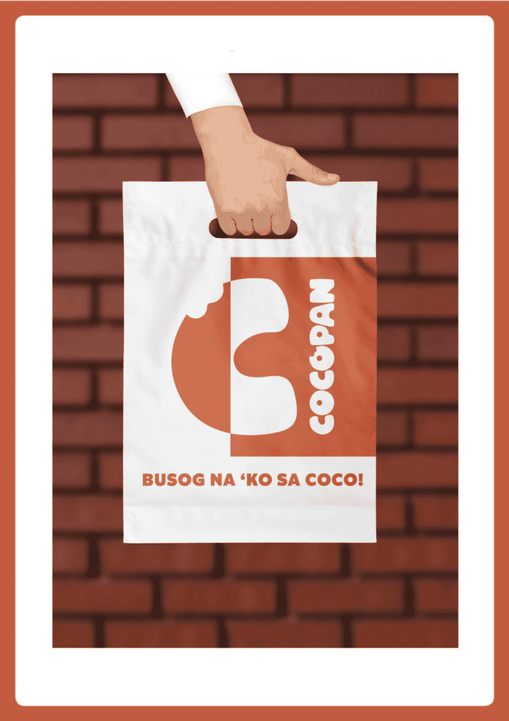
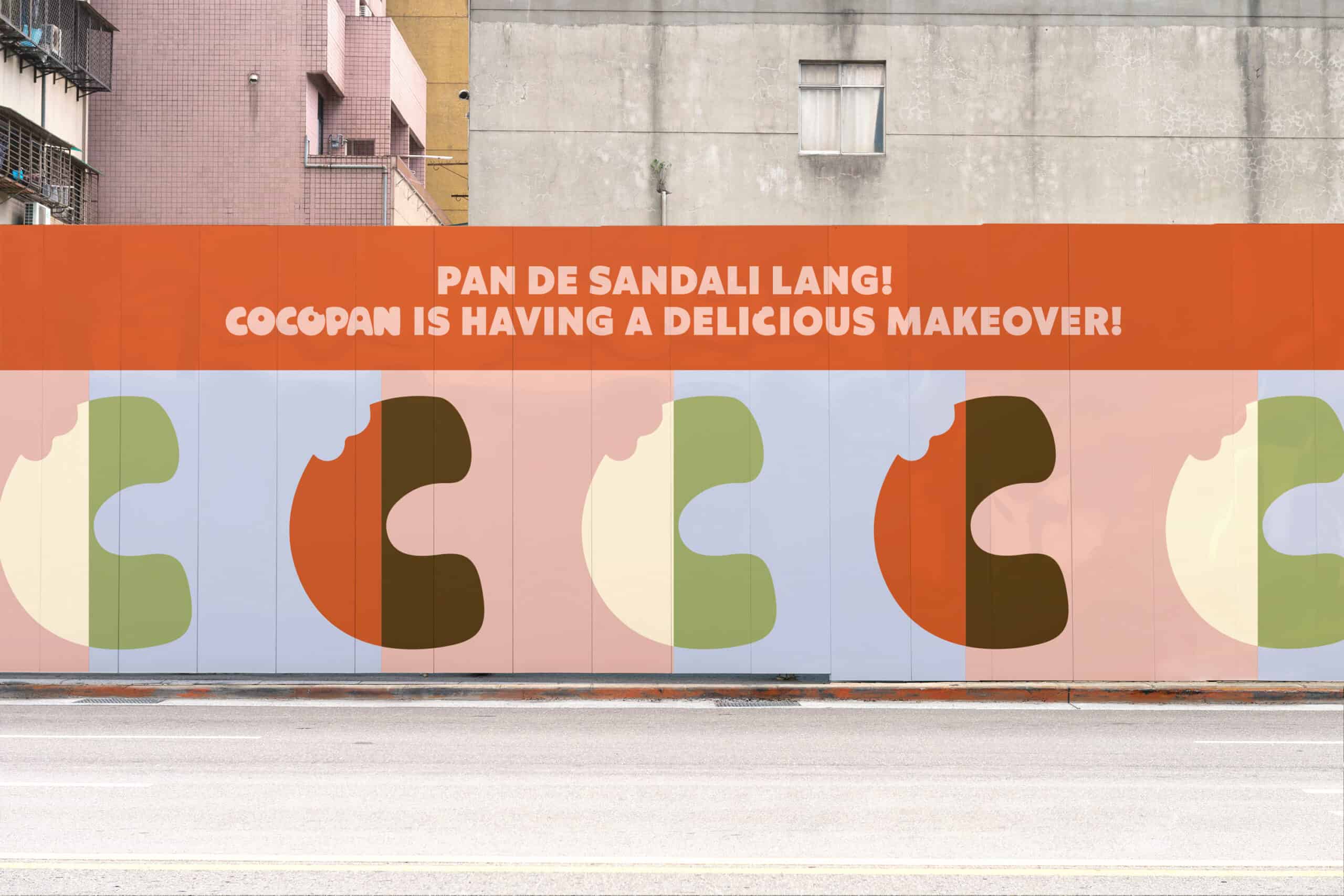
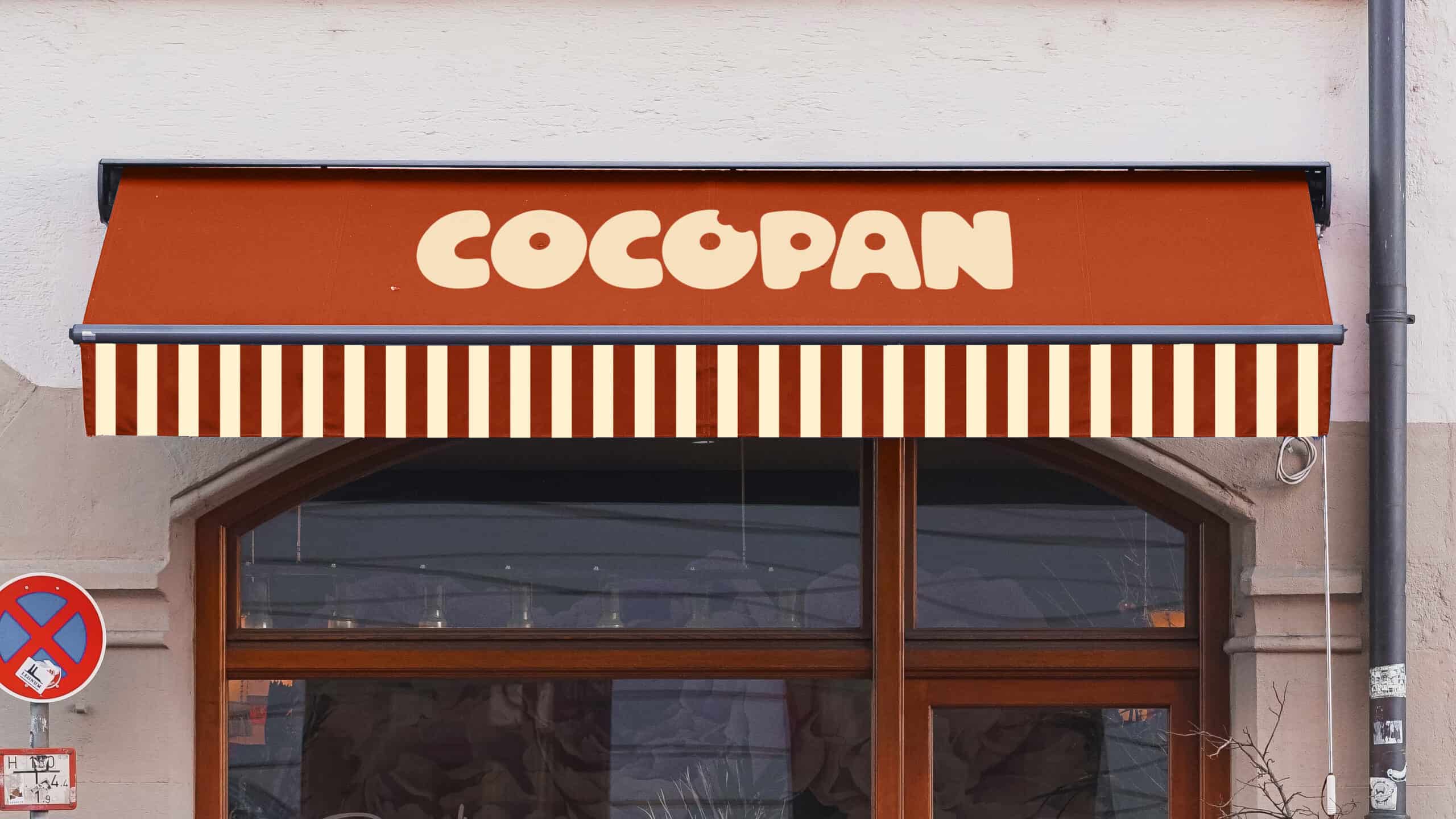
CoCo is found in every facet of the brand story, and it is now also embedded in the brand’s identity. We modified the existing Cocopan logo, then we developed a standalone “C” with the bites (a design feature transferred from the old wordmark) to become an ownable icon in future applications.
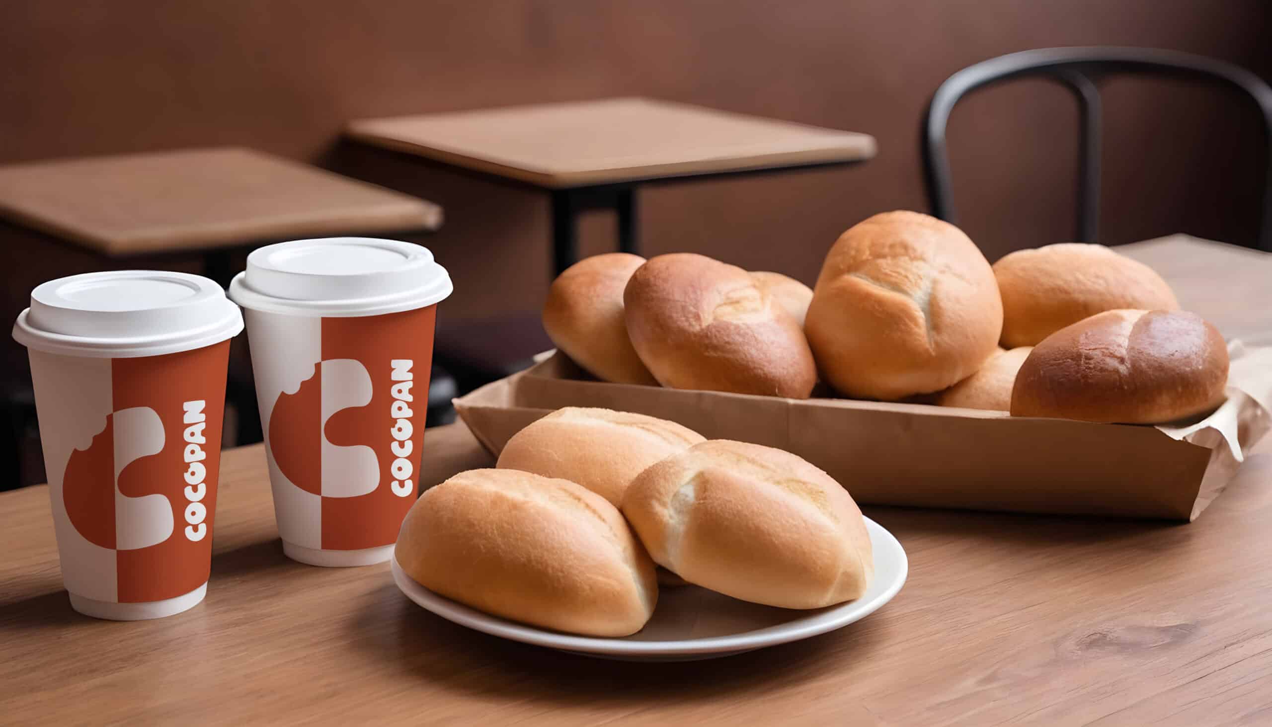
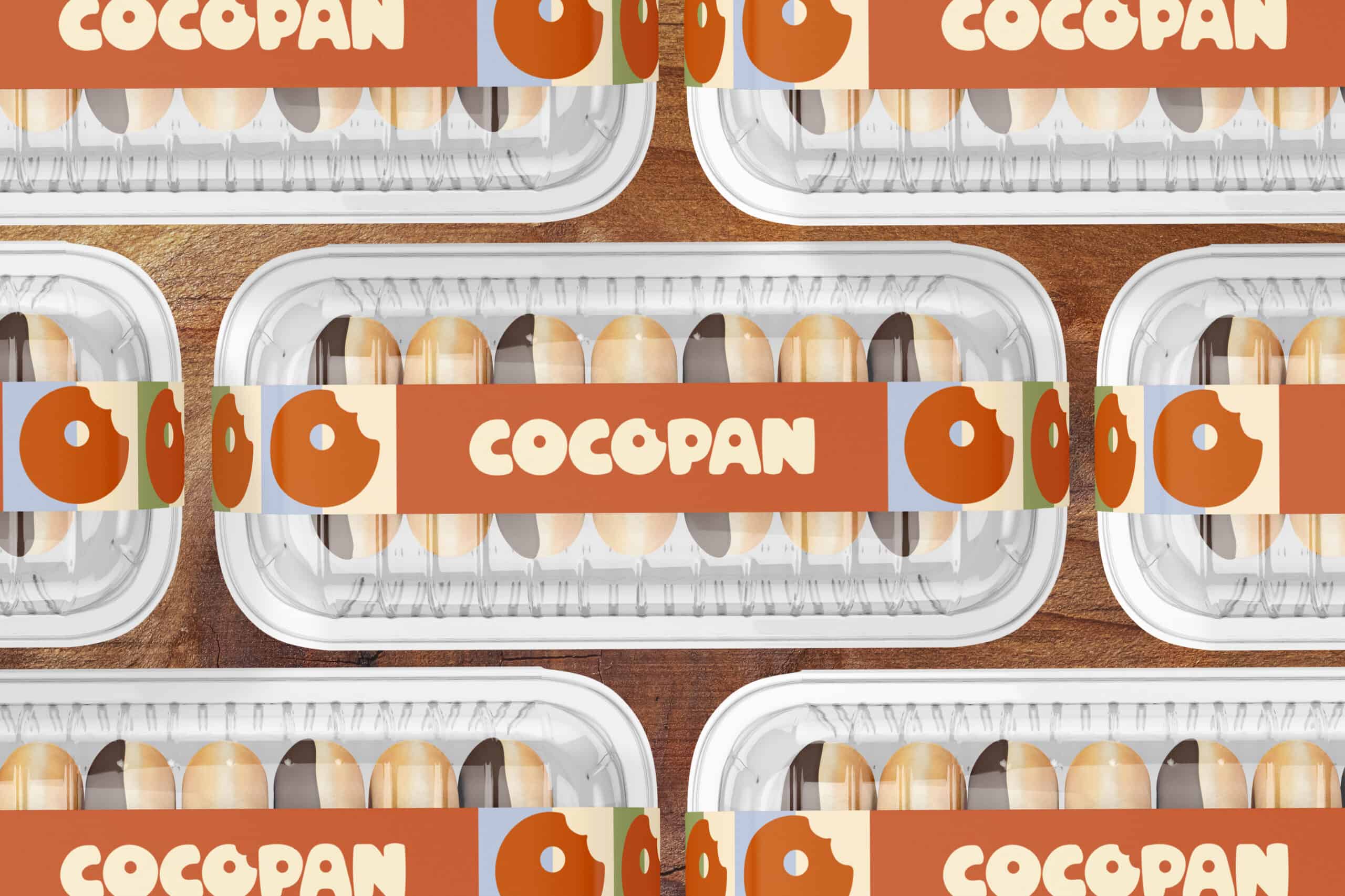
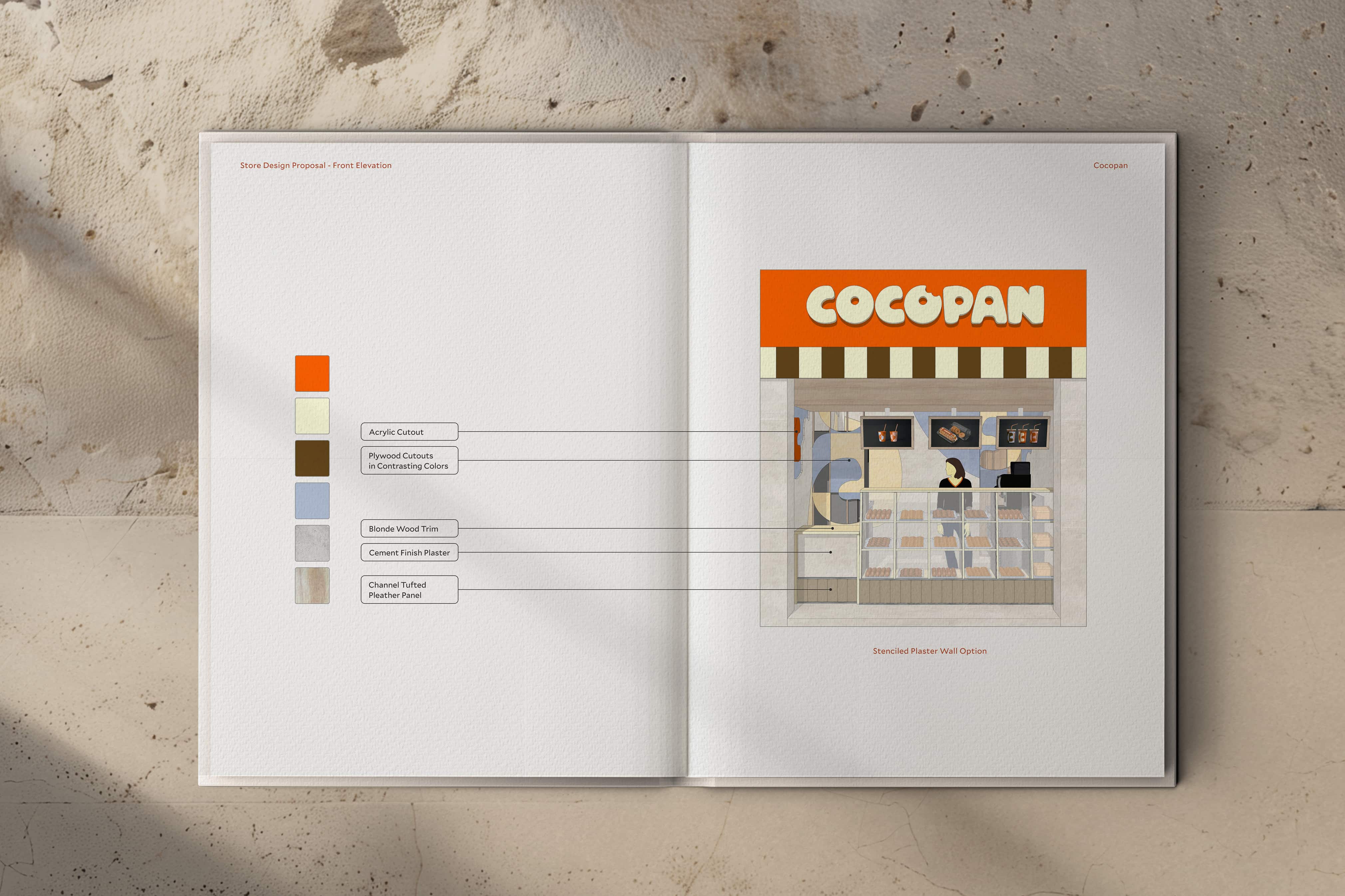
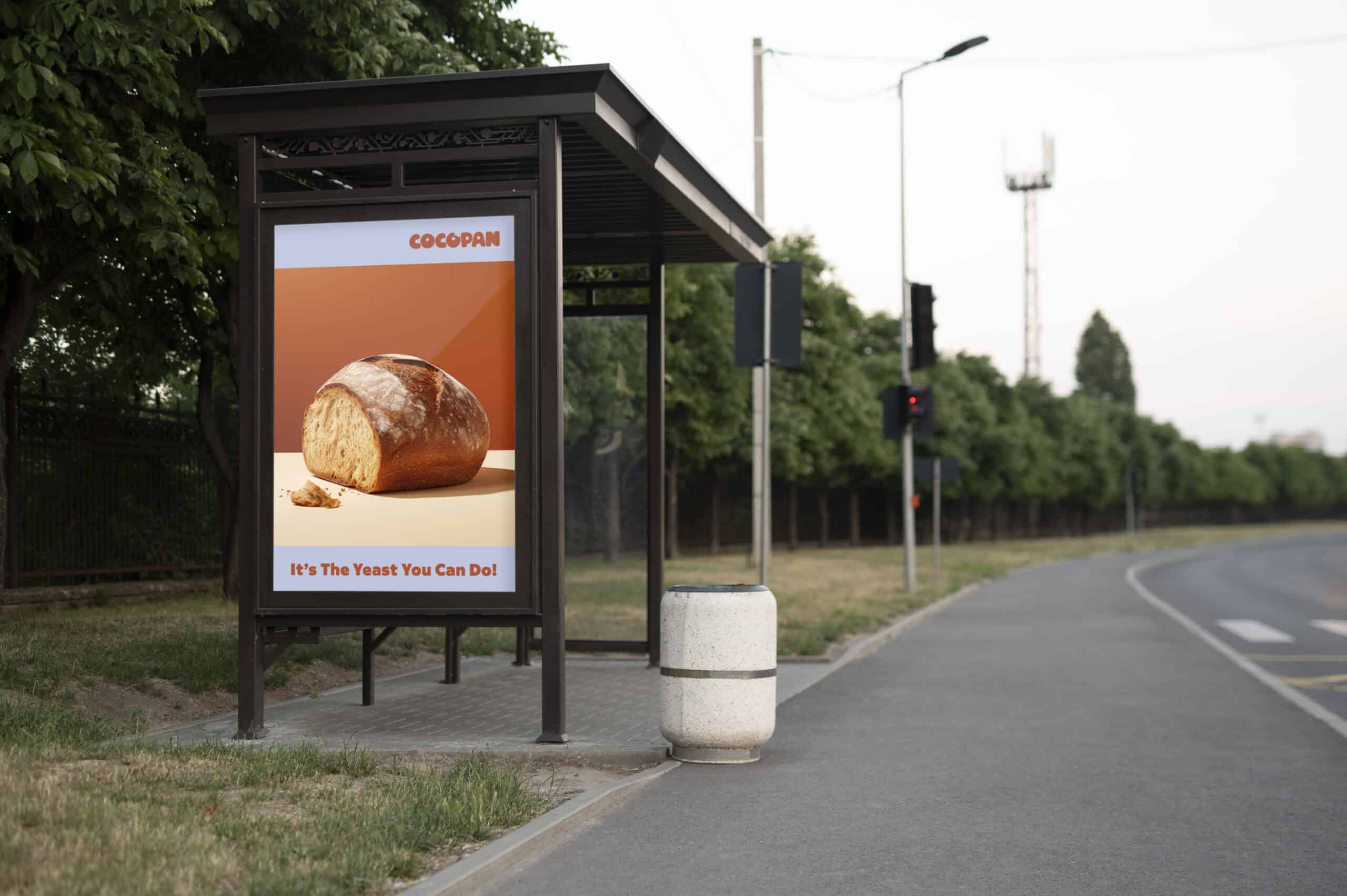
Utilizing warmer color tones, Cocopan positions itself against the loud primaries of its competitors, bringing about a welcoming yet still empowering feel to its retail branding aesthetics. Our graphic language also makes use of awning stripes meant to mimic sliced bread. We applied these contrasts across different retail branding applications, such as beverage packaging, uniforms, down to holiday design packaging.

Pan Intended
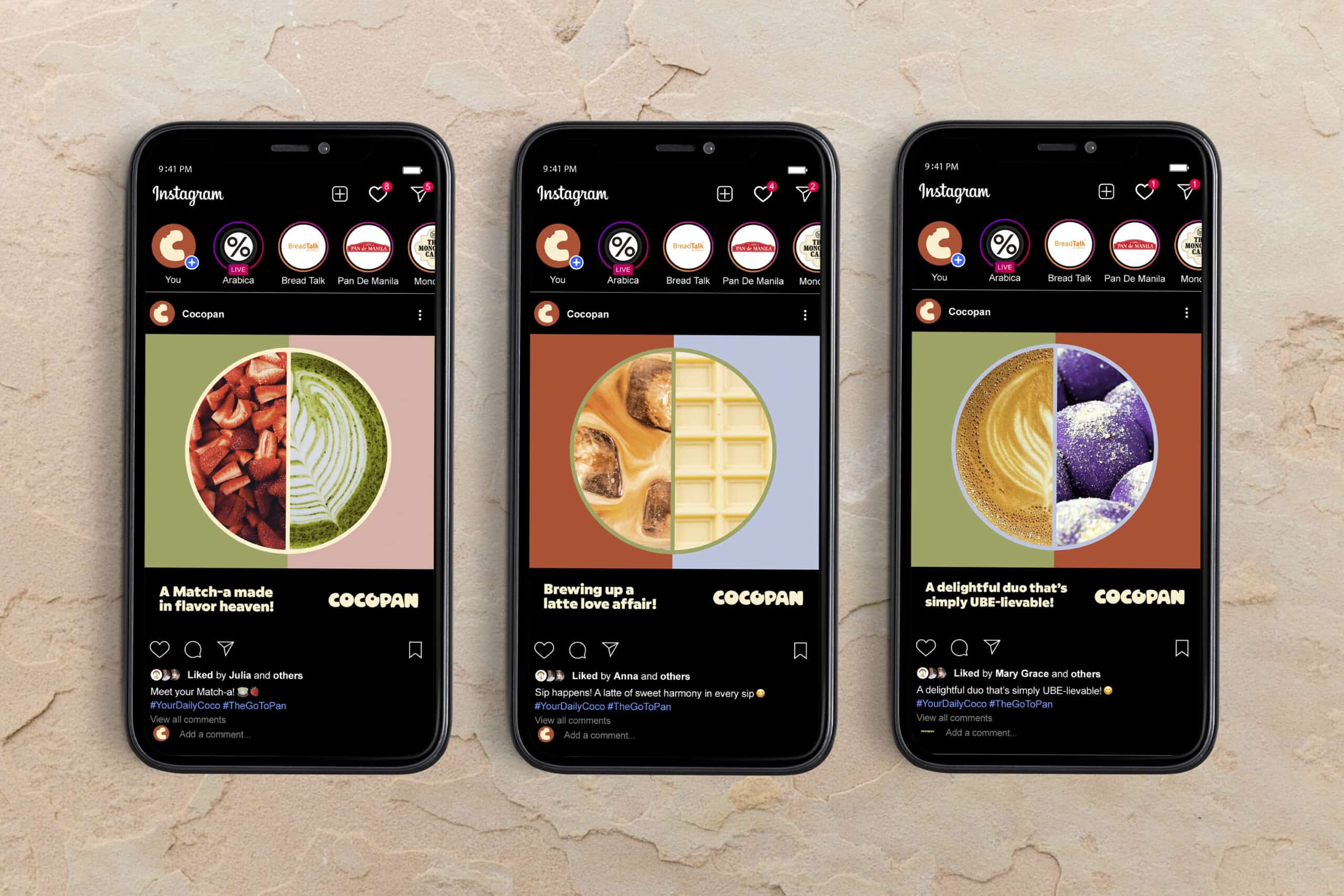
Inviting language does more than welcome customers: it affirms humanity and community belonging. Because of this, the brand’s tone of voice, which we call Coco Lingo, is a fresh take on colloquial communication commonly used among Filipinos. With the language straddling the line between kalog (street smart) and sosyal (classy), we make use of slang and wordplay to create a language that is conversational and familiar. This paves opportunities for witty and engaging content, even within retail branding spaces, ultimately inviting customers to a greater experience that is very much attainable.
Invitation to Indulge
All these brand elements are meant to be an expressive take on bakery language into a playful and inviting brand world. Simultaneously, Cocopan took this as a perfect opportunity to add a sense of refinement to an everyday brand – democratizing sophisticated design for a wider audience. With this, Cocopan aims to stay true to its mission: to be a nourishing respite to a weary Filipino public as they step into the store. Its playfulness is an invitation to indulge, even if just for a moment.
The pressures of daily life bring out an inner yearning for satisfaction. And oftentimes, the immediate answer to the pressing need for satiation is a fresh, tasty piece of a humble pan de coco. As Cocopan begins to roll out its revitalized branding throughout its stores, Design For Tomorrow takes pleasure in collaborating with the Cocopan team in recrafting a resonating identity that echoes the mission and aspirations of the brand. We created a story that seamlessly weaves into the fabric of its communities – infusing the brand with a joyful sense of humanity that, in the process, becomes a celebration of Filipino spirit and resilience. In other words, what it means to be a fulfilling way to get through the day.

“Our team selected Design For Tomorrow to breathe life into our startup brand because of the sincere enthusiasm displayed by Ric and his team. Among all the design firms we approached, they were the ones who truly understood our concept and genuinely believed in our vision. Working with the DFT team was not only a pleasure but also very productive. They exhibited great responsiveness to feedback and an unwavering commitment to infuse our brand identity into every facet of their work, whether it was crafting captivating visuals or developing our brand’s unique voice. The output of their creative work gave us the confidence that our brand will surely stand out in a fiercely competitive market.”
GINO RODRIGUEZ
CEO, Cocopan
Client Cocopan Industry Retail, Food Discipline Branding, Design, Packaging Location Metro Manila, Philippines
Creative & Art Director Ric Gindap Associate Art Director Rashina Tuazon Brand Identity and Logo Designer Ma. Cecilia Inocencio Retail Design Kervin Pasco Strategy Ma. Julie Therese Amos Copywriter and Tone of Voice Dave Riel Española Account Manager Cessmarie Villones