BRANDING AGENCY FOR SINGAPORE & ASIA
Design For Tomorrow is a branding and strategy agency working with Singapore-based and Asia-facing brands that need sharper positioning, clearer identity, and stronger expression across markets.
We help founders, CEOs, CMOs, leadership teams, and ambitious organizations turn business vision into brand strategy, brand identity design, visual identity systems, naming, messaging, editorial platforms, creative direction, digital expression, and brand experience.
Our work begins in Manila, extends through Singapore, and moves across Asia with one belief intact: a brand should look polished, but it should also know what it means. Because when a brand knows what it means, everything begins to behave better: the logo, the website, the pitch deck, the packaging, the launch, the lobby, the investor conversation, and that one brave sentence the founder keeps rewriting at 1:37 in the morning.
Design For Tomorrow creates brands with clarity, character, and commercial consequence.
A branding agency for companies that need to travel well
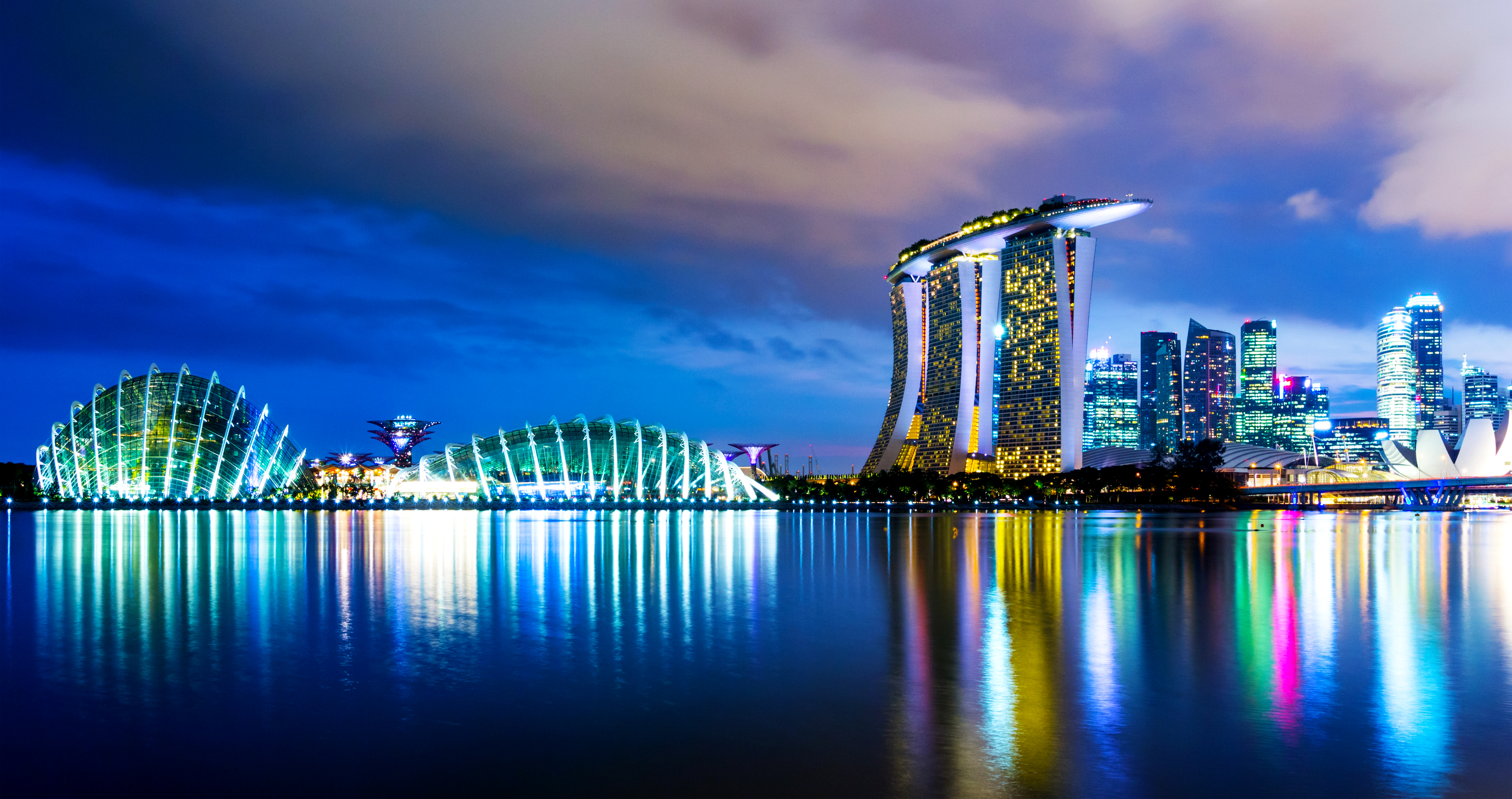
Singapore is one of Asia’s most exacting business environments. A brand here often needs to speak to many audiences at once: local customers, regional partners, international investors, internal teams, discerning buyers, and markets that judge quickly because they have been given very little reason to be patient.
A brand cannot survive that pressure on decoration alone.
A well-articulated brand needs a sharper idea, a more coherent voice, a stronger identity system, and a visual language with discipline. It also needs a story that can travel across websites, decks, signage, packaging, campaigns, social media, retail environments, events, investor materials, and everyday customer experience.
For companies searching for a branding agency in Singapore, brand strategy agency in Singapore, identity design agency in Singapore, or creative branding agency for Asia, the task is rarely to find another supplier who can make things look respectable.
Respectability is easy. Beige can be respectable. Airport carpeting can also be respectable.
However, the harder task is finding a partner who can clarify what the brand means, why it should matter, and how it should appear in the world with enough intelligence to be remembered.
That is where DFT works best.
design with a spine
Design For Tomorrow works at the intersection of strategy, writing, design, culture, and experience. We are a branding and strategy agency for organizations that need their identity to do real work.
Our work is especially relevant for companies preparing for:
_ Regional expansion
_ Market repositioning
_ Brand refresh or rebrand
_ New venture launch
_ Founder-led brand building
_ Investor-facing communications
_ Premiumization
_ Digital transformation
_ Portfolio clarification
_ Customer experience improvement
_ Brand architecture and naming systems
Our work does not begin by asking what color the logo should be. That would be like diagnosing a fever by interviewing the curtains.
We begin by understanding what the organization is trying to become, who it needs to reach, and where clearer meaning can create stronger commercial and cultural advantage.
Then we build the system: strategy, identity, language, design, experience, and the practical tools a brand needs to behave intelligently long after the launch champagne has gone warm.
Who we work with
We work with founders, entrepreneurs, family businesses, leadership teams, regional companies, creative ventures, property platforms, wellness brands, restaurants, consultancies, financial services firms, media companies, lifestyle brands, and organizations preparing to be understood by more demanding audiences.
Our experience spans:
_ Beauty, health, and wellness branding
_ Food and beverage branding
_ Restaurant branding and hospitality identity
_ Media, culture, and creative industry branding
_ Real estate, property, and proptech branding
_ Finance, fintech, and wealth management branding
_ Consultancy and professional services branding
_ Lifestyle, fashion, and retail branding
_ Editorial, publishing, and communications platforms
_ Brand experience and environmental design
_ Sustainability, mobility, energy, and impact-led branding
Across these sectors, the work remains consistent: give the brand a clearer mind, a better face, and a more compelling way to enter the room.
What We Build
01
Brand Strategy and Positioning
For companies that need sharper differentiation, stronger relevance, and a clearer reason to be chosen.
We define brand strategy, positioning, audience logic, brand architecture, strategic narratives, and market-facing language.
This is the work that decides what the brand means before everyone argues about whether the blue is too blue.
02
Brand Identity Design
For organizations that need a visual system with recognition, restraint, and force.
We create brand identity design, logo systems, visual identity systems, typography, color palettes, graphic language, iconography, brand applications, and identity guidelines.
A strong identity should give shape to the strategy underneath instead of behaving like a decorative sticker placed on top of a confused organization.
03
Naming and Brand Architecture
For brands, products, platforms, ventures, and portfolios that need clearer names and smarter relationships.
We develop brand naming, product naming, naming systems, brand architecture, sub-brand logic, portfolio structures, and verbal identity.
A good name opens the right door.
04
Messaging, Voice, and Editorial Strategy
For organizations that need to sound clearer, sharper, and less as if twelve departments were trapped in a Google Doc overnight.
We create brand messaging, tone of voice, brand narratives, website copy, campaign language, founder stories, editorial platforms, custom publishing, brochures, magazines, monographs, and communications strategy.
Language is where strategy learns manners.
05
Digital Expression and UI/UX Direction
For brands that need to behave coherently across websites, platforms, digital campaigns, social media, investor decks, and customer journeys.
We shape digital brand systems, website direction, UI/UX design direction, content strategy, information hierarchy, and digital experience design.
The website is often where a brand’s confusion becomes public. We prefer to spare everyone that small municipal tragedy.
06
Brand Experience and Creative Direction
For brands that need to be felt across physical, digital, editorial, retail, hospitality, and event touchpoints.
We create brand experience systems, creative direction, art direction, packaging design, retail expression, signage, wayfinding, environmental graphics, campaign concepts, and customer touchpoint design.
Brand experience is where identity stops posing and starts working.
Singapore-linked and Asia-facing brand work
DFT’s Singapore-linked and Asia-facing work spans media, proptech, real estate, regional design institutions, beauty, wellness, coaching, plant-based food, restaurant concepts, human capital, professional services, communications, lifestyle retail, and wealth management.
The range matters because Singapore is rarely a one-category market. A brand may need to speak to customers in one register, investors in another, partners in another, and internal teams in the only language that prevents meetings from multiplying like damp laundry.
Our work helps brands become clearer across that complexity.
Featured Work
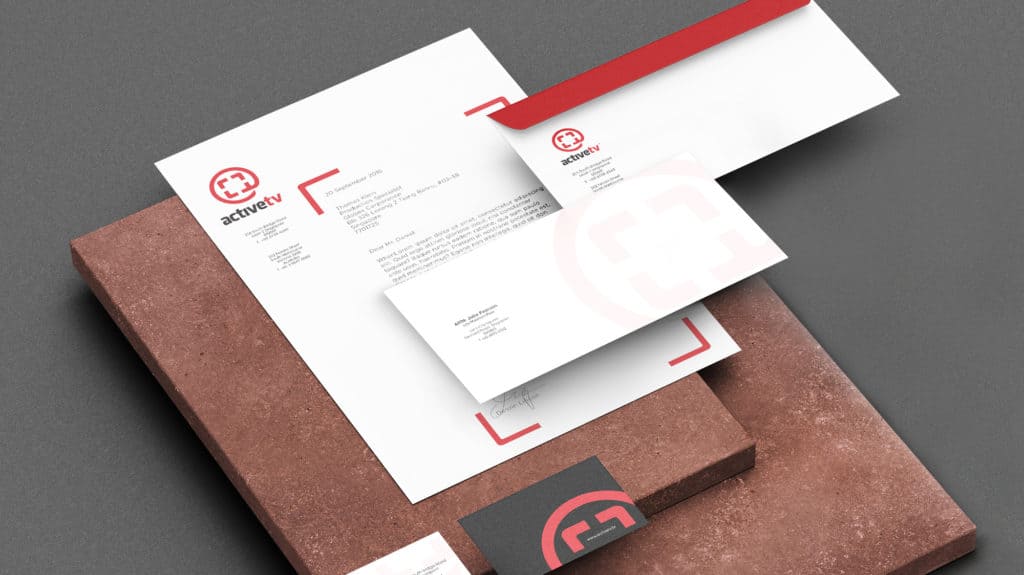
activeTV
Media Company Rebranding for a Singapore-Based Producer
activeTV, a Melbourne-founded media company operating from Singapore, needed a refreshed identity for a fast-changing media landscape. DFT developed a more flexible brand system built around a framing icon that could hold varied content, digital formats, and future brand extensions.
The identity gave activeTV a stronger visual structure for a time when media no longer sits politely in one channel. It moves through screens, feeds, events, activations, partnerships, branded content, and whatever fresh format arrives next to make everyone in the industry pretend they saw it coming.
Relevant services: media company branding, logo redesign, visual identity system, brand identity design, digital media branding, Singapore branding agency
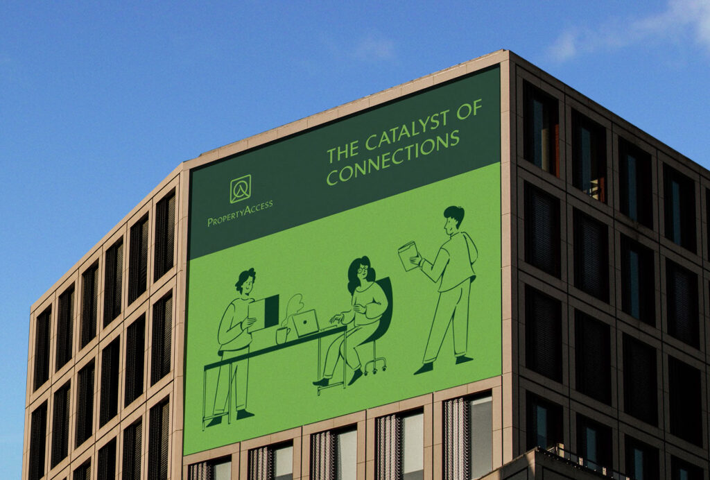
PropertyAccess
Cross-Border Real Estate and PropTech Brand Refresh
PropertyAccess is a cross-border real estate platform with a Singapore link through one of its co-founders who is based in Singapore. The platform connects developers, buyers, and investors across Asia, helping make regional property opportunities easier to understand, evaluate, and trust.
DFT helped refresh the brand to improve clarity, credibility, and international appeal for audiences navigating property opportunities across markets.
In cross-border real estate, confusion is expensive. Buyers need reassurance. Developers need credibility. Investors need context. Platforms need to feel useful before asking anyone to make a serious decision involving contracts, currency, and a mild private panic.
DFT helped PropertyAccess become clearer and more credible across brand identity, digital experience, content strategy, and investor-facing communication.
Relevant services: proptech branding, real estate branding, cross-border real estate platform branding, brand strategy, identity design, UI/UX direction, Singapore-linked brand work, Asia-facing brand strategy
APSDA
Regional Brand Communication for an Asia-Pacific Design Association
DFT worked on the Asia-Pacific Space Designers Association’s brand communication and website content, helping clarify its role as a regional platform for interior designers, space designers, accredited professionals, national associations, fellows, partners, and industry stakeholders across Asia-Pacific.
During DFT’s work for APSDA, Singapore was represented as one of the association’s key national organization members. APSDA was then led by Prof. Keat Ong, who was concurrently President of the Society of Interior Designers, Singapore, or SIDS. This gives the project a meaningful Singapore link while preserving its broader regional nature: an Asia-Pacific design association shaped by regional collaboration, professional credibility, and Singapore-linked design leadership.
The work required careful calibration: institutional authority without stiffness, regional ambition without vague conference language, and professional credibility without sounding as if the website had been written by a committee trapped in a hotel ballroom after the coffee had been removed.
Relevant services: association branding, website content strategy, regional brand communication, professional services branding, Asia-Pacific design community, institutional brand strategy, design industry branding, Singapore-linked brand work
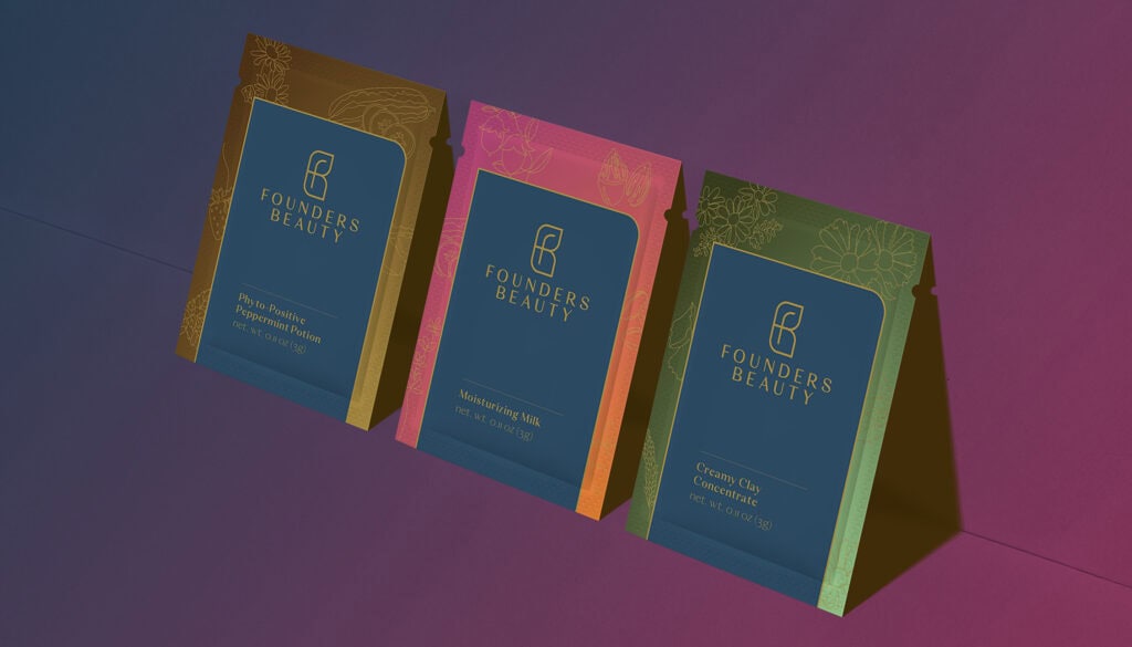
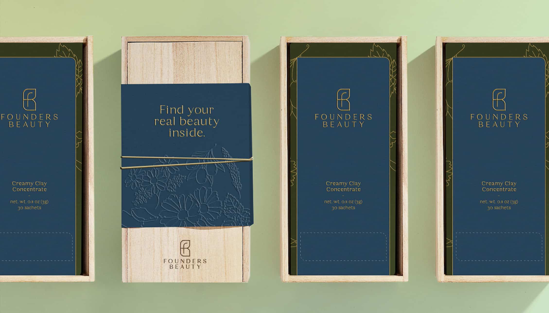
Founders Beauty
Skincare and Wellness Brand Identity for a Singapore-Based Brand
Founders Beauty is a Singapore-based skincare and wellness brand created for people with a high degree of sensitivities. DFT helped crystallize the founder’s deeply personal vision into a more refined brand identity, upscale packaging language, and visual system.
The work translated care, sensitivity, and founder conviction into a brand that could feel gentle without becoming weak, premium without becoming cold, and beautiful without requiring the usual parade of impossible cheekbones and aggressive serenity.
The category was crowded with claims so the brand needed clarity. For a story rooted in health and healing, it needed grace and a differentiated perspective.
Relevant services: beauty branding, skincare branding, wellness branding, packaging design, brand identity design, founder-led brand strategy, Singapore-based brand

Just Jaq Fit
Fitness and Wellness Identity for a Singapore-Based Coaching Brand
Just Jaq Fit is a Singapore-based coaching brand by Coach Jaq Molloy. Created in collaboration with Singapore partner One Triple Four, the identity balanced movement, self-love, confidence, and personal transformation.
DFT developed a visual identity and brand expression that could feel energetic, approachable, and emotionally encouraging without collapsing into fitness-brand clichés involving thunderbolts, guilt, and a person shouting near a kettlebell.
The result was a coaching brand with warmth, clarity, and visual character.
Relevant services: fitness branding, wellness branding, coaching brand identity, lifestyle brand design, Singapore brand identity, creative direction, One Triple Four collaboration
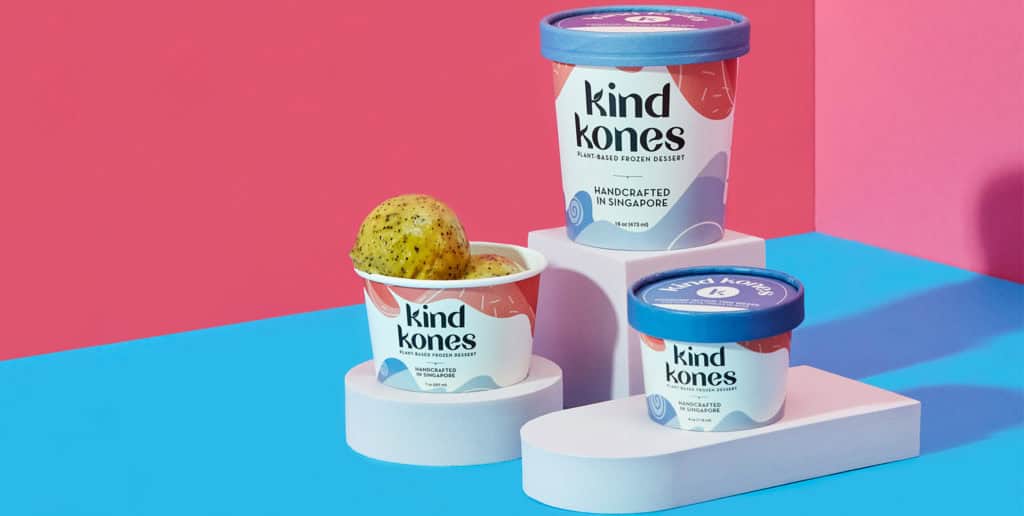
Kind Kones
Plant-Based Dessert Rebrand and Packaging System
Kind Kones needed to evolve from a niche vegan dessert brand into a more inclusive plant-based frozen dessert brand for a wider market. DFT worked on the rebranding and strategy, developing a bespoke wordmark, packaging system, color language, brand applications, and retail-ready identity.
The work kept the brand joyful, indulgent, and principled without sounding like it had arrived at dessert with a clipboard and a moral lecture.
It became more accessible, more ownable, and more commercially prepared for supermarket visibility, retail expansion, and broader customer appeal.
Relevant services: food and beverage branding, plant-based brand strategy, packaging design, retail branding, F&B branding Asia, brand refresh, visual identity system
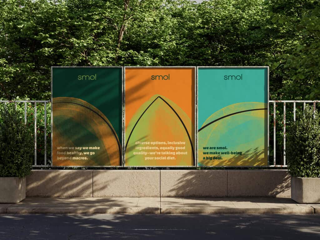
SMOL
Restaurant Rebrand and Hospitality Identity
SMOL is a Singapore café and salad bar founded by Charmaine Low, built around food, inclusion, sustainability, and social responsibility. Publicly described as a social enterprise, SMOL is committed to creating a more sustainable, inclusive, and socially responsible food ecosystem.
DFT helped reshape the SMOL brand with a clearer identity, a more vibrant visual expression, and a more confident hospitality language. The work strengthened how the dining concept appears across customer-facing touchpoints, while giving the brand room to express its deeper commitments: inclusive employment, anti-discrimination, environmental responsibility, halal access, and visible support for communities often pushed to the margins.
A restaurant identity has to set the table before the table is set. For SMOL, that meant building a brand presence with appetite, warmth, purpose, and enough confidence to carry both a salad bowl and a social conscience without wobbling.
Relevant services: restaurant branding, F&B branding Singapore, social enterprise branding, hospitality identity, inclusive brand strategy, purpose-driven branding, visual identity design, menu and collateral design, Singapore-linked brand work
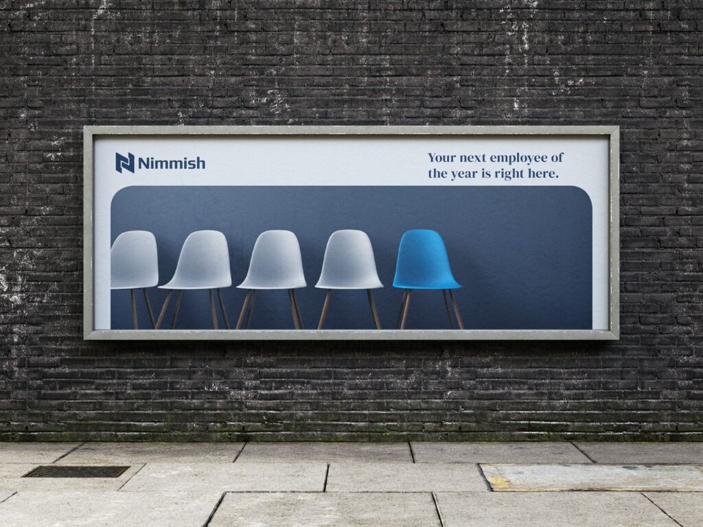
Nimmish
Brand Identity for a Singapore Human Capital and Management Consultancy
Nimmish is a Singapore-based company working across recruitment, manpower, and management consultancy services. DFT helped shape a clearer brand identity and a more credible business-facing presence for a company operating in the human capital and advisory space.
The work strengthened how Nimmish communicates trust, expertise, and professional value across client-facing touchpoints.
In recruitment and consultancy, clarity carries commercial weight. The brand needs to suggest judgment, discretion, and competence before the first conversation begins. A stronger identity helps make that confidence visible without forcing the company to sound like it has swallowed an HR conference lanyard.
Relevant services: recruitment branding, management consultancy branding, professional services branding, human capital branding, B2B brand strategy, identity design, brand positioning, Singapore-linked brand work

Tuki Merchant
Lifestyle and Retail Brand Expression
Tuki Merchant is a Singapore-linked lifestyle retail concept and Shopee store selling useful household items for everyday needs. A subsidiary of One Triple Four, the brand was built around the Hebrew word “Tuki,” תוכי, and the image of a jolly pirate hawking random but useful wares from near and far.
DFT developed the branding, specially designed wordmark, photography, and social media strategy, with a visual direction inspired by a merchant arriving by Chinese junk and the incorporation of a Chinese seal into the final design language.
The result is a retail brand with charm, wit, and a clear sense of discovery. Practical household objects suddenly feel less like errands and more like loot, which is frankly the only civilized way to buy a dish rack.
Relevant services: lifestyle branding, retail branding, Shopee store branding, brand identity design, wordmark design, photography direction, social media strategy, Singapore-linked brand work, One Triple Four collaboration, Asia-facing brand strategy
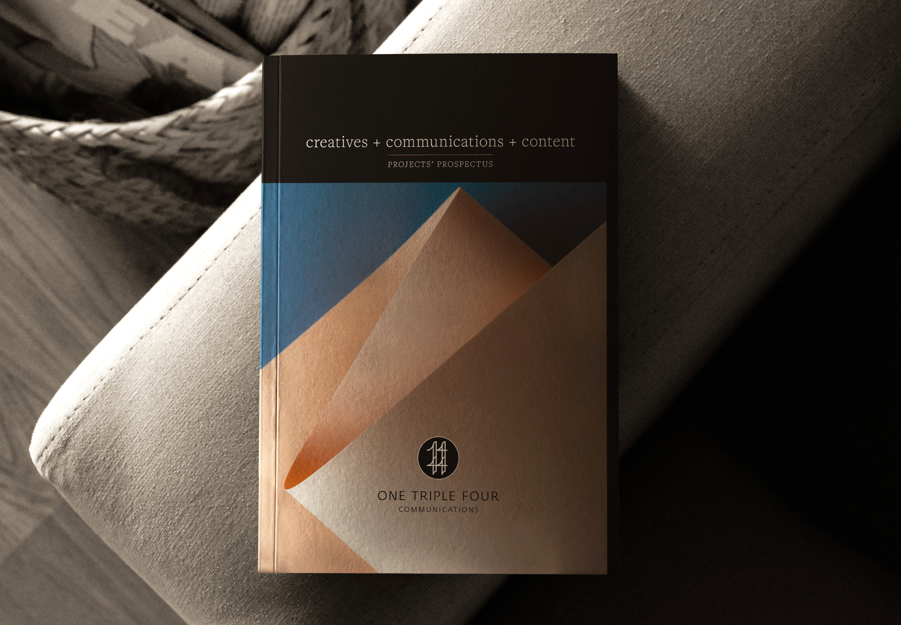
One Triple Four / 1444 Communications
Logo and Identity for a Singapore Communications Company
One Triple Four Communications is a Singapore-based public relations and communications services company working across brand and marketing strategy, communications execution, workflow best practices, consultancy, and training. Its belief is simple and useful: tell a great story, then build the tools and habits to keep telling great stories consistently.
DFT designed the logo and identity for One Triple Four, shaping a brand presence for a communications company built around story, strategy, and sustained execution. The identity needed to feel clear, professional, and adaptable, with enough character to support both consultancy and training tracks.
DFT has also collaborated with One Triple Four on selected brand projects, including Just Jaq Fit, Novo Naqa, and Tuki Merchant. This gives the relationship more weight: not only did DFT help shape One Triple Four’s own identity, the two teams have also worked together across founder-led, lifestyle, wellness, and retail brands.
A good communications brand cannot merely announce that stories matter. It has to look as if it knows how to carry one from the first sentence to the last invoice.
Relevant services: Singapore logo design, Singapore brand identity, communications branding, brand and marketing strategy, brand identity design, visual identity system, Singapore brand collaboration, communications strategy, creative consultancy Asia, lifestyle branding, wellness branding, retail branding, social media strategy
Zai Wealth
Wealth Management Brand Identity
For Zai Wealth, DFT is shaping a wealth management and property development fund brand around clarity, trust, discretion, and modern financial confidence.
In wealth management, credibility must arrive clearly. The brand needs to feel intelligent, composed, and human. Too cold, and it feels like a bank corridor after hours. Too luxurious, and it starts sounding like a watch advertisement having an existential episode.
The goal is to create a financial brand that feels assured, precise, and worthy of serious trust.
Relevant services: wealth management branding, financial services branding, finance brand strategy, premium brand identity, trust-led branding, brand identity design, Singapore finance branding
Regional experience beyond Singapore
DFT’s Singapore-linked work sits within a broader regional practice across the Philippines and Asia. Beyond the projects above, our work spans fintech branding, beauty and wellness branding, hospitality branding, property and placemaking branding, energy and sustainability branding, mobility branding, automotive branding, custom publishing, and brand experience design.
This wider experience matters because Singapore-facing brands often operate across categories, cultures, and markets. A financial services brand may need warmth. A hospitality brand may need restraint. A wellness brand may need discipline. A property platform may need editorial clarity. A consultancy may need sharper commercial language.
DFT connects brand strategy, identity design, messaging, creative direction, and brand experience so organizations become easier to understand, easier to trust, and easier to choose.
Why work with DFT for Singapore and regional brand work
Singapore rewards clarity and Asia rewards nuance. Strong brands need both.
DFT brings together strategic thinking, visual intelligence, editorial craft, cultural sensitivity, and commercial discipline. We understand how brands need to move across business, digital, retail, editorial, hospitality, and leadership contexts, including the delicate theater of first impressions.
We are especially useful when a brand needs to become:
_ Clearer to investors
_ Sharper to customers
_ More coherent across markets
_ More distinctive in a crowded category
_ More premium without becoming pompous
_ More human without becoming casual
_ More strategic without becoming unreadable
_ More beautiful without becoming decorative
A brand should have enough clarity that people lean in, without needing to shout to be taken seriously.
How we work
We listen before we prescribe
We begin with conversations, reviews, and a close reading of the brand’s current materials.
The first task is to understand where clearer meaning can create the greatest advantage.
We define the strategic foundation
We clarify the brand’s positioning, voice, messaging, and larger narrative.
This is where the brand learns to stand upright.
We design the identity system
We create the visual language: logo, typography, color, imagery direction, applications, and guidelines.
The goal is a working system with memory, discipline, and range.
We build the language and touchpoints
We develop the words, messages, digital direction, and key brand touchpoints the organization needs to meet the world properly.
Because identity without language is often just a beautiful person at a dinner party with nothing to say.
We help the brand stay coherent
We create the tools and guidance that help internal teams, partners, and collaborators apply the brand with consistency.
A good brand launch should not end with everyone asking for the logo in PNG, JPEG, SVG, PDF, and, inexplicably, Microsoft Word.
When companies search for a branding agency in Singapore, the real decision is clarity
A company searching for a branding agency in Singapore may begin with a simple need: a logo, a website, a deck, a refresh, a campaign, or a name.
But the real need is often larger.
A stronger brand should help leadership make clearer decisions, help customers understand the business faster, and help the organization express itself with greater confidence across markets, touchpoints, and moments of growth.
DFT helps Singapore-based and Asia-facing organizations turn business ambition into brand strategy, identity design, creative direction, brand experience, messaging, and digital expression.
The aim is simple: build a brand that travels well without losing its accent.

SONAM UTTAMCHANDANI
CEO, Founders Beauty
Singapore
“As an entrepreneur, launching Founders Beauty, and giving it an identity was extremely difficult for me to do all on my own. I remember it like it was yesterday, meeting with countless firms, explaining my vision, our mission as a brand and the goals I had, over and over and over again. It was an interesting process, entering each meeting with gusto and excitement and then leaving wondering if the firm I was meeting was right for us. Then I met Ric, and the team at Design For Tomorrow, which is exactly what I wanted, I wanted a brand of the future. True enough, as they always have from start to finish, Ric and his team have blown us away. They are the only branding firm who truly understood what we were going for. They were able to encapsulate what seemed to be impossible for me to do, into one vision, one icon, and yet somehow through that illustrate that Beauty truly knows no bounds at Founders Beauty. Their flair for the avant-garde, and zeal for creating the best is why they are able to truly design for tomorrow.”

PROF. KEAT ONG, FSID, APID
President(2023-2025), APSDA
Singapore, International
“I had the privilege of working closely with Ric during the brand evolution of APSDA, and the collaboration was both strategic and deeply meaningful.
Ric possesses a rare ability to listen beyond the brief. He understood that APSDA’s rebrand was not merely a visual refresh, but a repositioning of identity. one that needed to honor its legacy while projecting clarity, relevance, and regional leadership into the future. His sensitivity to institutional history, combined with bold forward-thinking, allowed the transformation to feel authentic rather than cosmetic.
Throughout the process, Ric was thoughtful, rigorous, and highly collaborative. He navigated diverse stakeholder perspectives with maturity and composure, while consistently anchoring the work to a larger vision. What impressed me the most was his capacity to translate complex organizational aspirations into a coherent brand language that felt both contemporary and enduring.
The end result has proven significant. The rebrand strengthened APSDA’s presence across Asia, clarified its voice, and reinforced its role as a progressive design body. It was not simply a new look, it was a recalibration of direction.
Ric brings strategic depth, cultural intelligence, and disciplined execution to his work. I would gladly collaborate with him again on any initiative that requires both design clarity and institutional sensitivity.”

SERINA BAJAJ
Co-Founder, Kind Kones
Malaysia, Singapore, Thailand
“It was an absolute pleasure working with Ric and the team on the rebrand of Kind Kones. They were incredibly patient and were able to match our vision in a completely bespoke manner. They took the time to listen to our ideas but also brought fresh ideas to the table along with their experience and creativity. Despite being geographically separated, it was a seamless experience and the end result exceeded our expectations. I’d highly recommend Ric and his team!”
Build a brand with clarity, character, and consequence
If your company is preparing for a launch, rebrand, regional expansion, investor conversation, category shift, or long-overdue identity reckoning, we should talk.
Design For Tomorrow helps ambitious organizations turn vision into brand strategy, brand identity, visual language, messaging, digital expression, and brand experience.
A clearer brand will not solve every business problem. Nothing does, except perhaps better sleep and fewer alignment meetings.
But it can make the organization easier to understand, easier to believe in, and easier to choose.
Frequently Asked Questions
For organizations exploring brand work with DFT, these answers outline how we approach strategy, identity, messaging, digital expression, and brand experience for Singapore-based and Asia-facing brands. They also give a clearer sense of the clients we support, the challenges we help solve, and the value of combining strategic thinking, design craft, editorial discipline, and regional fluency.
Is Design For Tomorrow a branding agency in Singapore?
Design For Tomorrow is a branding and strategy agency registered in Singapore, with a creative studio rooted in Manila and work across the Philippines, Singapore, and Asia. DFT works with Singapore-based, Singapore-linked, and Asia-facing brands that need brand strategy, identity design, creative direction, messaging, digital expression, and brand experience.
Is DFT’s creative studio based in Singapore?
DFT is registered in Singapore, while its creative studio is rooted in Manila, Philippines. This cross-border structure allows us to support Singapore-based, Singapore-linked, and Asia-facing organizations with brand strategy, identity design, messaging, editorial systems, digital expression, and brand experience.
What kinds of Singapore-linked brand work has DFT done?
DFT’s Singapore-linked work includes activeTV, a media company operating from Singapore; Founders Beauty, a Singapore-based skincare and wellness brand; Kind Kones, a premium plant-based frozen dessert; SMOL, a cafe and salad bar; Just Jaq Fit, a Singapore-based coaching brand created in collaboration with One Triple Four; and PropertyAccess, a cross-border real estate and proptech platform with Singapore presence.
DFT has also worked on or is developing Singapore-relevant and Asia-facing brands including Nimmish Consultancy, Tuki Merchant, Zai Wealth, and selected collaborations with One Triple Four / 1444 Communications.
What services does DFT provide for Singapore-based and Asia-facing brands?
DFT provides brand strategy, brand positioning, brand identity design, logo design, visual identity systems, naming, brand architecture, messaging, tone of voice, website copy, digital brand direction, UI/UX direction, packaging design, creative direction, editorial strategy, custom publishing, signage, wayfinding, and brand experience design.
Does DFT work with financial services and wealth management brands?
Yes. DFT has experience in financial services branding, fintech branding, investment fund branding and wealth management branding. Relevant work includes Bayad’s fintech brand transformation and the emerging Zai Wealth brand, which is being shaped around clarity, trust, discretion, and modern financial confidence.
Does DFT work with restaurant, food, and hospitality brands?
Yes. DFT works on restaurant branding, food and beverage branding, hospitality branding, packaging design, destination storytelling, and brand experience. Relevant work includes Kind Kones, SMOL, and hospitality or destination-led projects requiring a strong mix of strategy, design, writing, and emotional atmosphere.
Can DFT help with a rebrand or brand refresh?
Yes. DFT helps organizations with rebranding, brand refresh, brand repositioning, identity redesign, brand architecture, messaging systems, and digital expression.
A rebrand should not be treated as a costume change. It should clarify what has changed in the business, what must be preserved, and what the market now needs to understand.
Is DFT a good fit for founder-led brands?
Yes. DFT frequently works with founders and leadership teams who carry a strong vision but need help turning that vision into a coherent brand strategy, brand identity, voice, and customer experience.
Founder-led brands often have powerful intuition. The work is to translate that intuition into a system other people can understand, believe in, and build upon without needing the founder to explain everything over coffee until the end of civilization.
Why hire DFT for Singapore or regional brand work?
DFT combines strategic clarity, visual intelligence, writing, editorial discipline, cultural sensitivity, and sector range. The studio is useful for brands that need to move across audiences, categories, and markets without becoming generic.
For companies looking for a branding agency in Singapore, brand strategy agency in Asia, identity design agency for Singapore-based brands, or creative agency for Asia-facing companies, DFT offers a perspective shaped by Manila, Singapore, and the wider regional market.